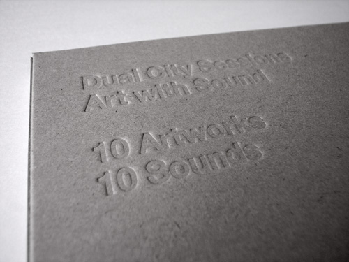
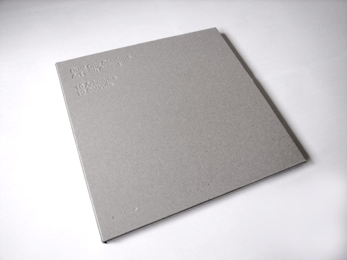
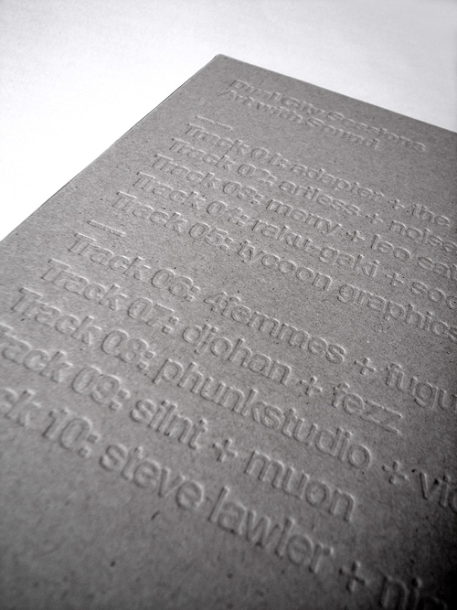
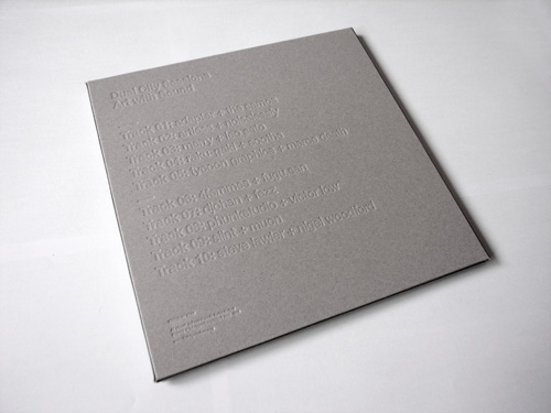
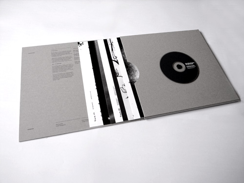
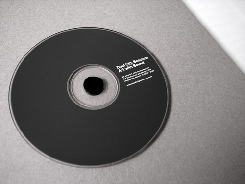
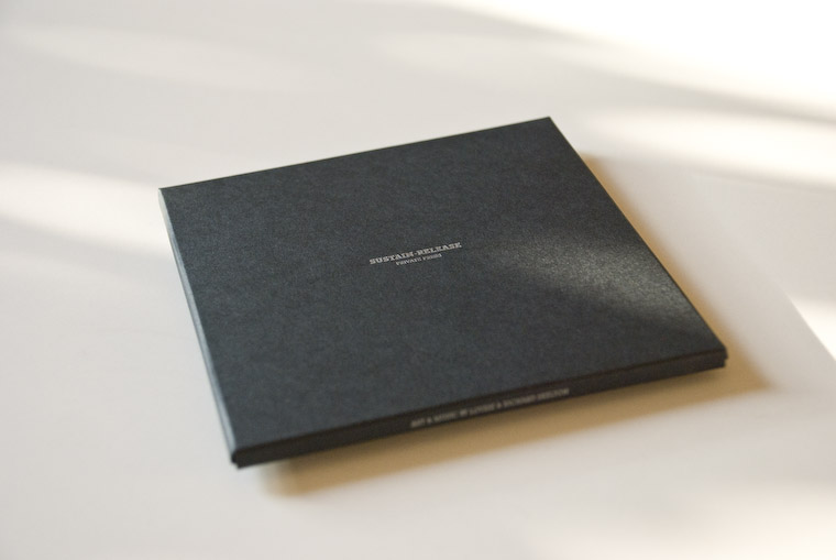
| Art with sound box set |
 |
|
 |
 |
 |
 |
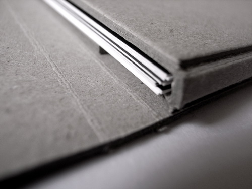 |
| design by silnt | buy it here www.dualcitysessions.com/awsboxset/ |
 |
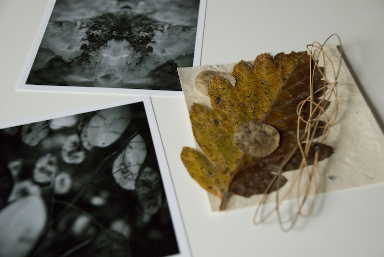
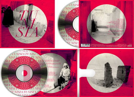
| Karcarah |
 |
|
 |
| www.flickr.com/photos/mulano/ |
|
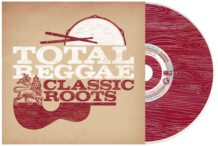
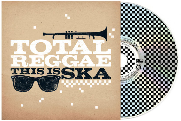
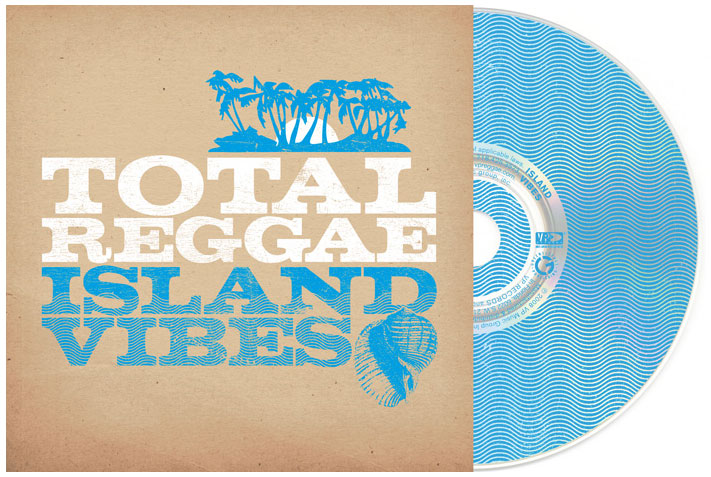
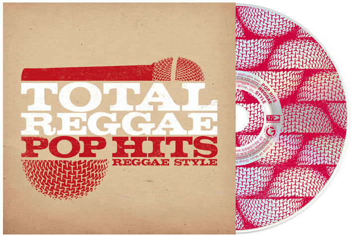
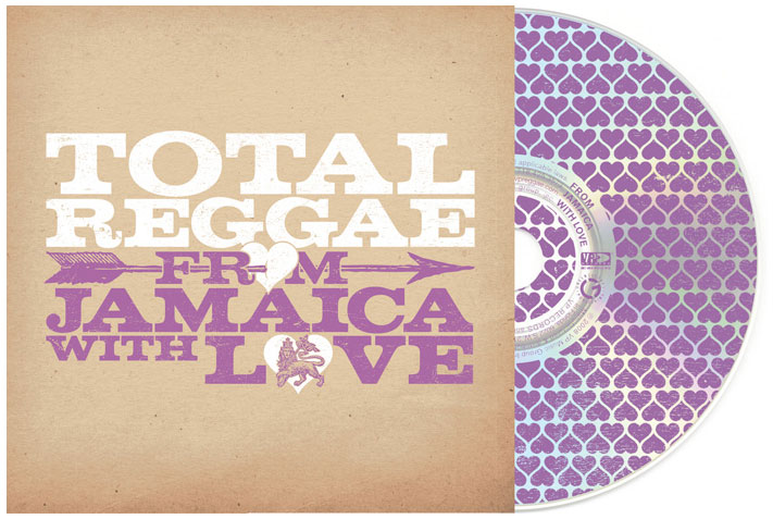
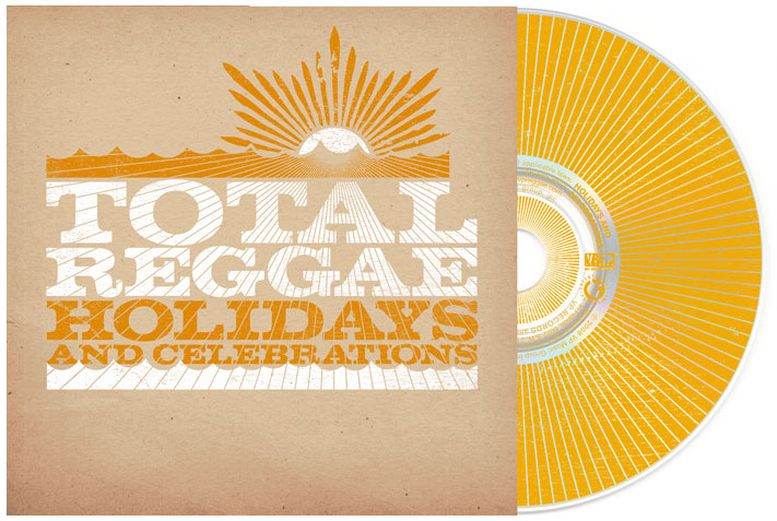
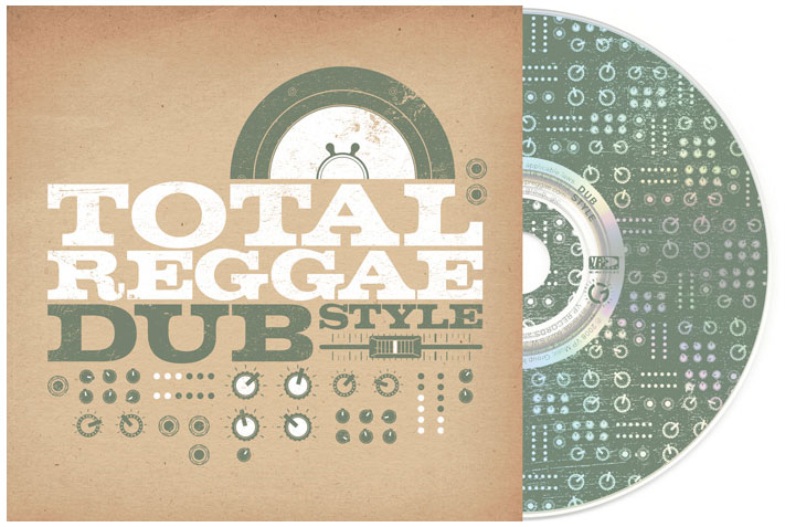
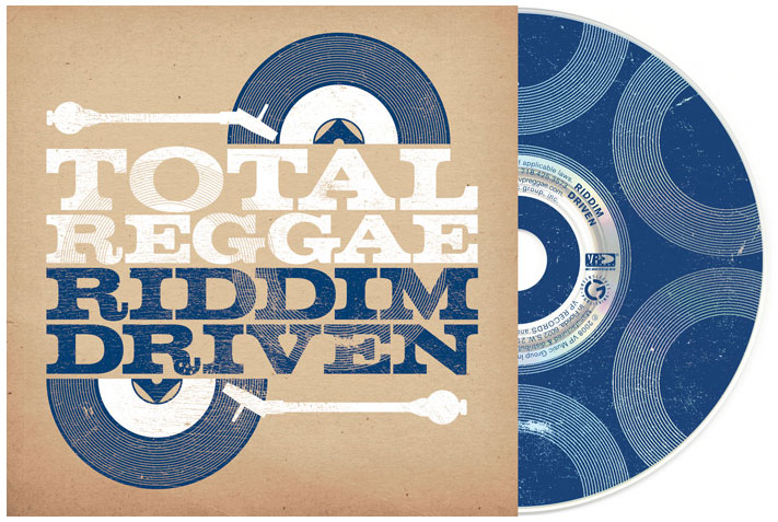
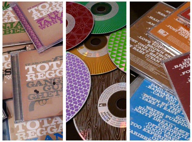
| Total reggae by Super5 |
 |
 |
 |
|
|
 |
 |
 |
 |
 |
|
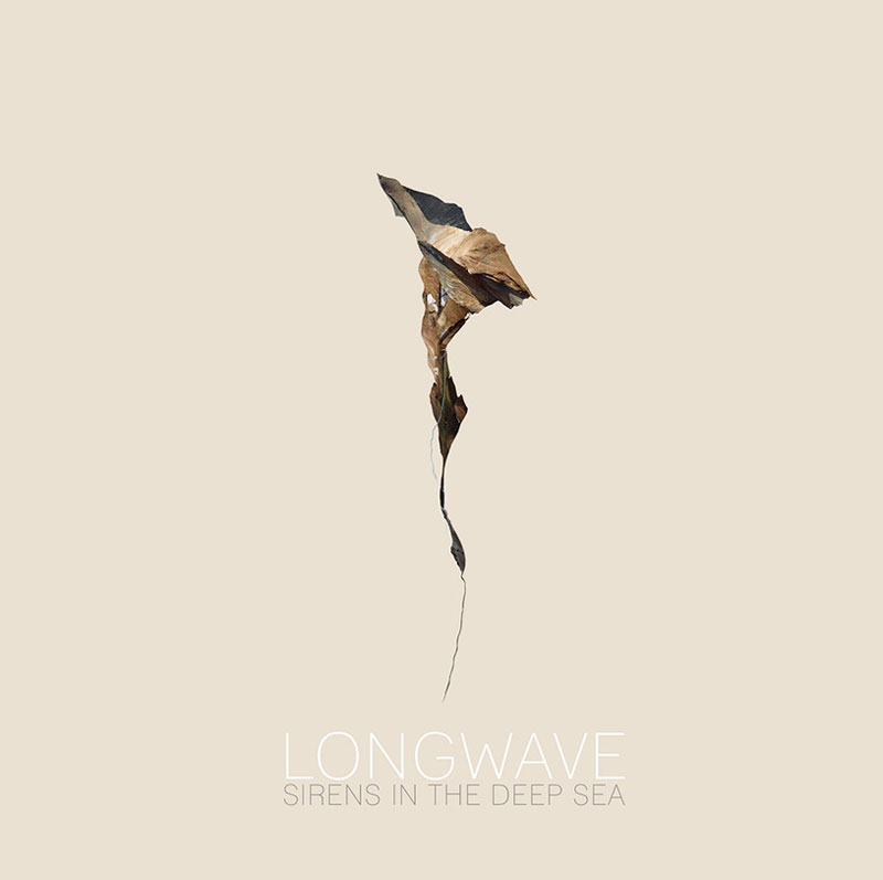
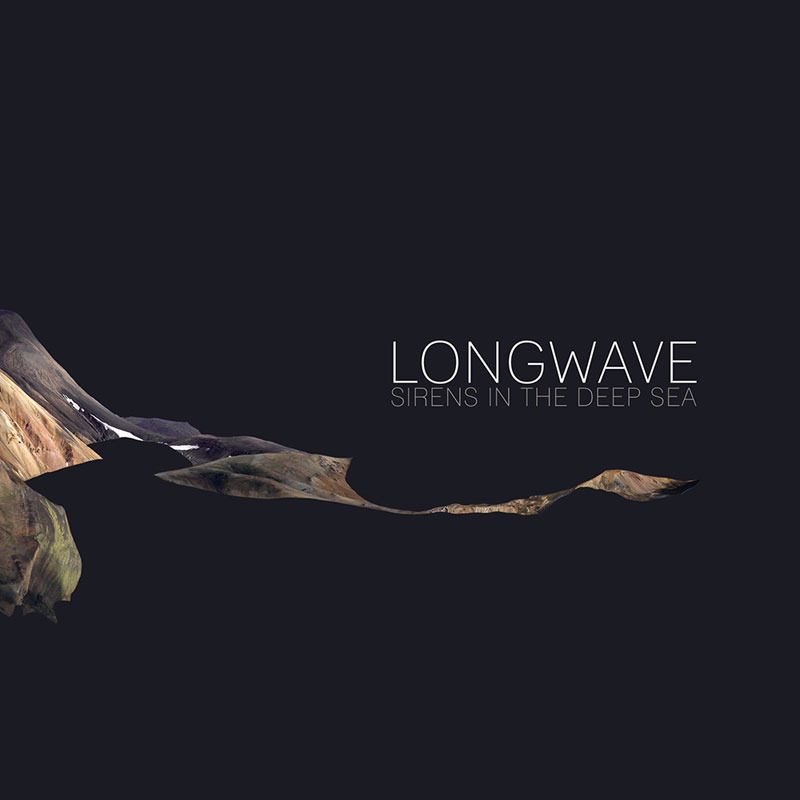
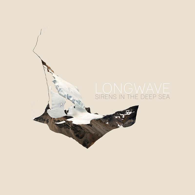
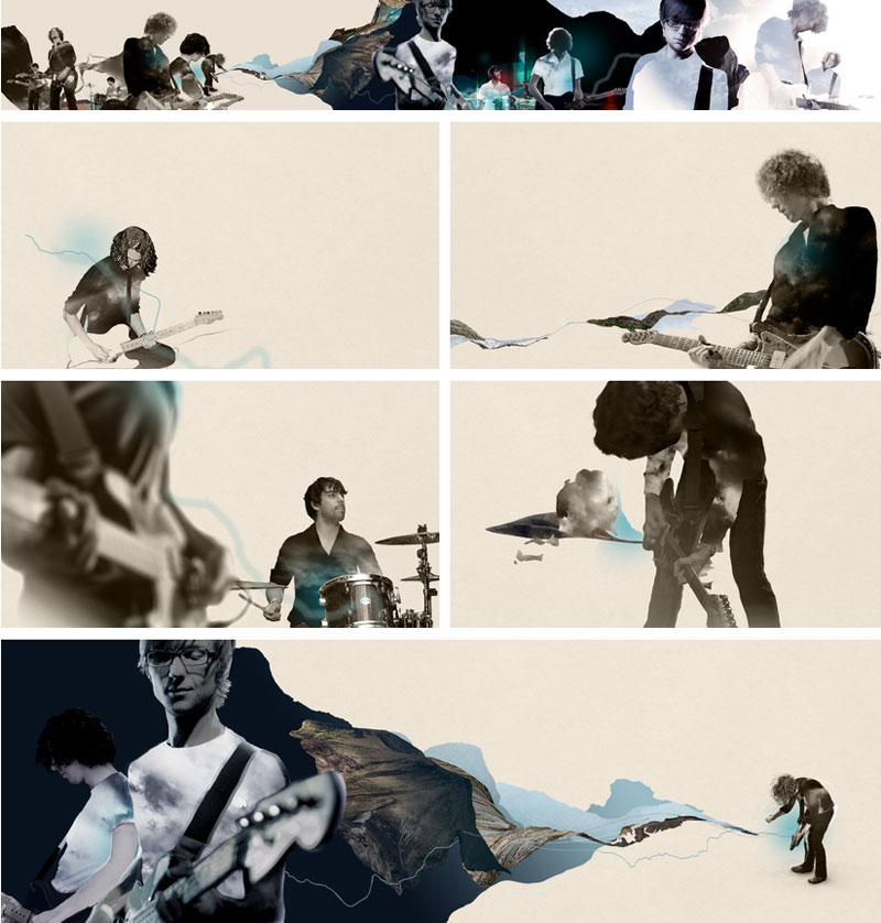
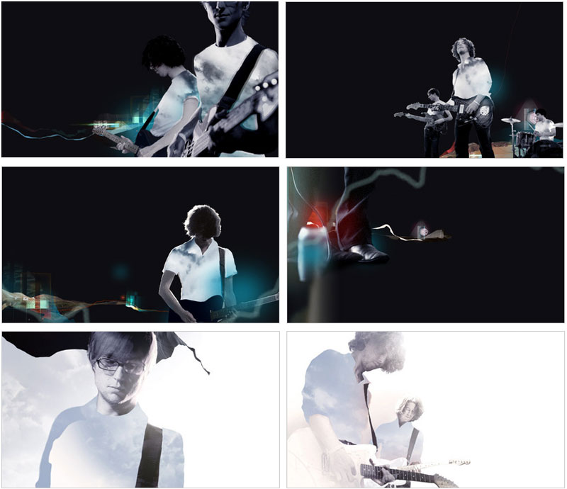
| Long wave by the last mix tape |
 |
 |
 |
|
|
|
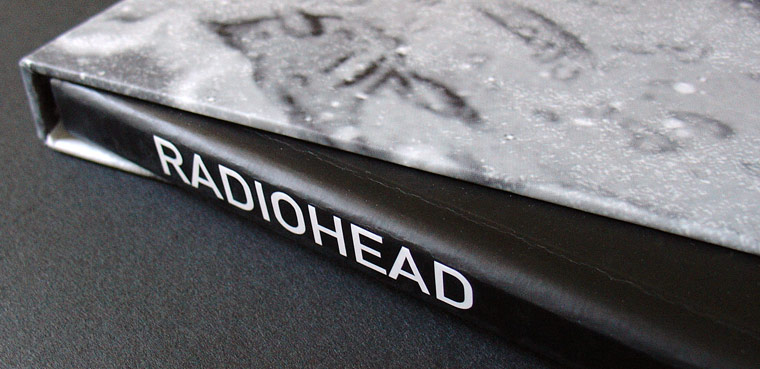
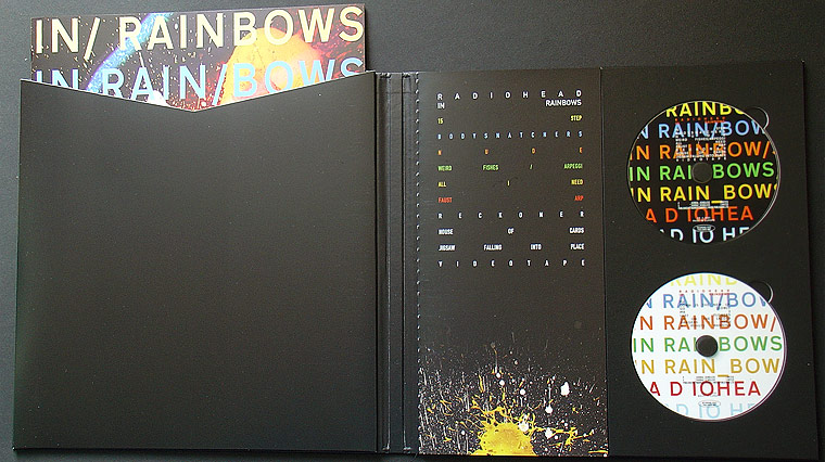
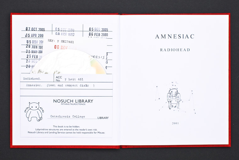
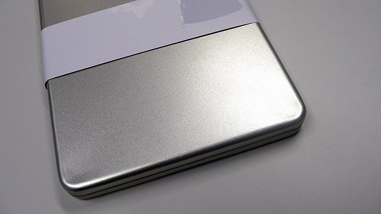
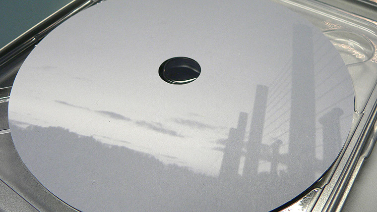
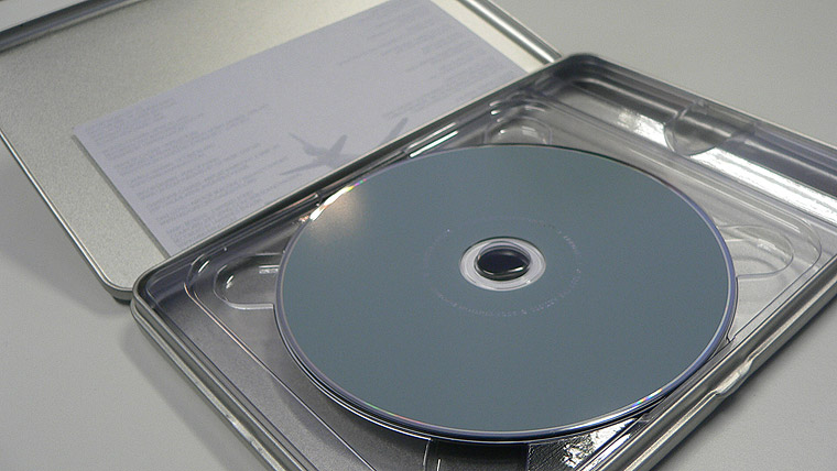
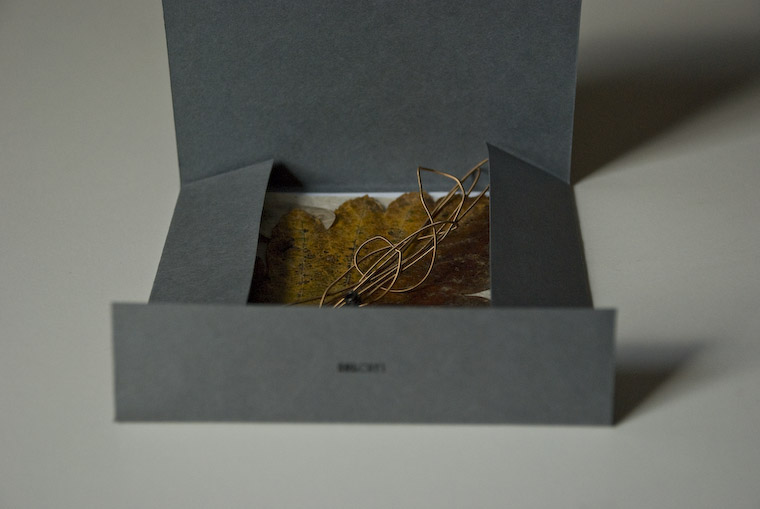
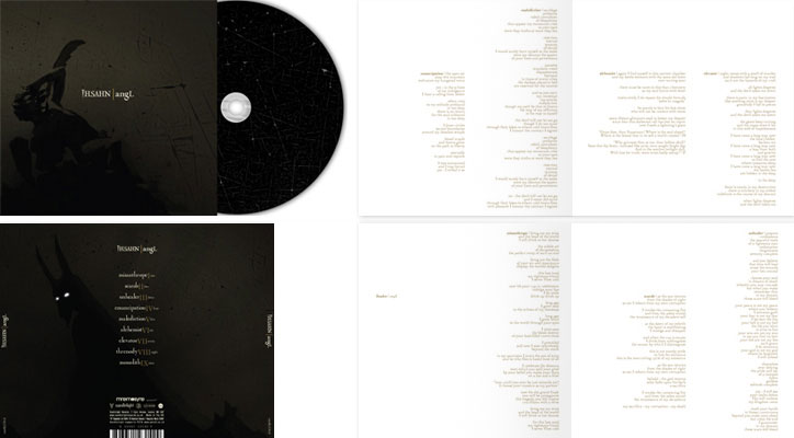
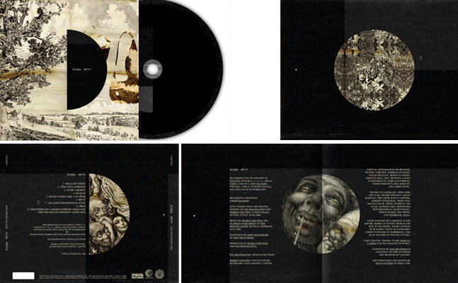
| Hard format |
| "It seems like everybody’s talking about the end of physical music media. Who knows whether they’re right or not, but Hard Format is a little place we’ve set up to celebrate our love of brilliant music-related design." Selection of their selection... |
 |
|
 |
 |
|
 |
 |
 |
 |
 |
 |
|
 |
 |
|
 |
|
 |
|
|
 |
 |
 |
 |
 |
 |
| www.hardformat.org |
|
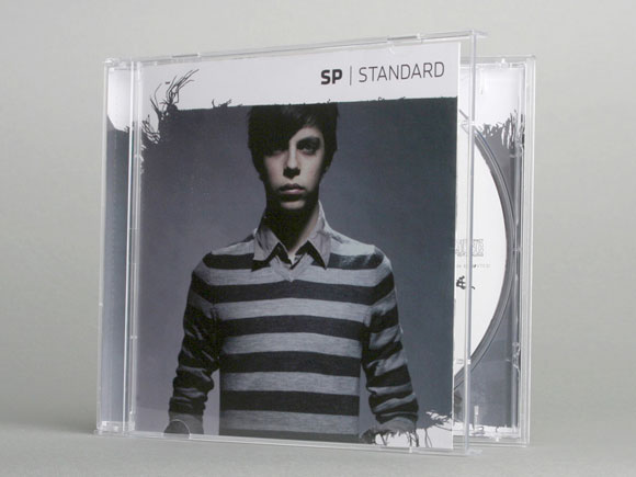
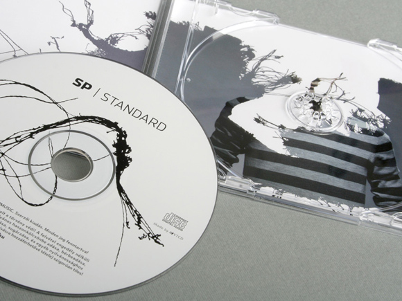
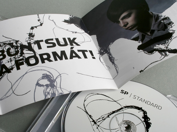
| SP | STANDARD by voov |
 |
|
|
| www.voov.hu/projekt/12 |
|
| alejandra román |
|
|
 |
|
|
|
|
 |
|
| Ritxi Ostáriz new works |
 |
|
|
|
|
| www.iikki.com |
|
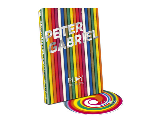
| Interview with Marc Bessant |
| I never do interview for this blog. After I found Marc Bessant on behance, I thought it was the occasion to have answer I ask myself... He has done the new "3" Portishead album, as well as Peter Gabriel album as he his working for the realworld label... |
 |
| Can you please introduce yourself, personnaly and
professionaly? Marc Bessant. Born - Bristol 1972. Education – Sporadic. Qualifications – none. Like many people, after leaving school I was unsure what to do with my life, I had always liked music and art so after a short musical interlude in London, I put pen to paper designing album covers/t-shirts/posters for local bands, soon I noticed that all that loud music had not only affected peoples ears but also their eyes as well, as work of mine was beginning to sell, I continued painting canvases in my spare time and even had a couple of one-man shows in the mid 90s but I was getting more and more interested in commercial art, especially posters and record covers, so I carried on doing work (mostly for free) along those lines for various outfits/DJs. As passionate as I was about it, I couldn’t make ends meet, eventually getting a job in a small printers firm in Bristol (which I enjoyed immensely) which taught me a lot about the process’ involved, something which later I would be grateful for. Then in 2000 I received a call from RealWorld asking me to bring my portfolio in for a viewing, I cobbled a book together and took it along. |
 |
 |
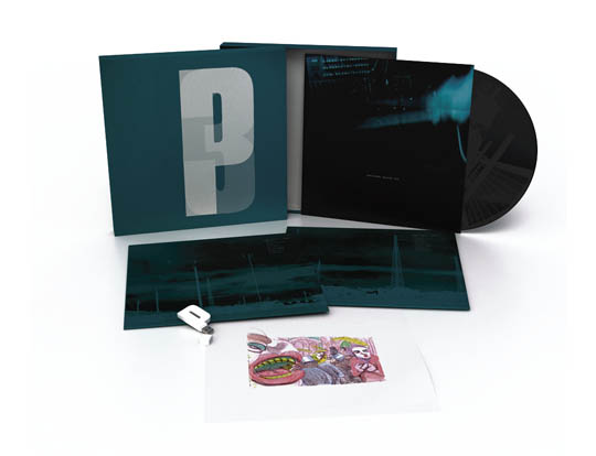
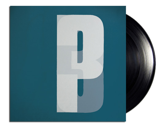
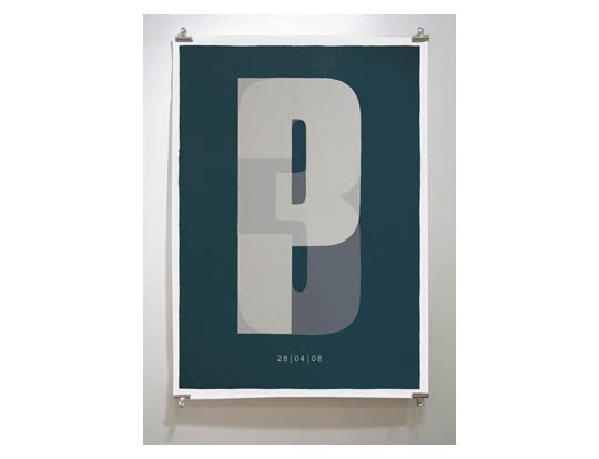
The first project that specially attrack me on your behance folio, is the latest portishead album. Can you talk about the process of making such a design ? Did you work with the band or with "marketing people" ? I’d worked closely with Portishead from the beginning
and after the ten year gap from the last record I knew the only visual
which had stuck in the public eye had been the ‘P’ character,
it was an estabilished brand which I wanted to not only reintroduce
but reinforce. We were keen to avoid anything ‘conceptual’,
no puns or noir imagery, that was all dead to us, I wanted to present
a box, which simply holds the music, with the least amount of information
on it which would ultimately say everything – essential minimalism
– which I felt captured the eastern block coldness of some of
the music I was hearing in the studio. |
 |
 |
 |
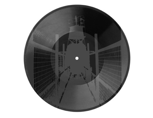 |
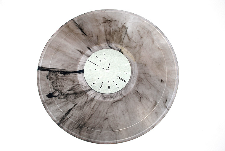
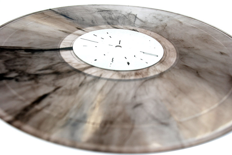
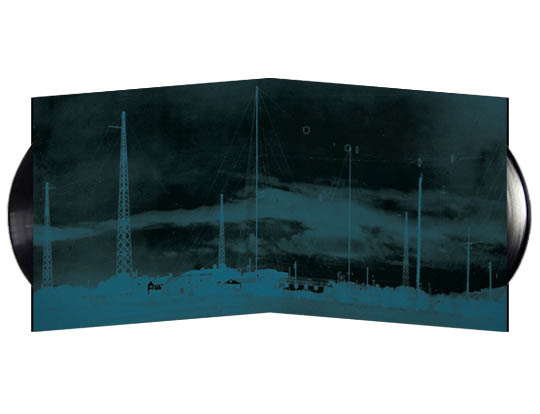
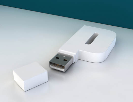
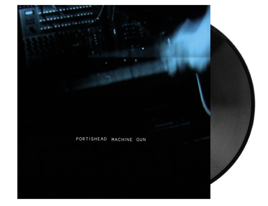
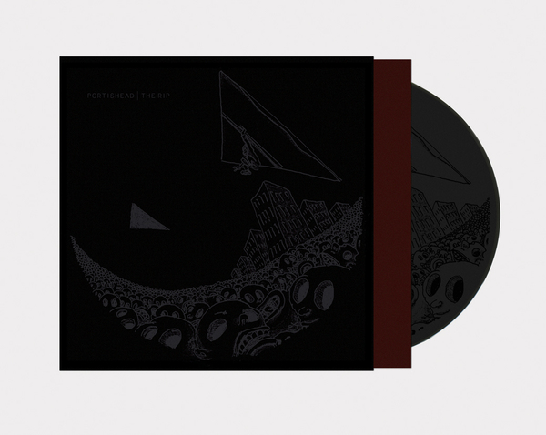
| I also see you can do very unusual process for
this Portishead album as the USB logo, and "The rip" single.
Can you talk more about this special RIP 12"... The process for The Rip single was a bit of an experiment really, ideally I wanted a matt black laminate film, which would give a very deep rich black and also cut down the chances of smudges/fingerprints then screenprint a matt black image on top of that – unfortunately time was tight and the record company couldn’t source the films so it got a little compromised leading to a slightly unsatisfactory finish, however, always wanting to keep there groups happy they allowed us another go, this time with a reverse process ie matt stock with a satin ink screenprint on top. This worked better. Concerned with the black on black all being a little TOO heavy I opted for a one colour inner bag to just set things off before getting to the vinyl and etching itself which is the same Nick Uff illustration as on the sleeve only this time a matt on gloss. |
 |
| You are currently working at realworld. Can you
present the label to people that may not know it and you work there ? RealWorld was set-up by Peter Gabriel in the 80s, primarily as a recording facility for bands from all over the world that ordinarily wouldn’t get heard by the masses, it grew into a record label, festival creator (WOMAD), Design Dept, multimedia centre and ultimately a place where ideas could take shape without the corporate eye over your shoulder. |
| Do you work in the realworld
studio ? As I follow Peter Gabriel work for years, I know he invites people
from all over the world in the studio to record their album then issued
by realworld... Are you involved in this process? Do you design artists
sleeve together with them... I work in one of the many buildings here at RealWorld, a stones throw away from the recording studio where I do all the art and design for RealWorld records and, when possible, deal directly with the musicians involved. |
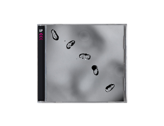
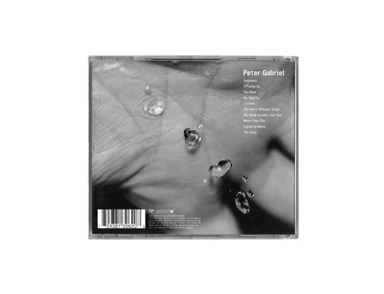
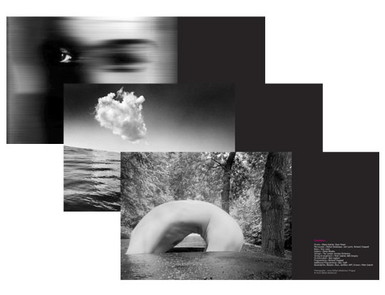
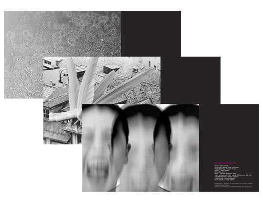
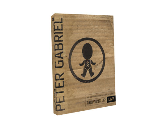
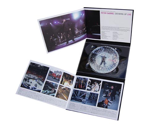
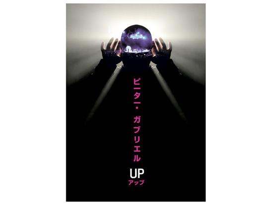
| I also see you have done work with Peter Gabriel for the latest UP album, and the UP tour which follow, can you talk about this ? Peter Gabriels ‘UP’ was a longer process
than P3, not so immediate, I wanted to give a hefty nod back to the
early albums which Hypgnosis had done where Peters face had been distorted
or melted (or both) - fortunately Peter was up for that too but also
wanted to include somehow his love of photography, the original idea
was to send various tracks to various photographers and see how they
interpreted it but time was against us so instead we did it the other
way round where we looked at lots of photographer and said ‘that
suits that’ etc. |
 |
 |
 |
 |
 |
| Can you show us some "behind the scene",
I mean first ideas or projects not accepted by Peter Gabriel or Portishead
? Most projects I have sketchbooks and scribbles which show ideas in development , often its a right mess and only makes sense working backwards from product, I’ll take a look but I’d prefer to not show that stuff just yet. |
 |
 |
 |
 |
What is your next aim ? |
| What other work you are proud of and would want
to present? I love doing gig posters, its what got me into this lark and what I continue to get pleasure from doing but theres less of a call for it in the UK also I think that’s changing so... |
 |
 |
 |
 |
 |
 |
| Thanks a lot Marc |
| To know more about Marc, check his behance page as well as his recent blog. |
|
See CD archive page 05 - page 04 - page 03 - page 02 - page 01
 |
 |
 |
 |
 |
| |
||||