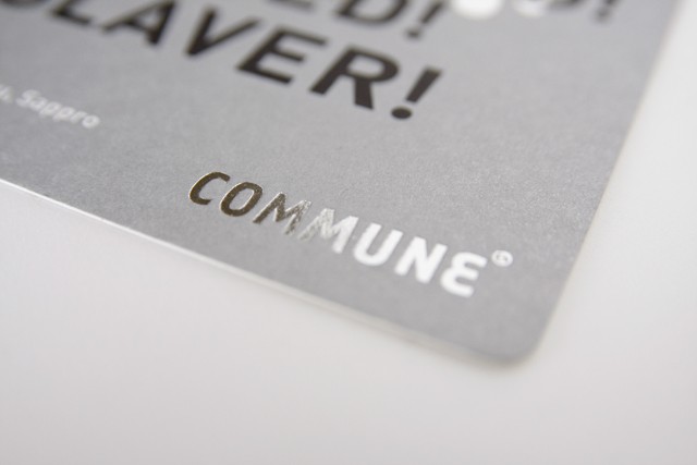
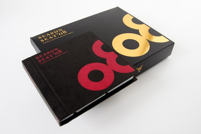
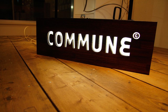
| Commune | |||||||||||||||
| posted in identity & print sections on march 28th | |||||||||||||||
|
|||||||||||||||
 |
|||||||||||||||
|
|||||||||||||||
|
|||||||||||||||
 |
|||||||||||||||
 |
|||||||||||||||
 |
|||||||||||||||
 |
|||||||||||||||
 |
|||||||||||||||
|
|||||||||||||||
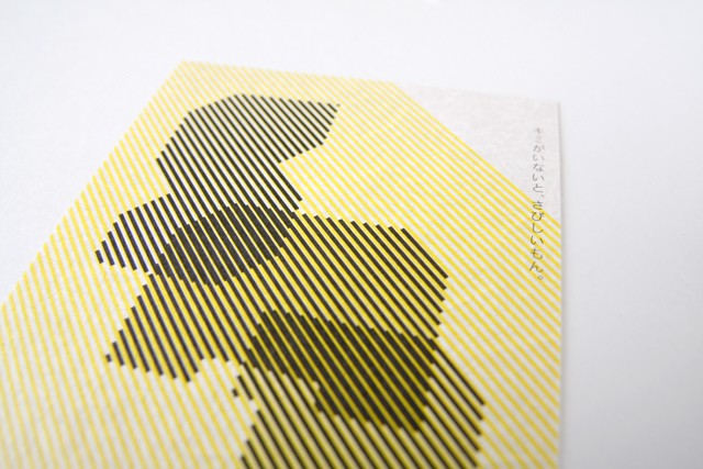
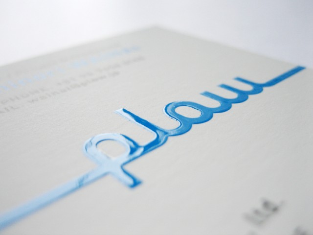
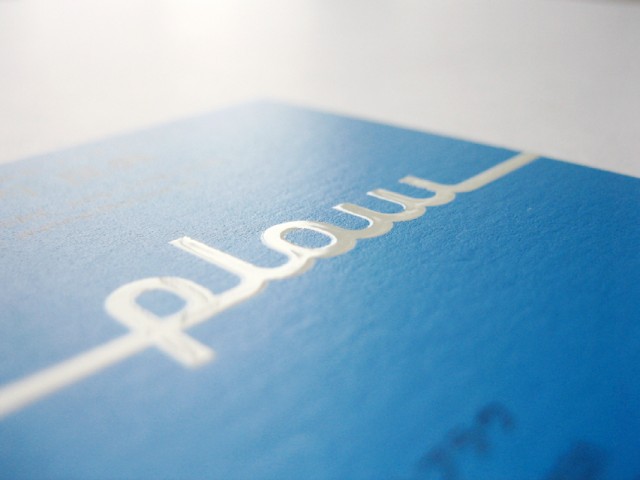
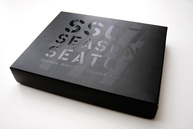
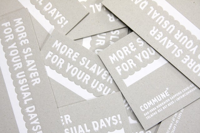
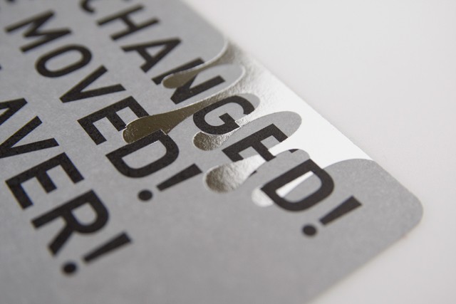
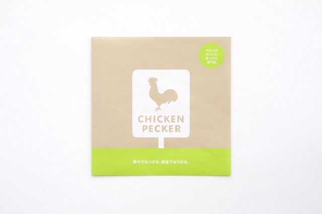
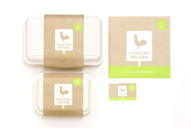
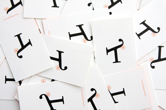
check identity & print for full selection | www.commune-inc.jp |
|||||||||||||||
 |
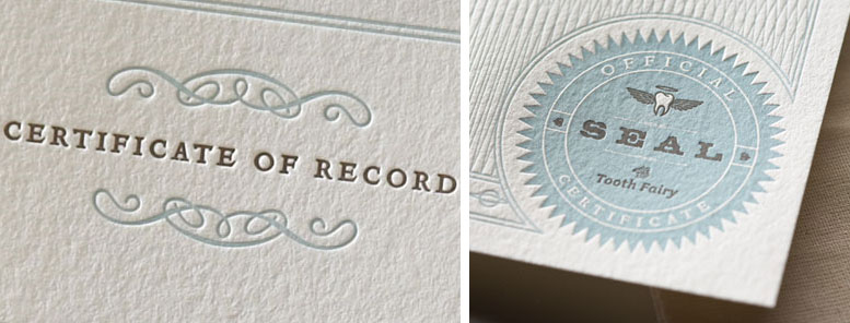
| Tooth fairy kit |
| posted in print section on march 27th |
 |
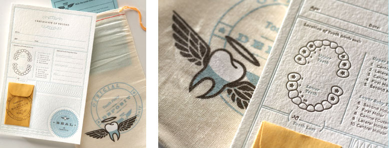 |
| buy it at www.officeofthetoothfairy.com | designed at www.rubberdesign.com |
 |
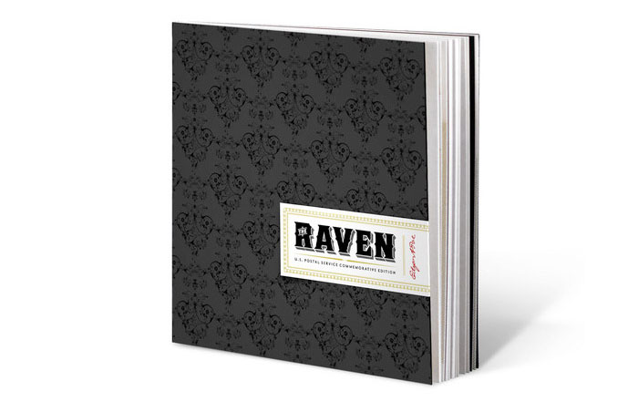
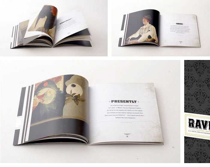
| Edgard Poe book by Emmanuel Polanco | ||||||
| update his exellence page on march 26th | ||||||
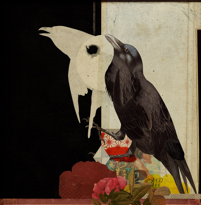
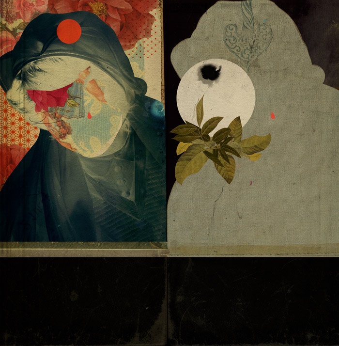
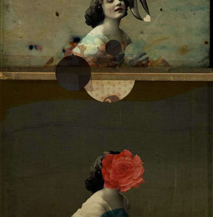
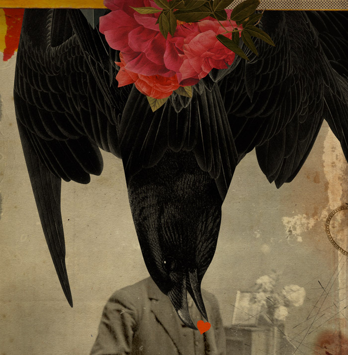
| Nice illustrations done Emmanuel Polanco for Journey Group. This USA postage book "The Raven" was designed by Mike Ryan, who did a very nice type setting. | ||||||
|
||||||
|
|
||||||
| www.journeygroup.com | www.emmanuelpolanco.net | ||||||
 |
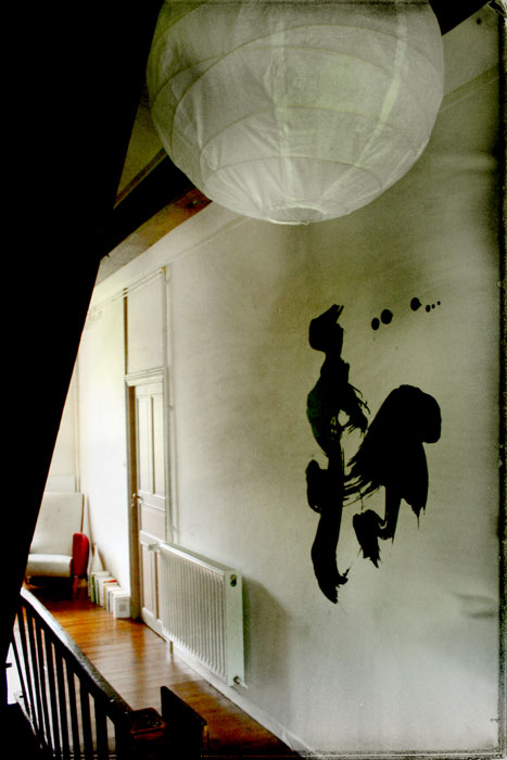
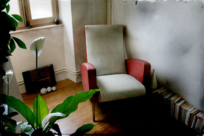
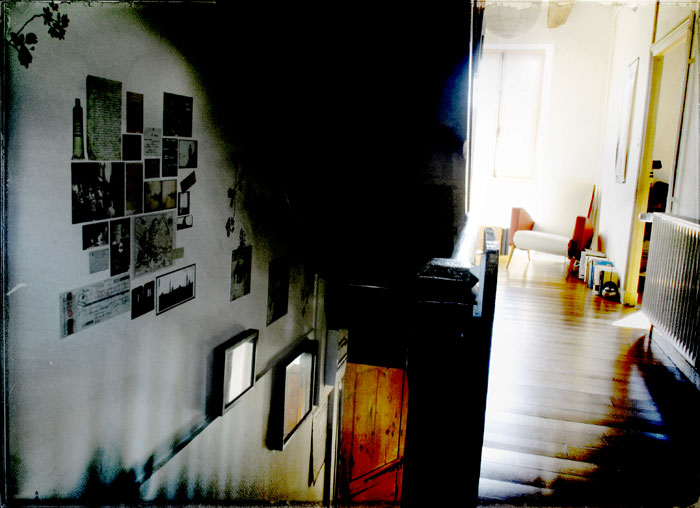
| This is the place that we call "our home" |
| posted on personal section on march 25th |
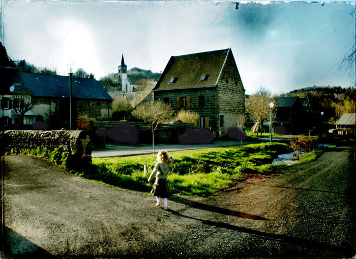
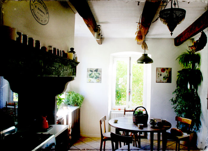
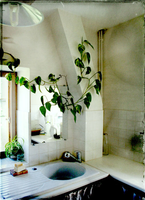
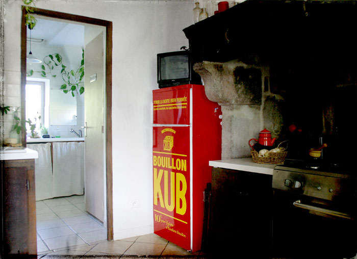
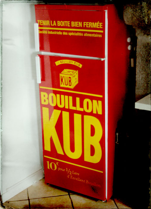
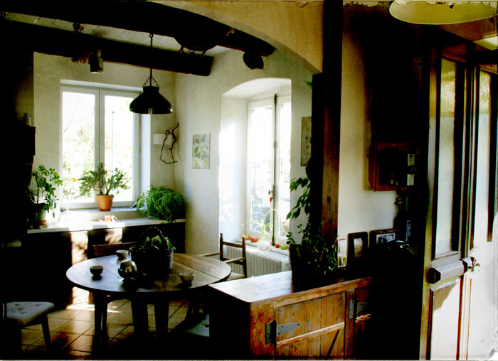
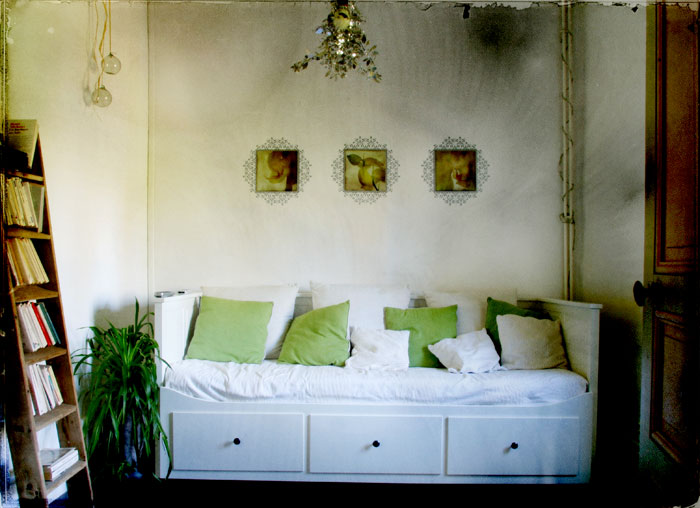
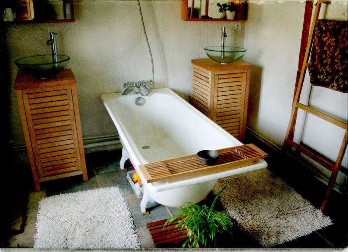
| With the update of the harmonie intérieure shop, we also put pictures of our home take by my friend Denis Pourcher (and some by me too ;). |
 |
 |
 |
|
 |
 |
 |
 |
 |
 |
 |
 |
 |
 |
 |
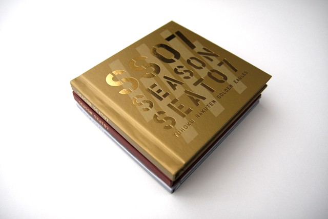
| Hard format |
| posted in music.CD section on march 21th |
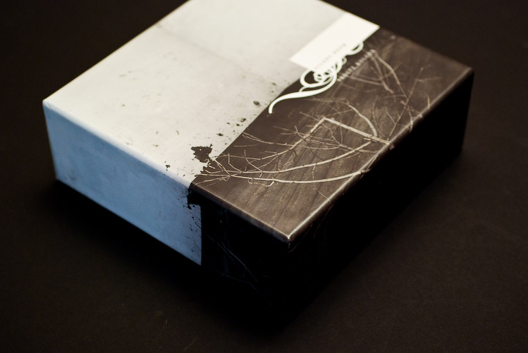
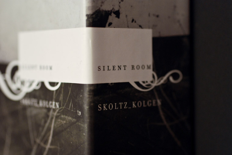
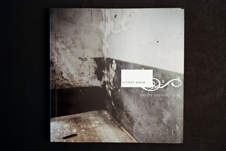
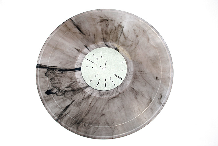
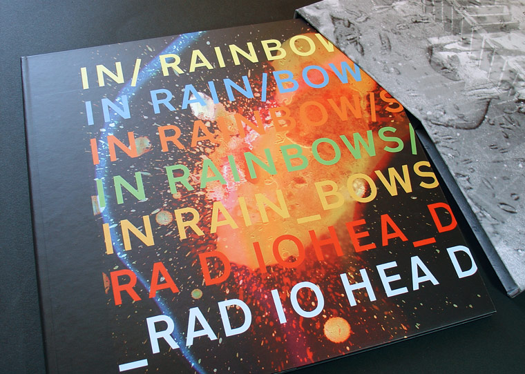
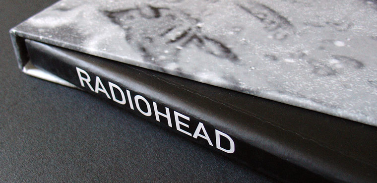
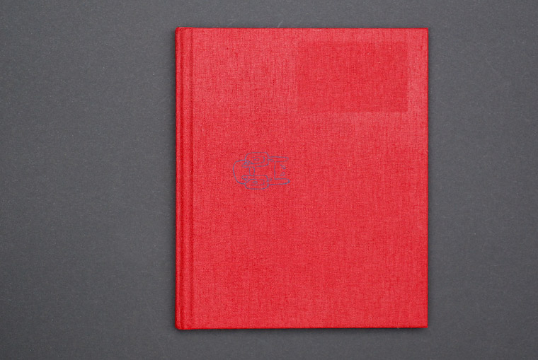
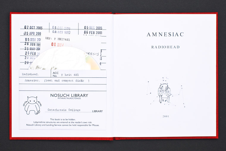
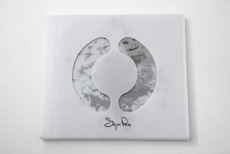
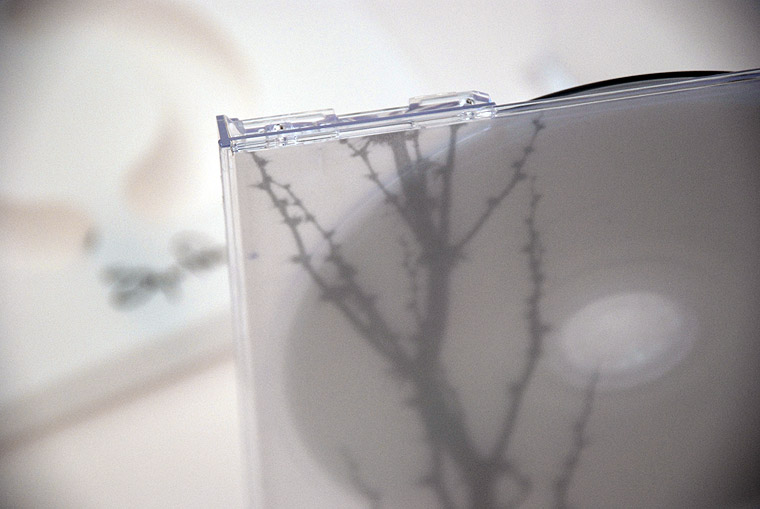
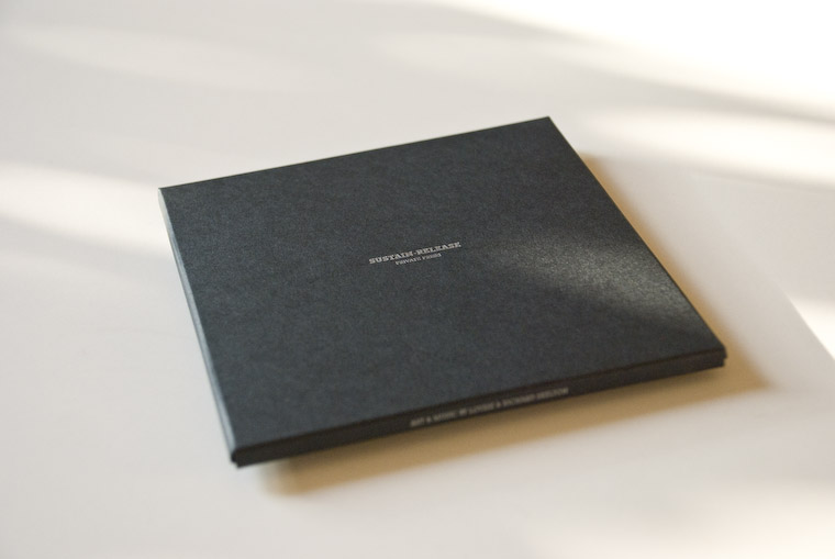
| "It seems like everybody’s talking about the end of physical music media. Who knows whether they’re right or not, but Hard Format is a little place we’ve set up to celebrate our love of brilliant music-related design." Selection of their selection... |
 |
|
 |
 |
 |
 |
|
 |
|
|
 |
|
|
| Check music.CD section for all selected images |
| www.hardformat.org |
 |
| Allison Newhouse | |||
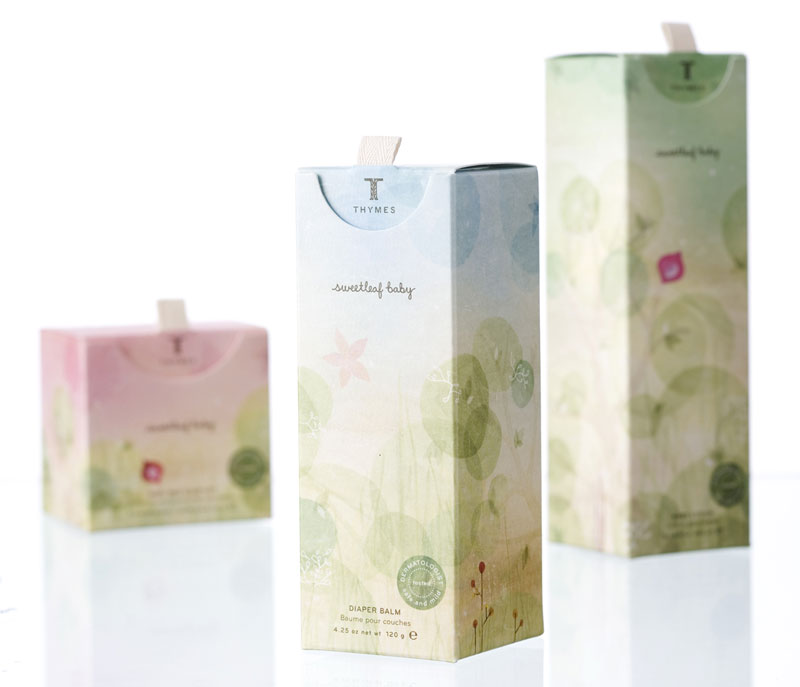
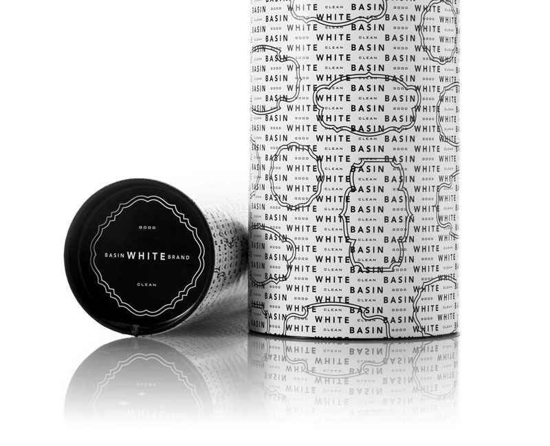
| posted in packaging & identity sections on march 19th | |||
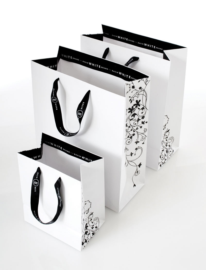
I already present most of Allison's works in packaging section or on Duffy exellence page, but they are like a good movie, it always good to watch them again... |
|||
 |
|||
 |
|||
 |
|||
 |
|||
 |
|||
 |
|||
 |
|||
 |
|||
|
|||
 |
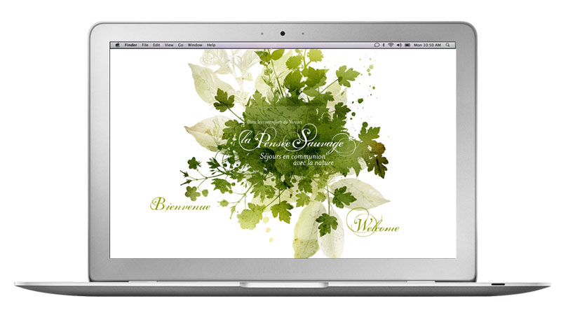
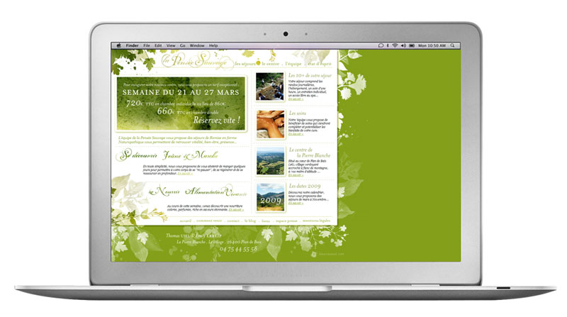
| La pensée sauvage web site |
| posted on personal section on march 18th |
| now online... |
 |
 |
| www.lapenseesauvage.com |
 |
| Benjamin Button & Prologue film |
| posted in graphic section on march 17th |
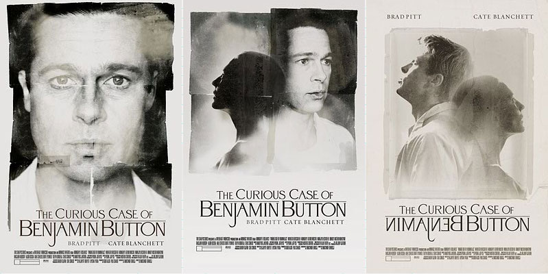
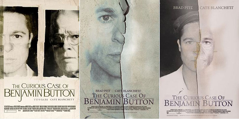
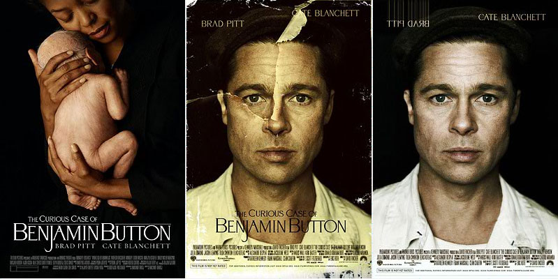
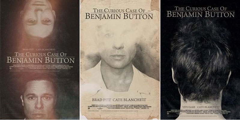
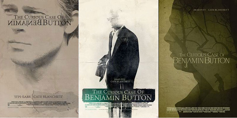
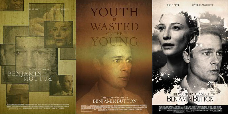
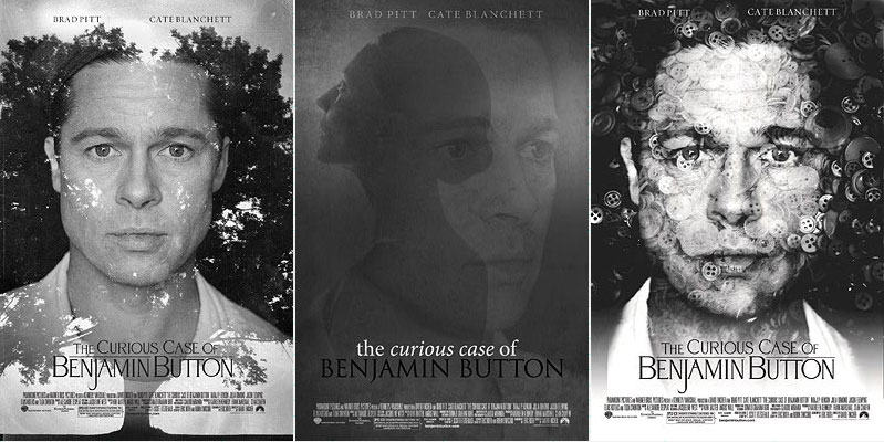
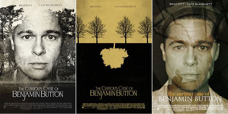
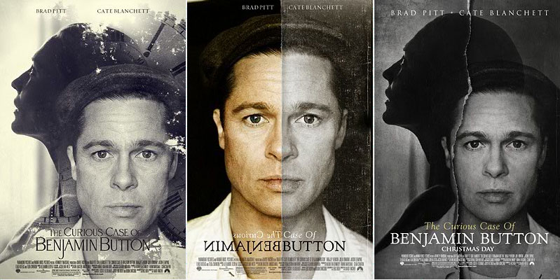
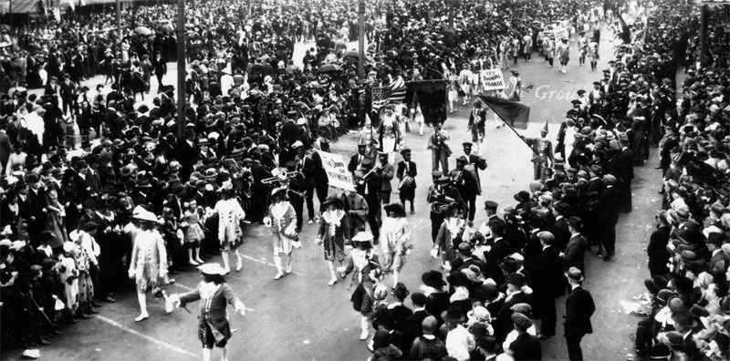
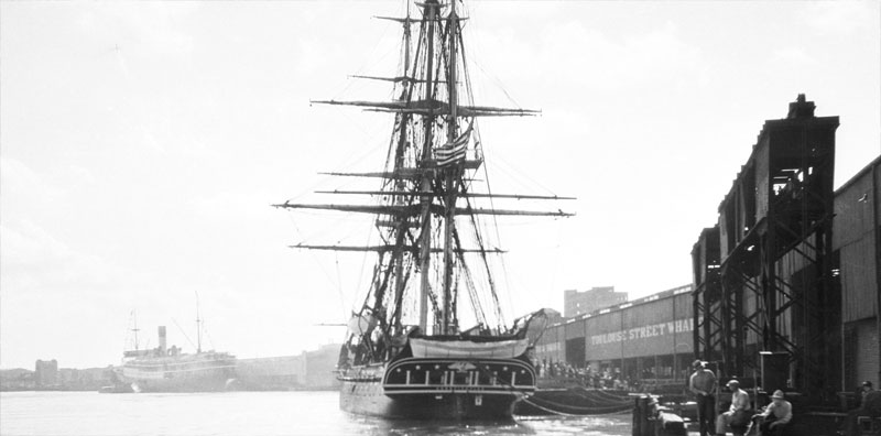
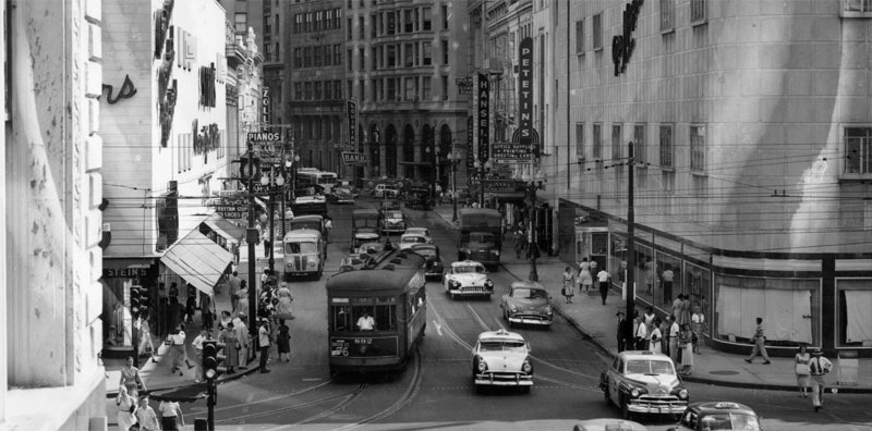
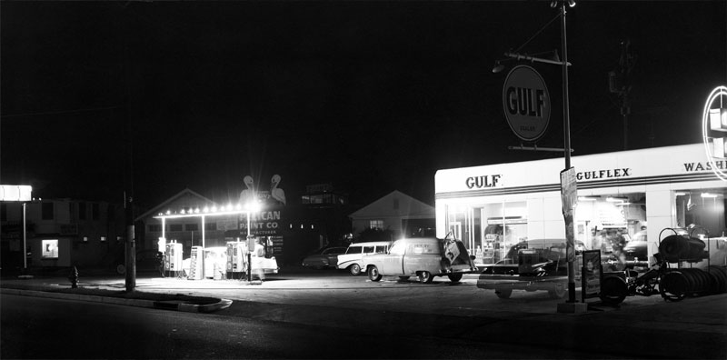
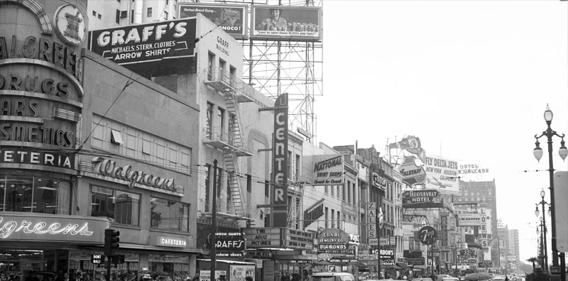
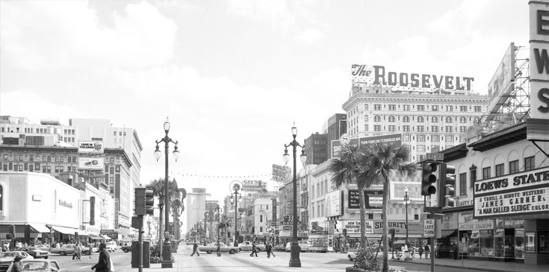
| Prologue film design the latest David Finsher movie communication tools "The curious case of Benjamin button"... beside the fact that this movie is, as I expect it, full of emotions, I really like to see the process presented on prologue web site. |
|
 |
| |
 |
 |
|
|
|
 |
| |
 |
 |
 |
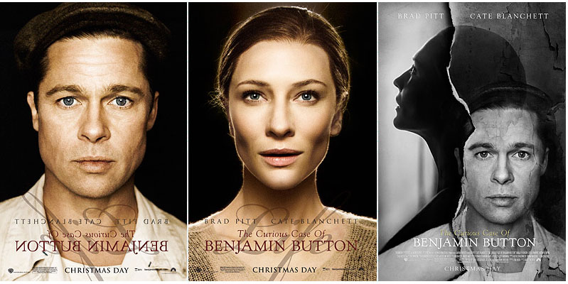 |
| Also, the official web site of the movie is at the image of the movie : unexpected and in the opposite direction of usual movies web site, showing you the spirit of the movie instead of a simple biography of the director and actors... So, Ijust show you this and let discover it by yourself. |
 |
 |
 |
 |
 |
 |
| www.benjaminbutton.com |
 |
| 3 photographers | |||||||||||||
| posted in photo section on march 14th | |||||||||||||
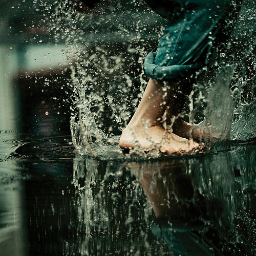
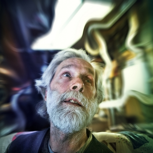
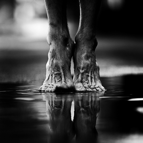
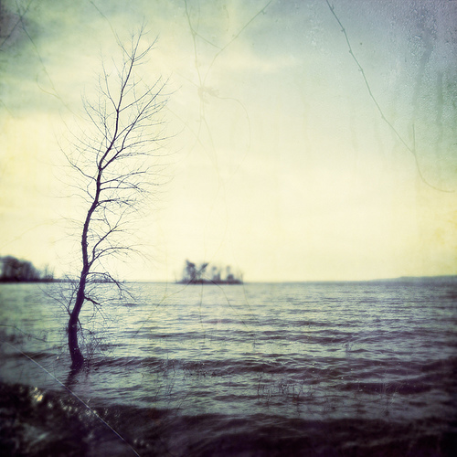
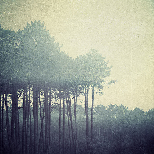
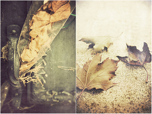
| I really focus on print and identity lately as it is my main work... but now it is week end and time for some emotions... Here comes 3 photographers... | |||||||||||||
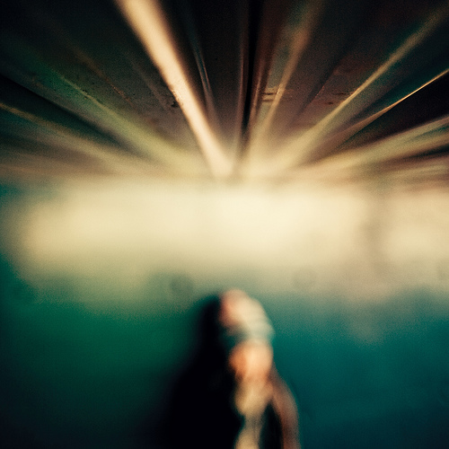
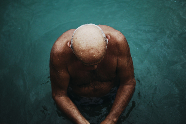
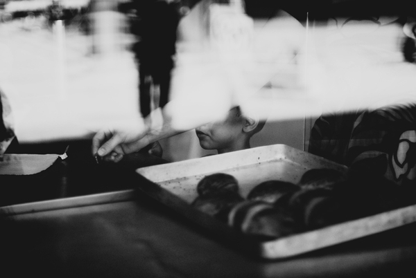
| The work of Benoit Paillé is very good, but also what is behind his work... I admire is availability to ask unknow people to be photographied, something I can never imagine to do... He also seems to like feet in water ;) | |||||||||||||
|
|||||||||||||
|
|||||||||||||
| www.flickr.com/photos/benoitpaille | |||||||||||||
 |
|||||||||||||
|
|||||||||||||
|
| Gardener design |
| posted in identity section on march 13th |
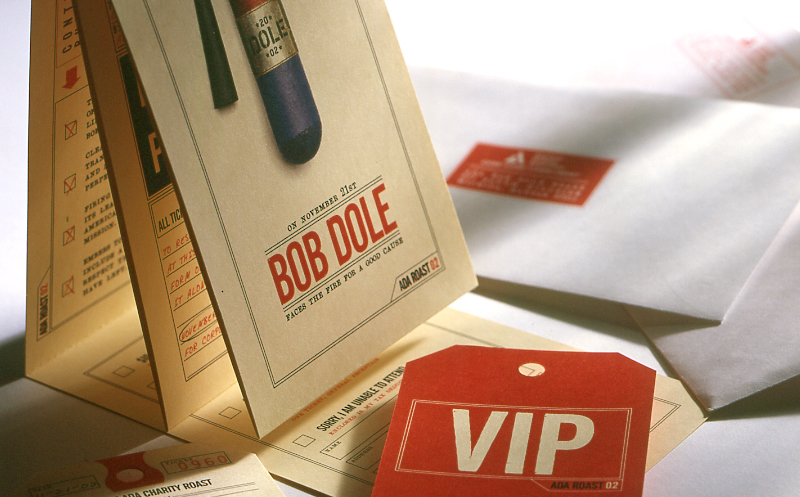
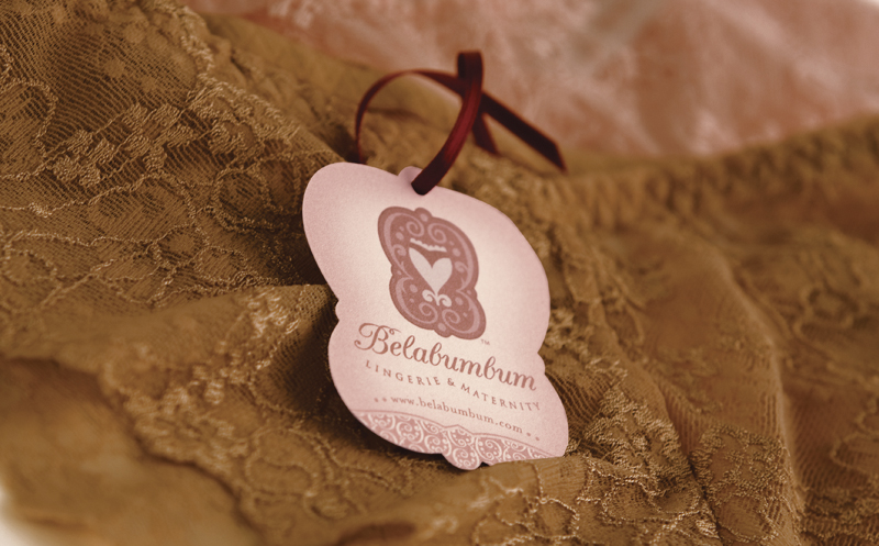
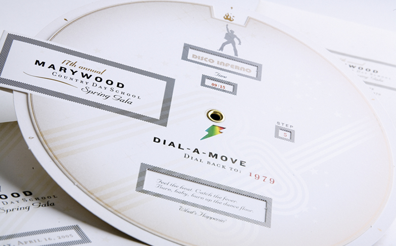
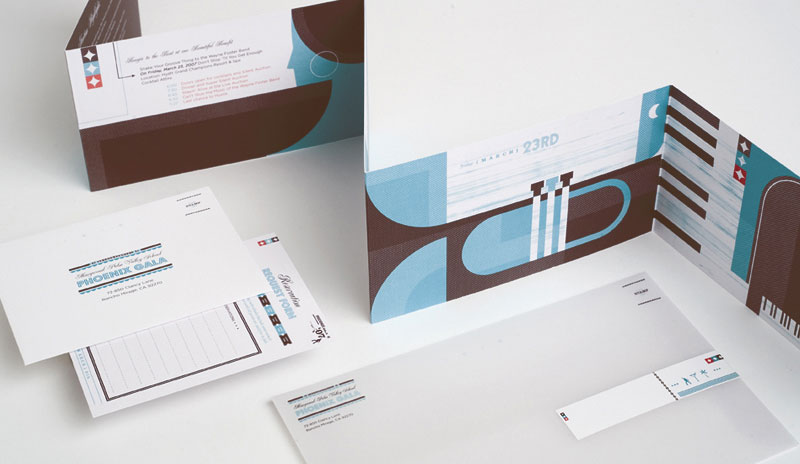
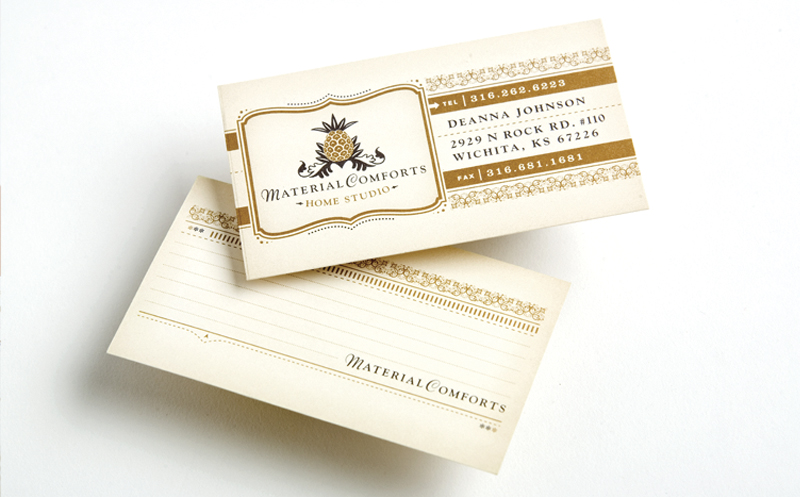
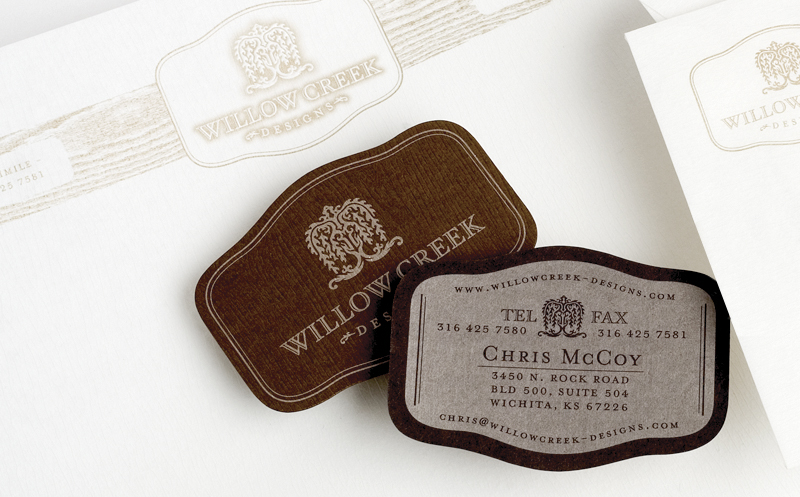
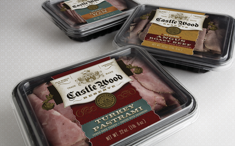
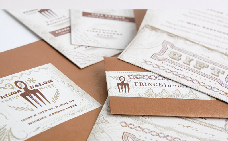
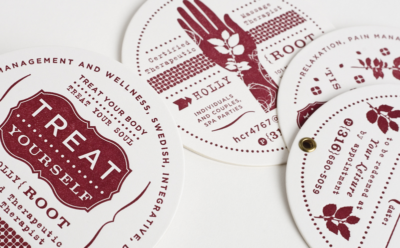
After some email exchange with Ty Wilkins, he send me more images of Gardner Design works... |
 |
 |
 |
|
|
 |
 |
 |
 |
 |
 |
 |
 |
 |
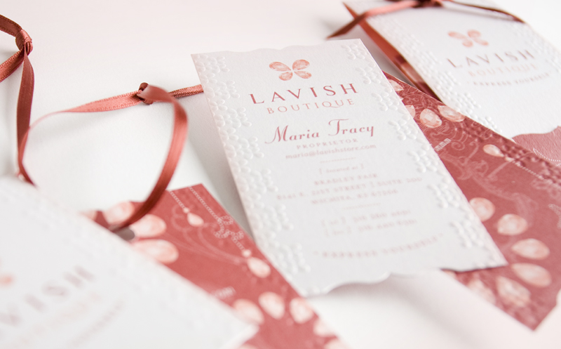 |
www.gardnerdesign.com | Ty blog www.typetheory.com |
 |
| Chris Ashworth |
| posted in exellence section on march 11th |
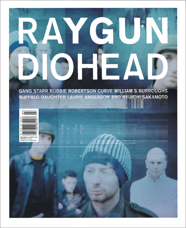
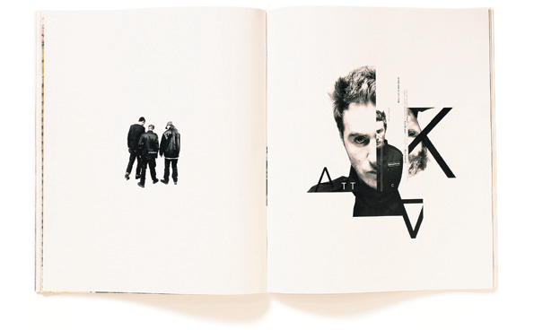
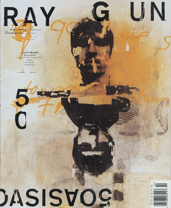
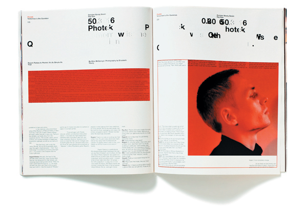
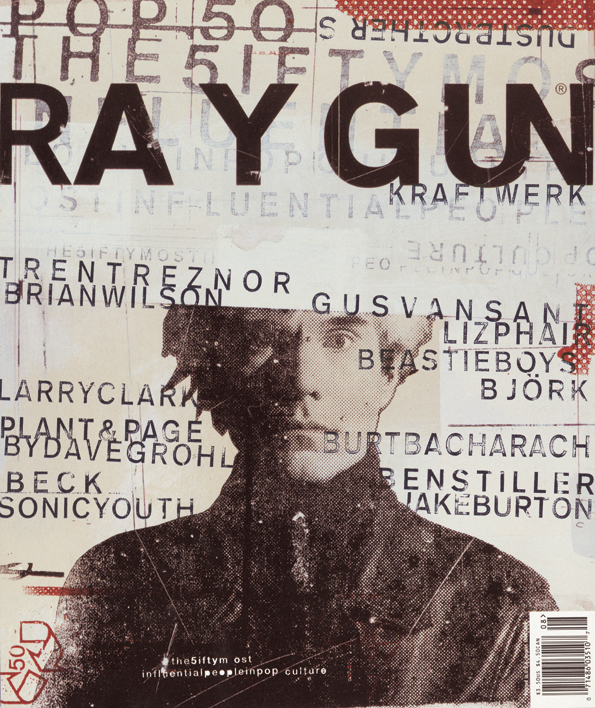
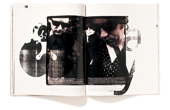
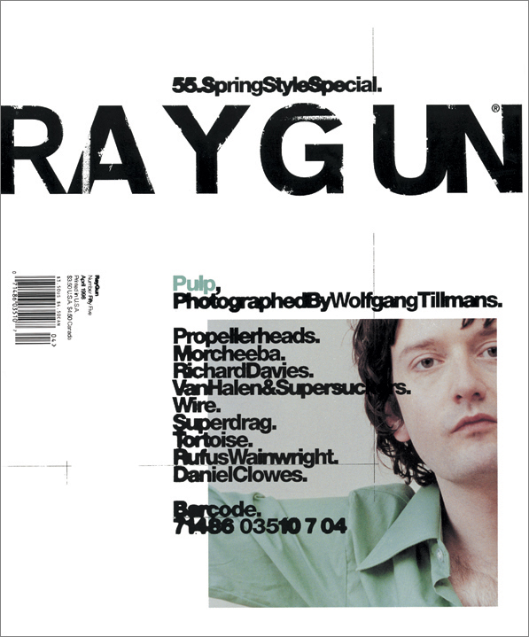
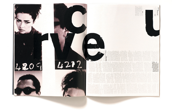
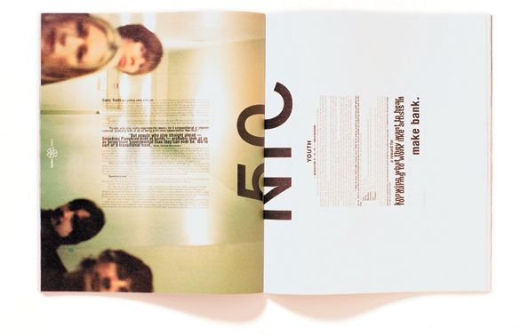
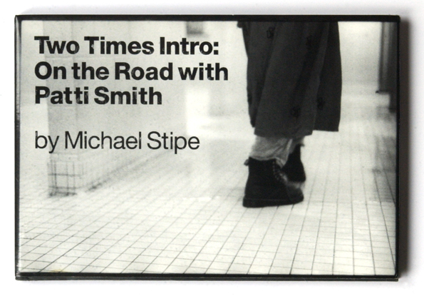
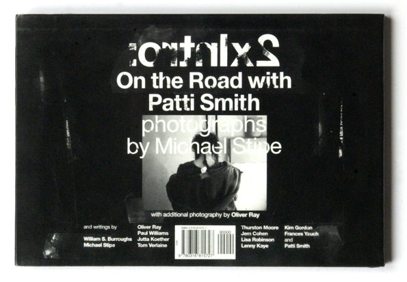
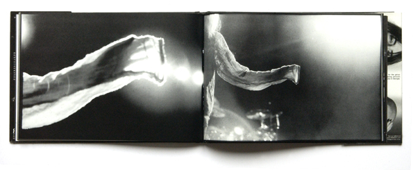
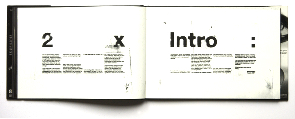
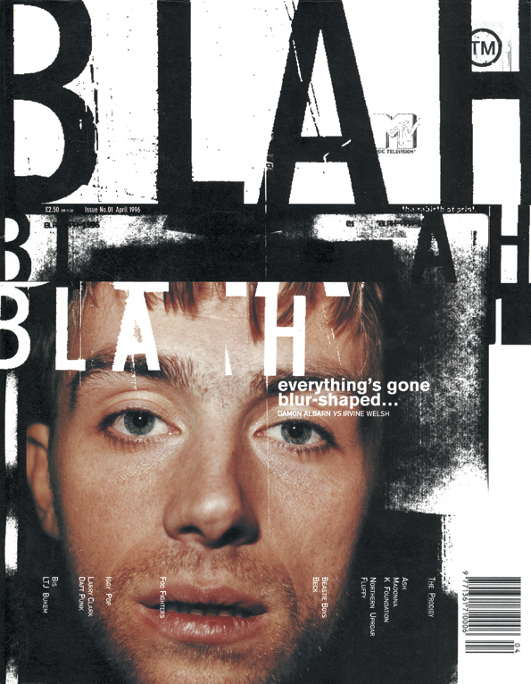
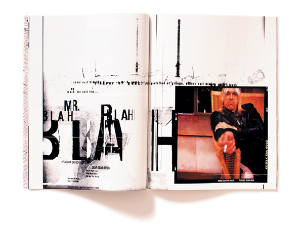
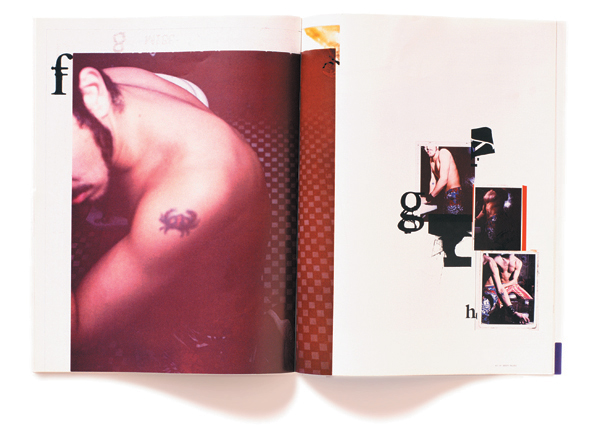
| Chris was one of the former art director of Ray Gun publishing. Even if his recent works (specially Getty) are stunning, the main inspiration source for me is his work in the 90's on ray gun magazine and others...The Michael Stipe Photography book "2xintro" as well as the Ray gun book ar still in my library and where some of the first to be there when I was student... |
 |
 |
|
|
|
|
|
|
 |
|
|
 |
 |
 |
 |
 |
See all selected images on his exellence page | www.chris-ashworth.com
|
 |
| Tomasz Opasinski |
| update exellence page on on march 11th |
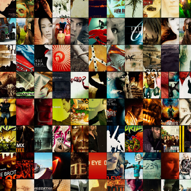
| Some weeks ago I had the change to interview Tomasz about
his amazing work for movie posters. He just publish a new version of his
site with a lot of new projects never seen before, still amazing... |
 |
read Tomasz interview here | www.tomasz-opasinski.com |
 |
| NNSS |
| posted in identity section on march 10th |
 |
 |
 |
 |
|
 |
 |
| www.nnss.com.ar |
 |
| Jessica Hische |
| posted to graphic section on march 9th |
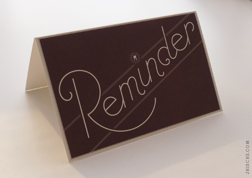
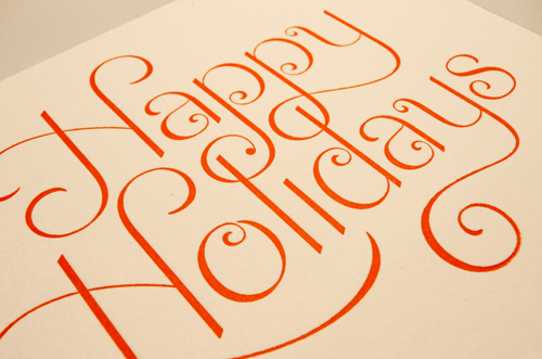
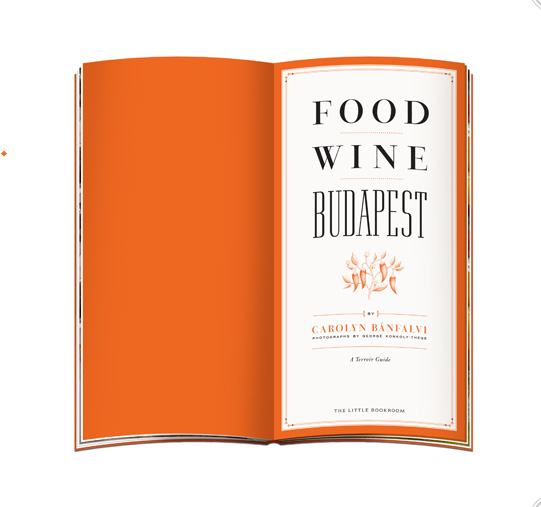
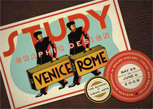
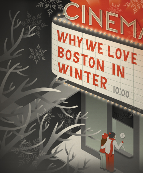
| Amazing mix of illustration and fonts... |
|
|
 |

|
 |
 |
 |
 |
 |
 |
 |
 |
see all selected images in graphic section | www.jhische.com |
 |
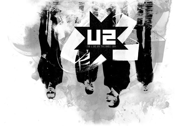
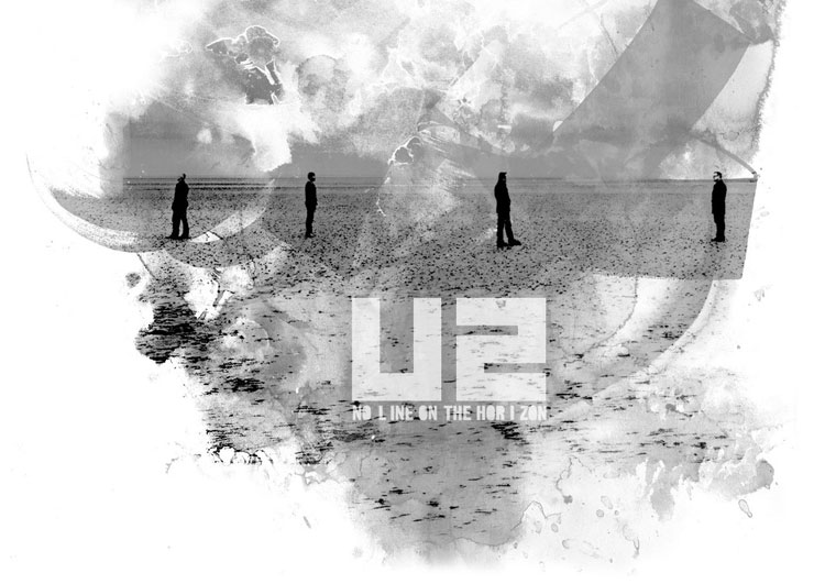
| U2 - No line on the horizon - remix |
| posted on personal section on march 09th |
| As a musician do with a song, I took the images of this great album and remix it with my own style... |
 |
 |

|
| I put online a mini dedicated web site. Also, wallpapers get published here : www.suckingrockandroll.com |
 |
| Typographic Lock-ups & Enclosures |
| posted in identity sections on march 06th |
 |
Type Theory is a "journal of contemporary typography" by Ty Wilkins. You may think this is just another type blog, but after only being on the scene since January of this year Type Theory is quickly becoming an indispensable reference. Ty currently works as a graphic designer for Gardner Design and is also involved in the behind the scenes work on LogoLounge. I discovered his site via the images below posted to ffffound. The following logos are the work of Brian Miller. As Ty said in his article, "When given a long string of words, he can transform them into a sophisticated typographic concoction. As the Vice President and Senior Art Director of Gardner Design, Brian has many opportunities to apply his type prowess to the art of logo design. In situations where many designers would be inclined to complain of copy overload, Brian excels at elegantly composing lengthy phrases and titles. "Each logo is an example of either a 'typographic lock-up' or 'typographic enclosure.' Several logos fall under both categories. All logos seen were presented to the client. Some were selected as the final logo and others have been waiting in the Gardner Design archives until now." Stunning! |
 |
 |
 |
|
 |
| www.typetheory.com & Brian logo article |
 |
| Tolleson design 2 |
| added to exellence section on march 4th |
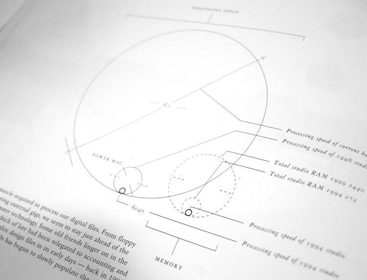
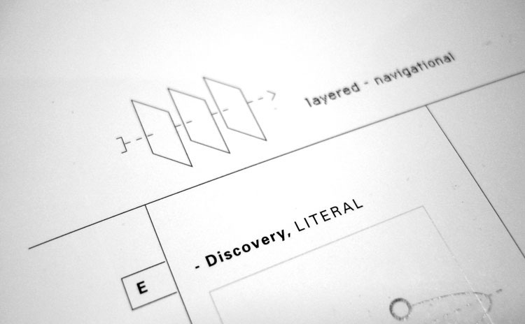
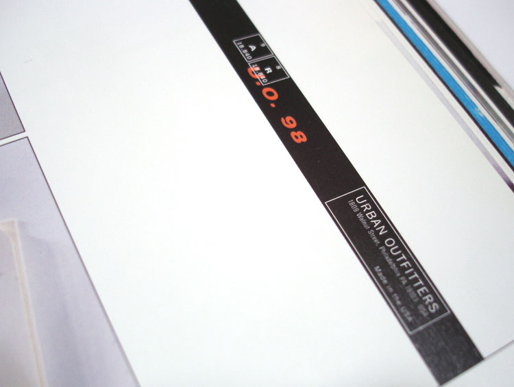
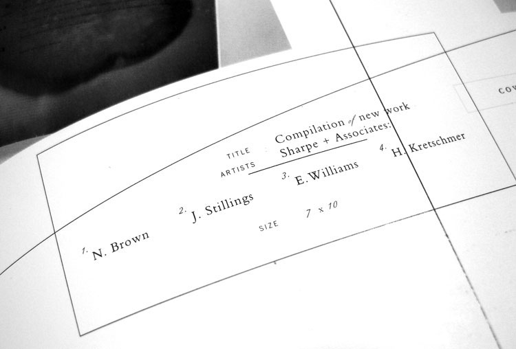
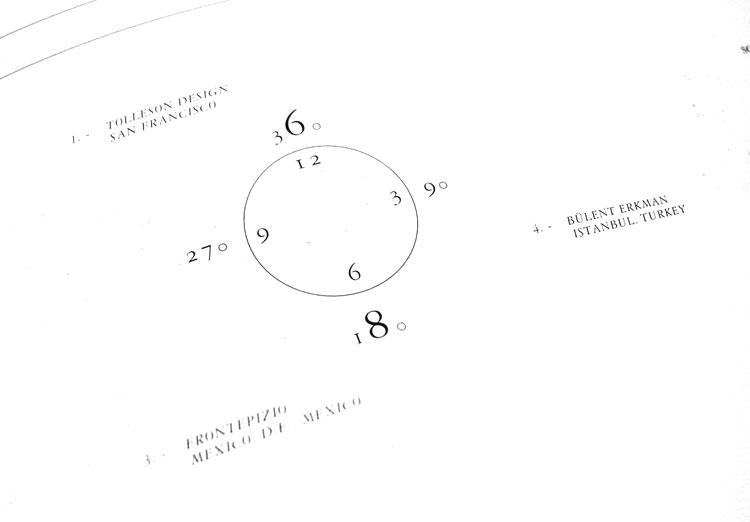
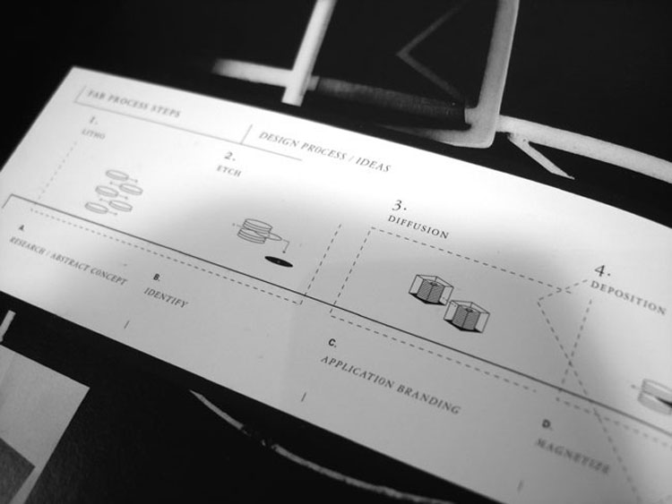
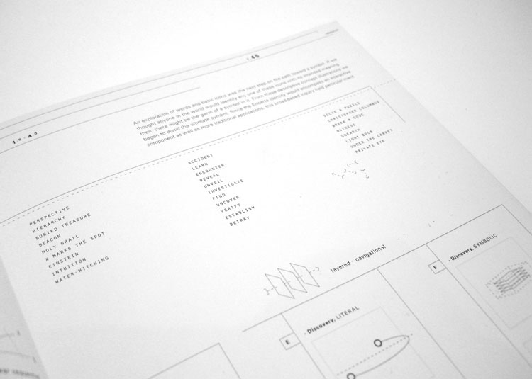
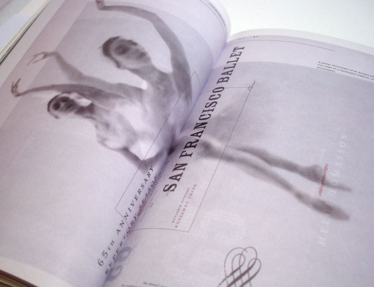
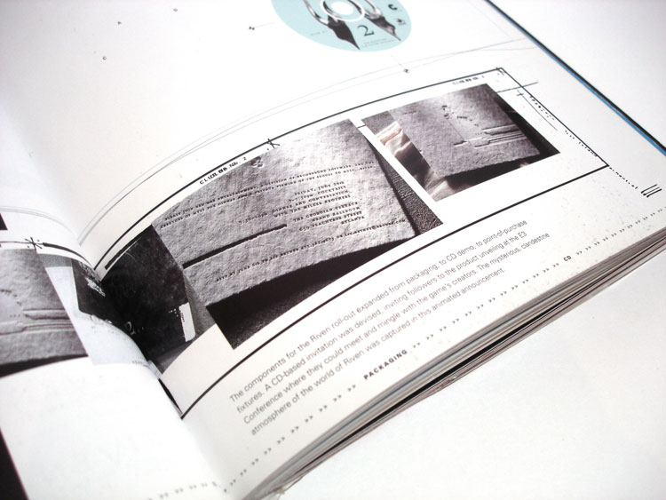
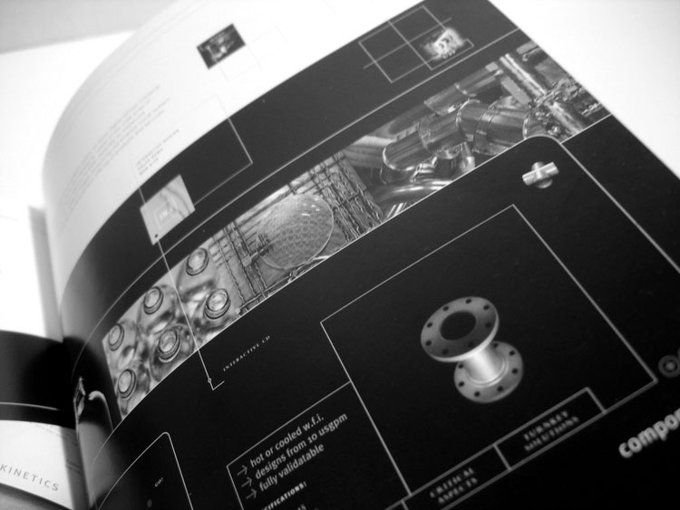
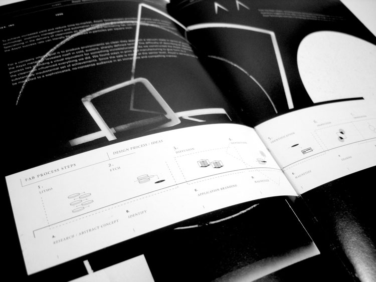
Some years ago, when I was a young designer, I buy a book, called "Tolleson design"... it is my bible... I already published a selection of their work in the excellence section, based on images they have on their web site but never publish these, which are pictures I took from their book. So, they now have 2 exellence page... The use of fonts and details is simply the best I ever seen... |
 |
 |
 |
 |
 |
 |
 |
 |
 |
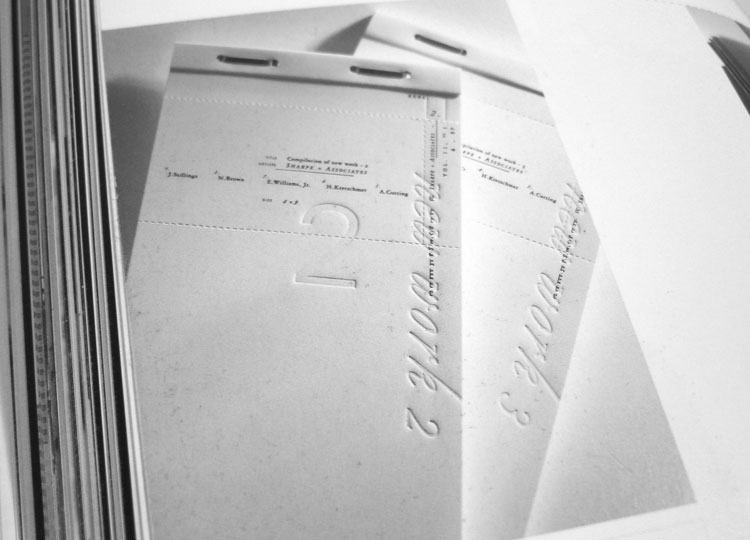 |
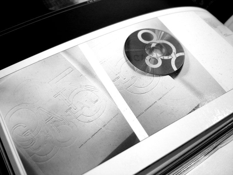 |
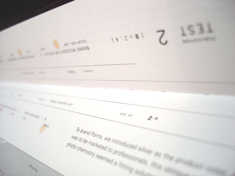 |
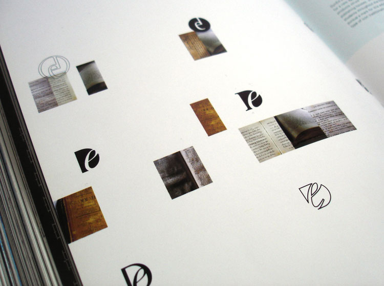 |
 |
 |
| See all selected images in the Tolleson 2nd exellence page... |
| www.tolleson.com |
| Check also their first exellence page with images from their web site. |
 |
| March splash page |
| posted on march 3d |
| This month splash page is done by me... just a non used image I did for Cooperative de mai... |
 |
 |
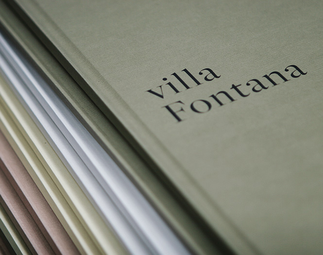
| Me & Mister jones | |||||
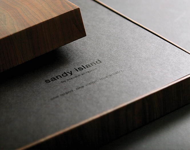
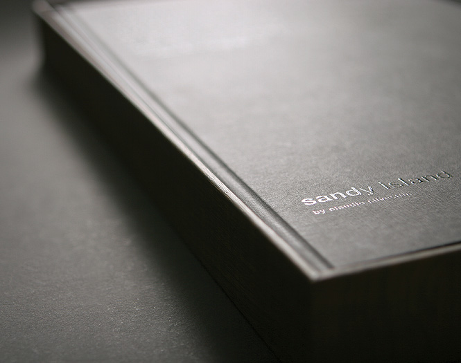
| posted in print & identity sections on march 02th | |||||
 |
|||||
 |
|||||
 |
|||||
|
|||||
 |
| Elizabeth remix |
| posted on personal section on february 28th |
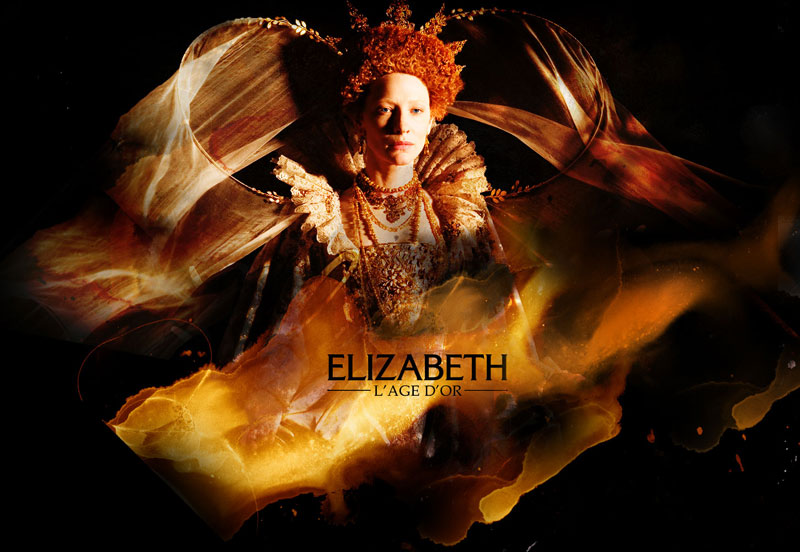
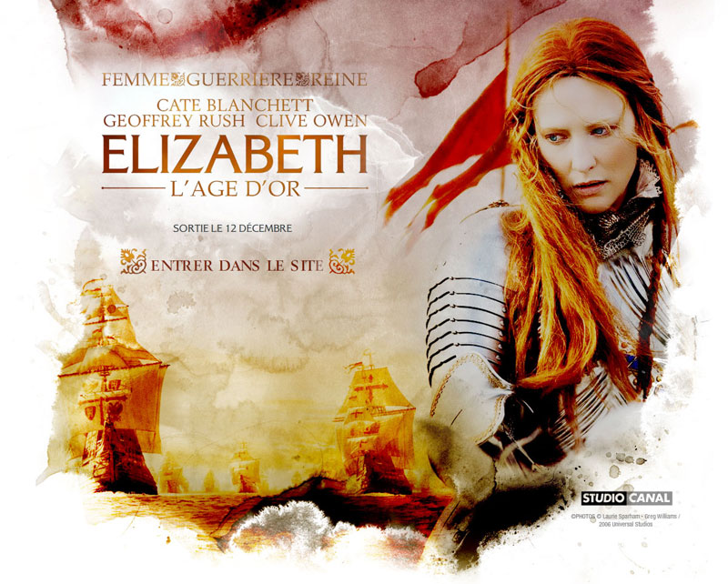
| I took a week of holiday far from computer... time to think and to design for fun ;) I did what I want to call a remix of the Elizabeth web site... Like a musician, I took this project and do my own version... |
 |
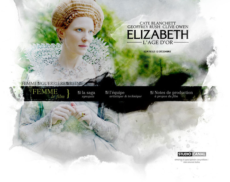 |
| You can see them bigger clicing on each image, and details here. |
| www.fabienbarral.com |
 |
 |
 |
 |
 |
 |
| |
||||
