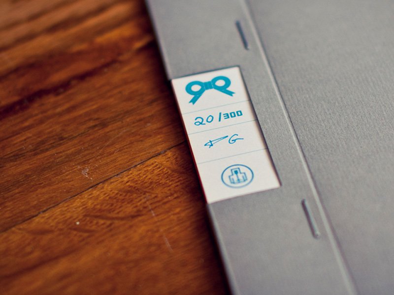
7 rules wall sticker by Angelique Fokker

perso / february 27th / 10.57 AM/from St Cannat near Aix en Provence


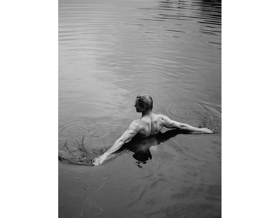
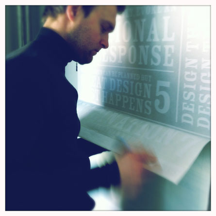
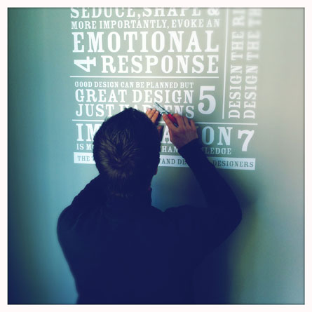
Angelique Fokker order the 7 rules wall sticker in white and took these very nice pictures of the "making of" ;) ! Thanks !


www.harmonie-interieure.com


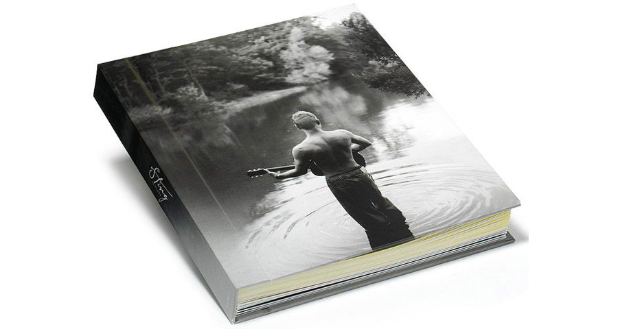
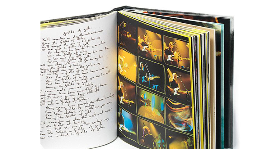
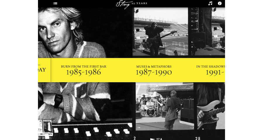
Sting 25 years

music / february 26th / 5:27 PM / from St Cannat near Aix en Provence


Last night, I went to my 28th Sting concert... Yes, you well read, I see him live 28th time, since my first show in 1991... my passion to his music brings me to design as I collect records during years...

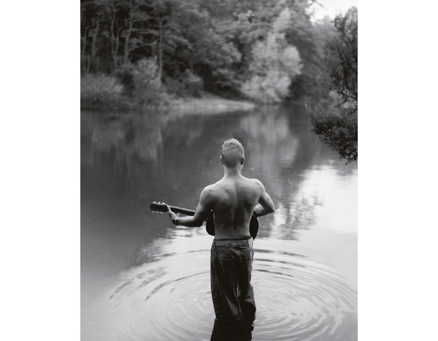
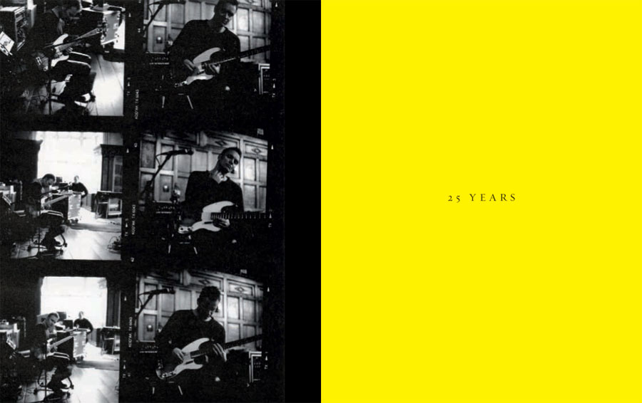
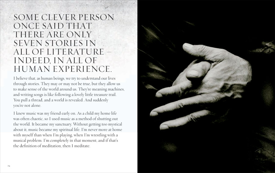
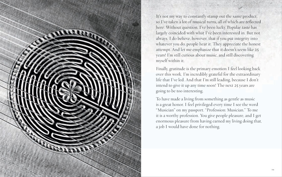
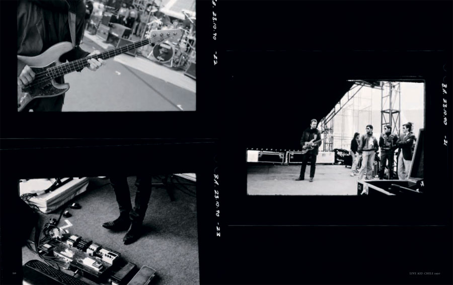
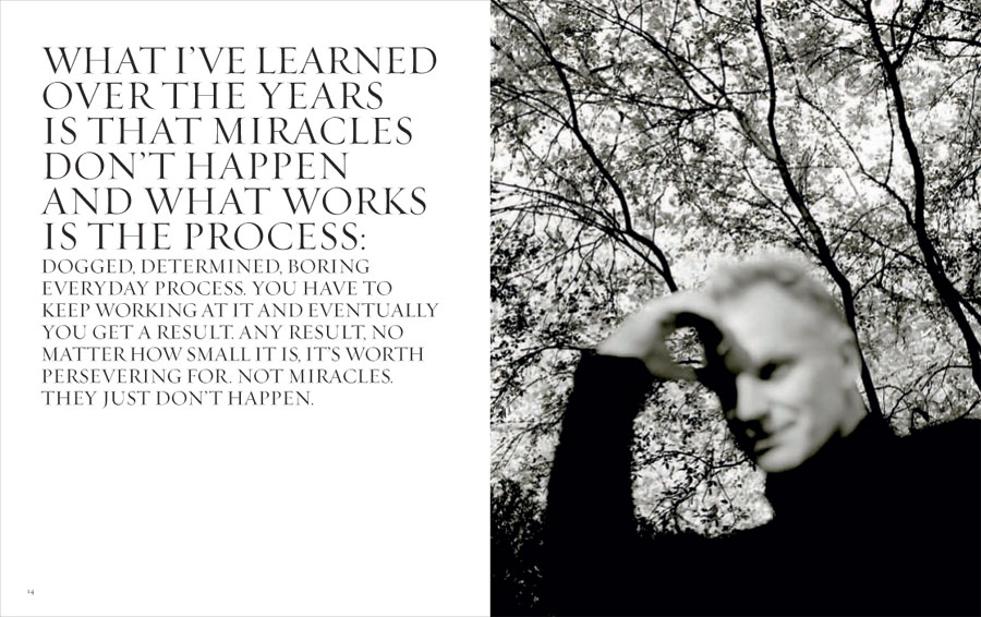
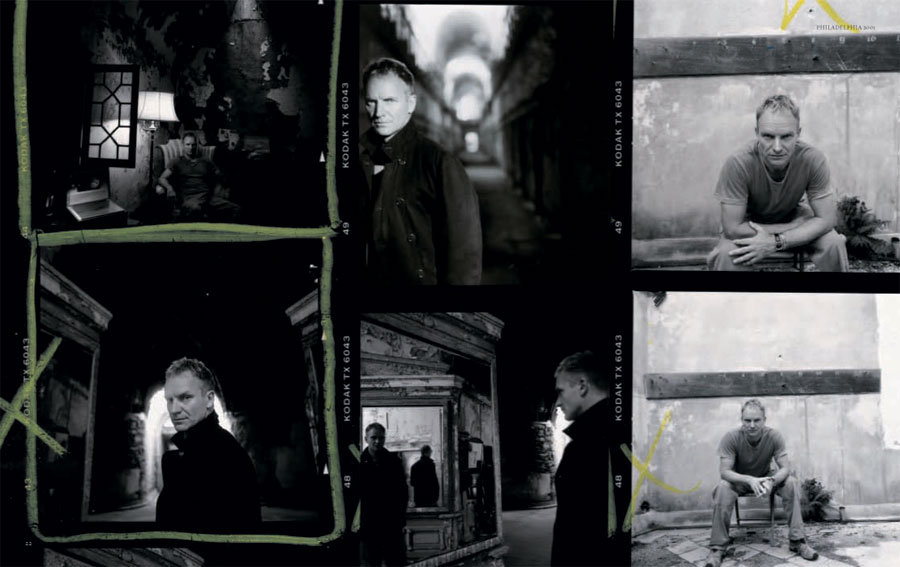
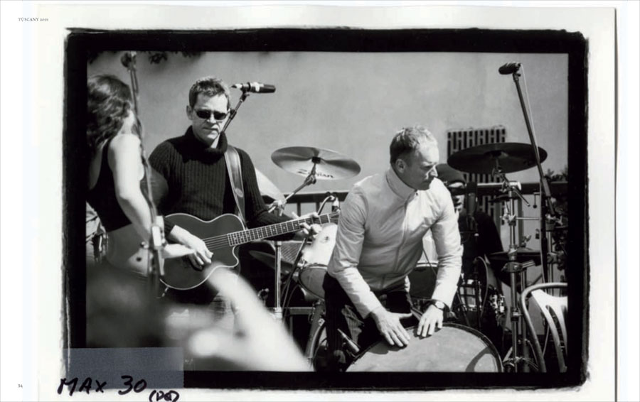
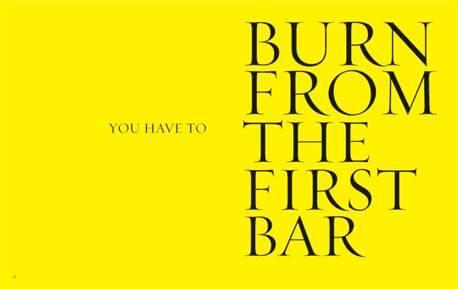
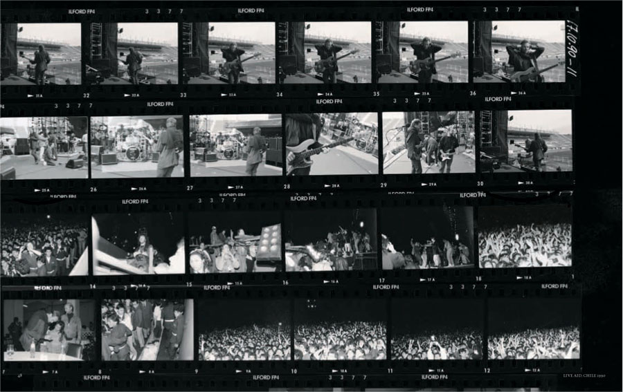
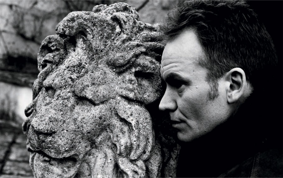
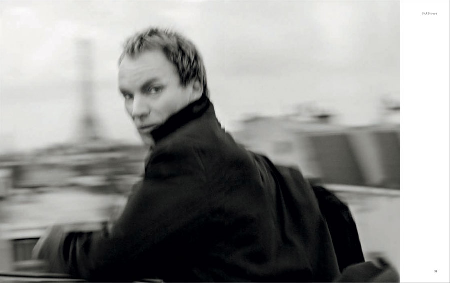
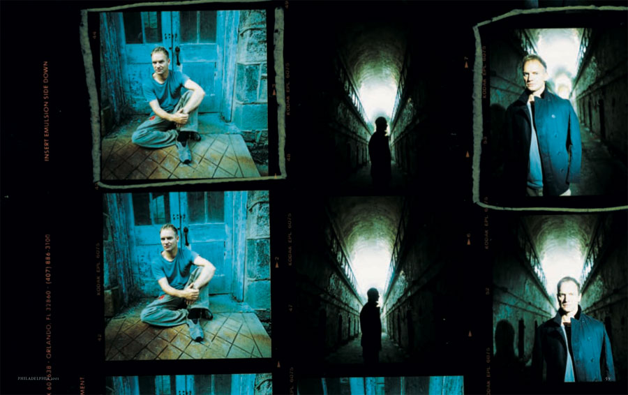
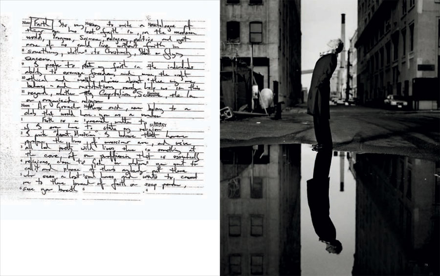
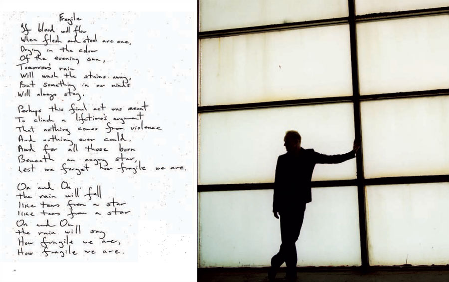
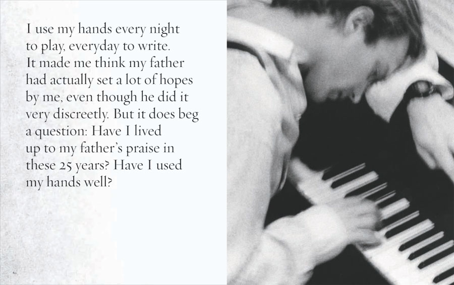
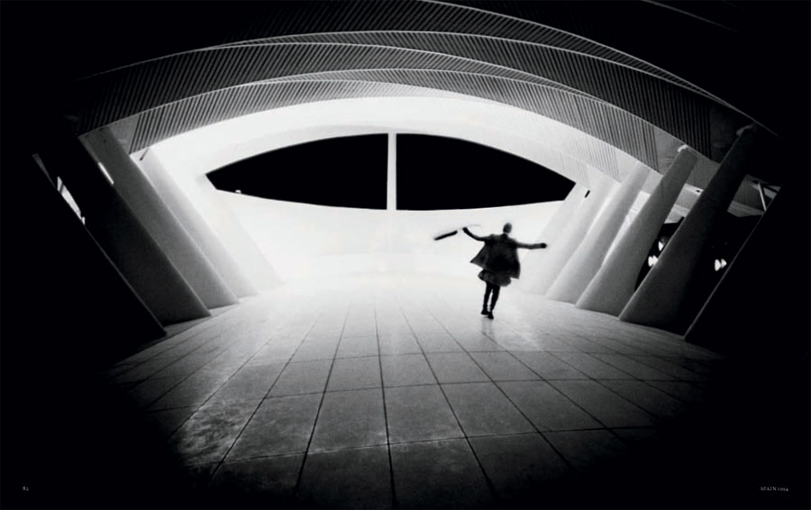
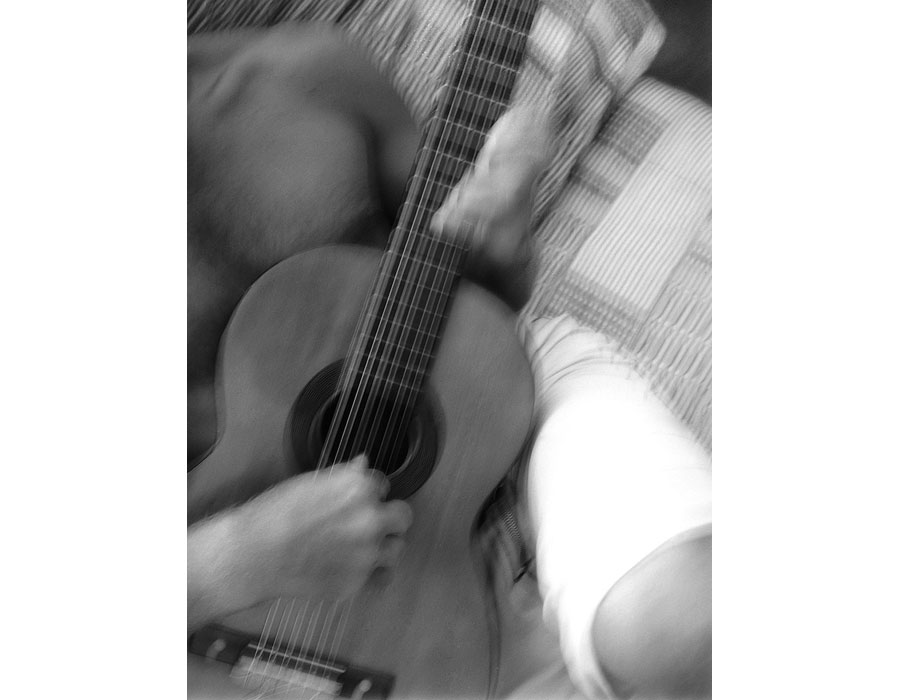
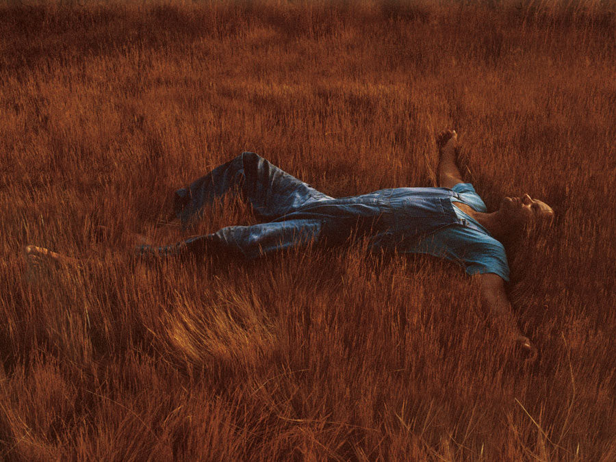
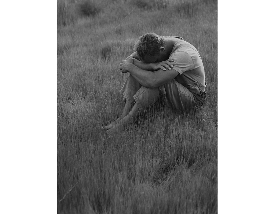
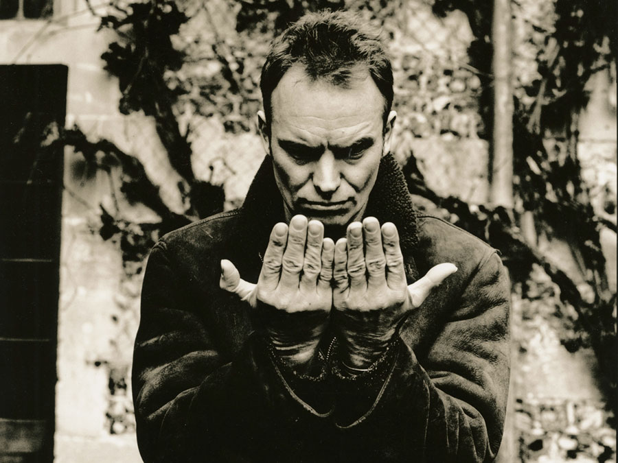
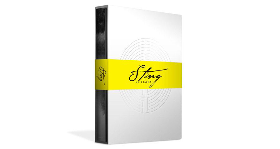
Last year, a special box set was issued to celebrate the 25 years of Sting solo carriere... I really like its design, with B&W pictures and use of yellow color. The box set is a expenssive regarding there are no real new songs in it, but Radical media, the agency behind the design of the project, also design a free iPad app with a much interesting content. Here come some picture of the box and book, with a mix of black and white pictures taken over the years...


www.stingoop.com / www.radicalmedia.com / download the free app
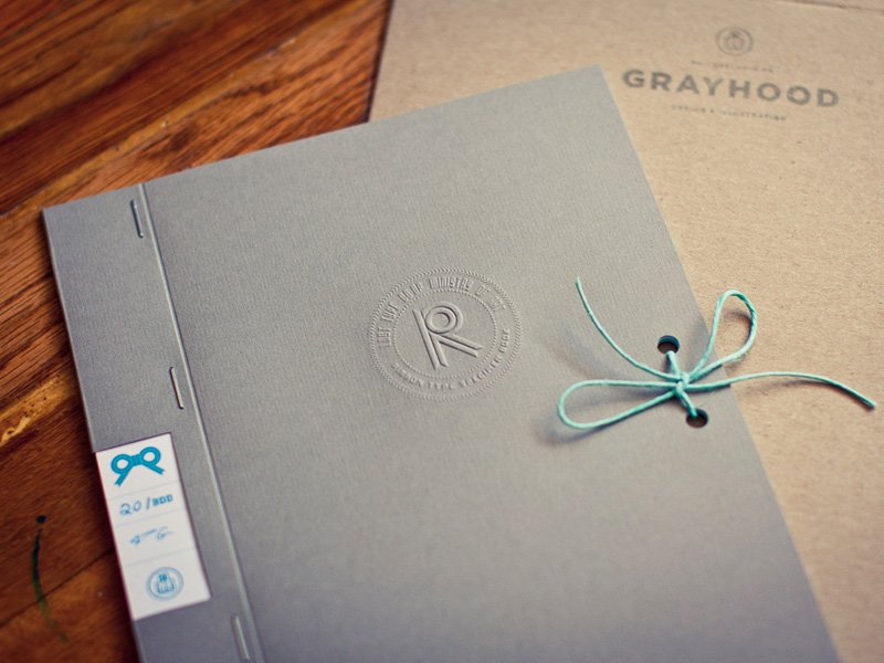
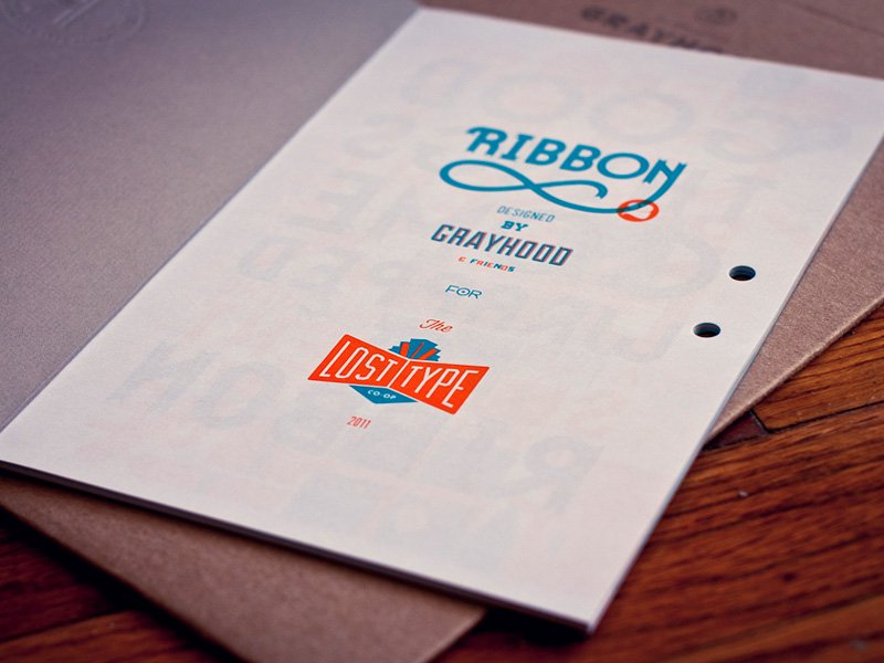
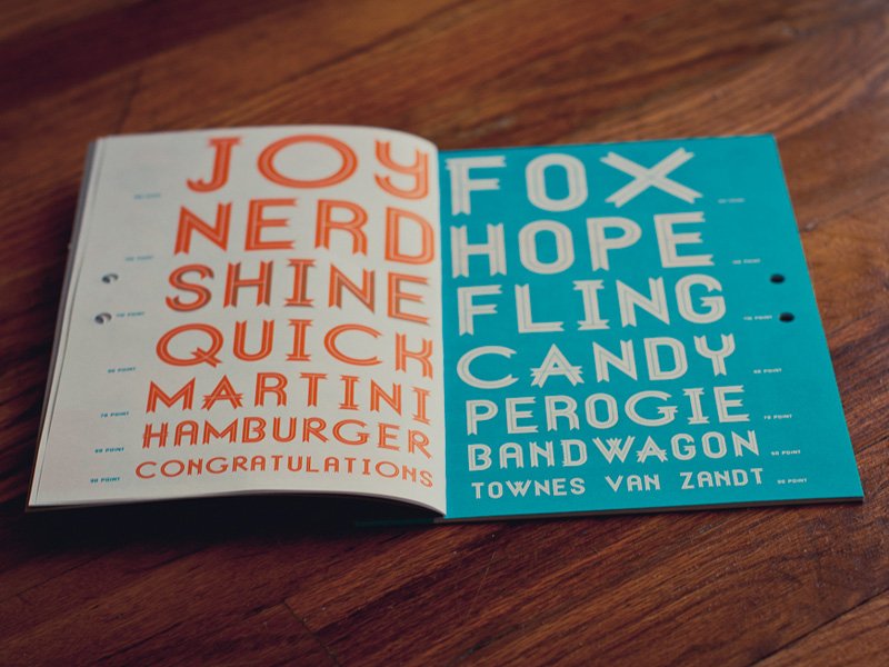
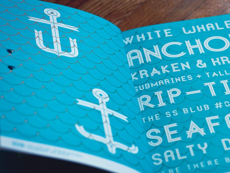
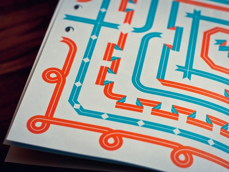
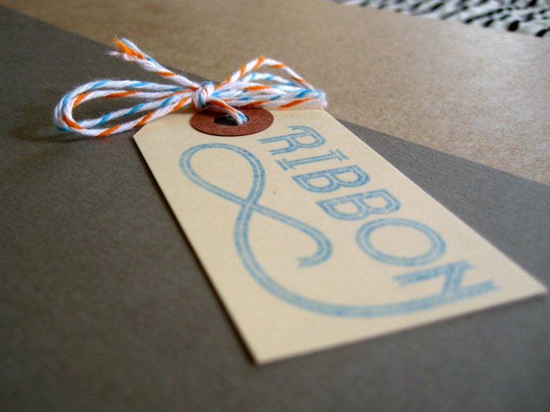
Ribbon Typeface book

print / february 23th / 5:22 AM / from St Cannat near Aix en Provence /


For the last 5 days, I am in a nice rental place near Aix en Provence. I have no web connection here, well not an "all the time" one, just enough to get emails and keep the flow of work... So, it is perfect time to work on the MrCup project. The less posts you will found here, quicker the new project will be online !

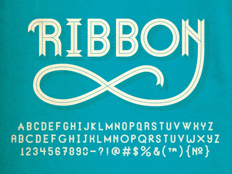
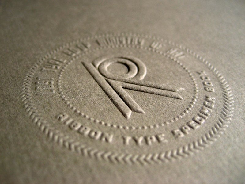
Dan Gneiding design the Ribbon Typeface and propose to send the specimen book to those who contribute thirty dollars or more when downloading the Ribbon typeface.


grayhood.com / available at losttype.com

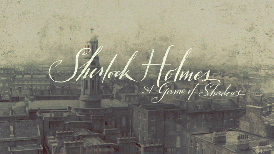
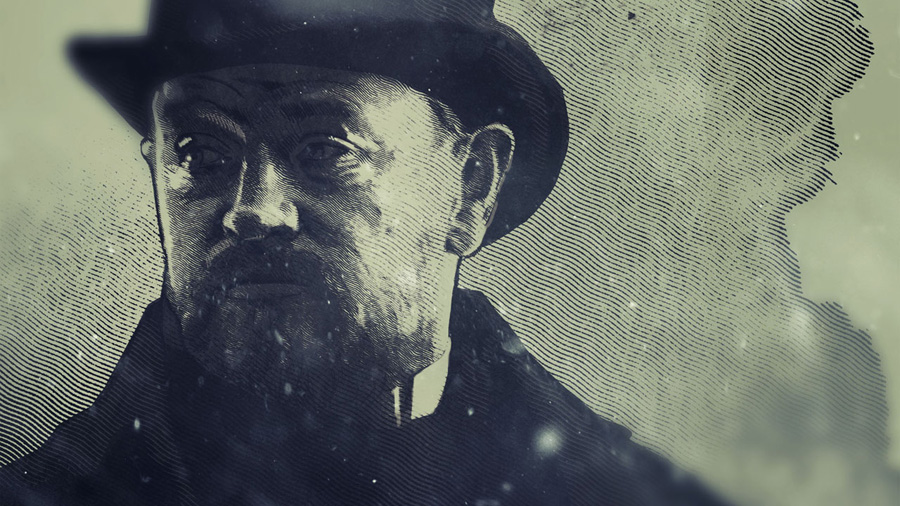
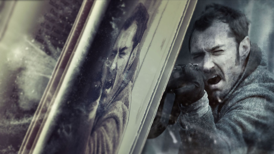
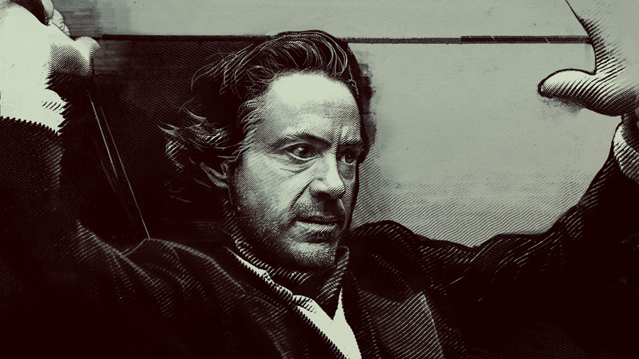
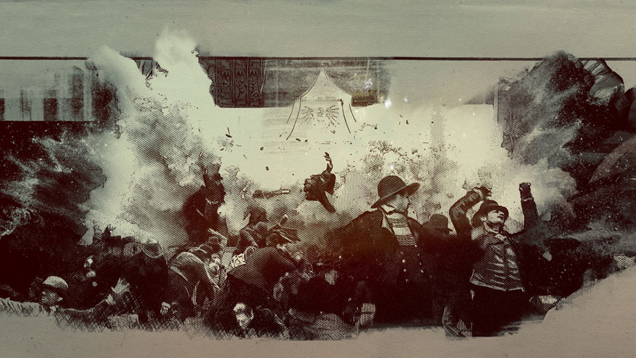
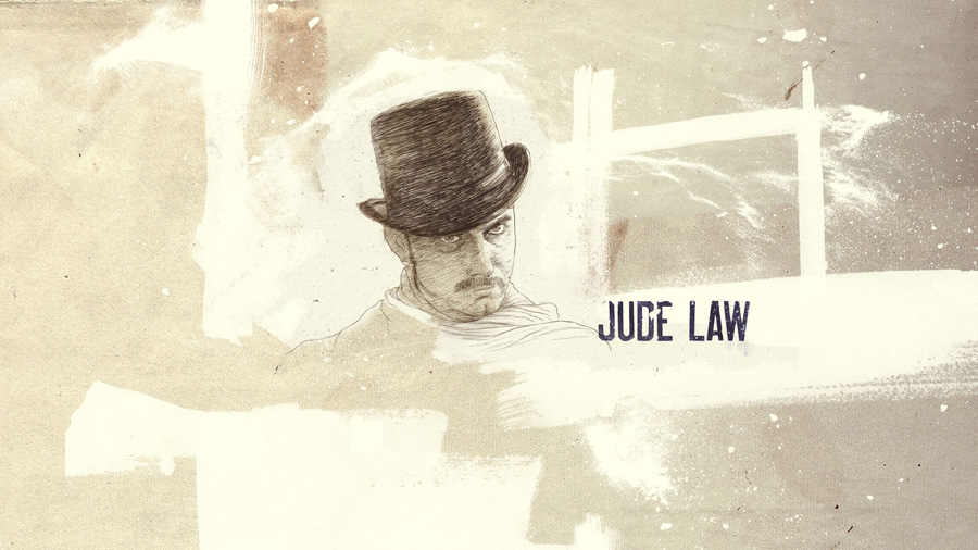
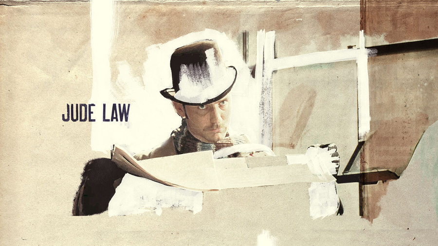
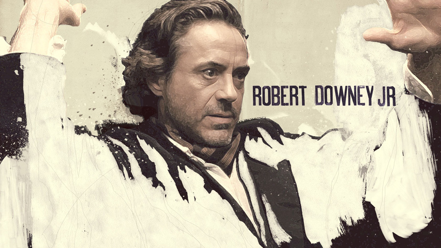
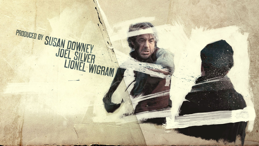
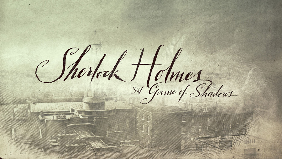
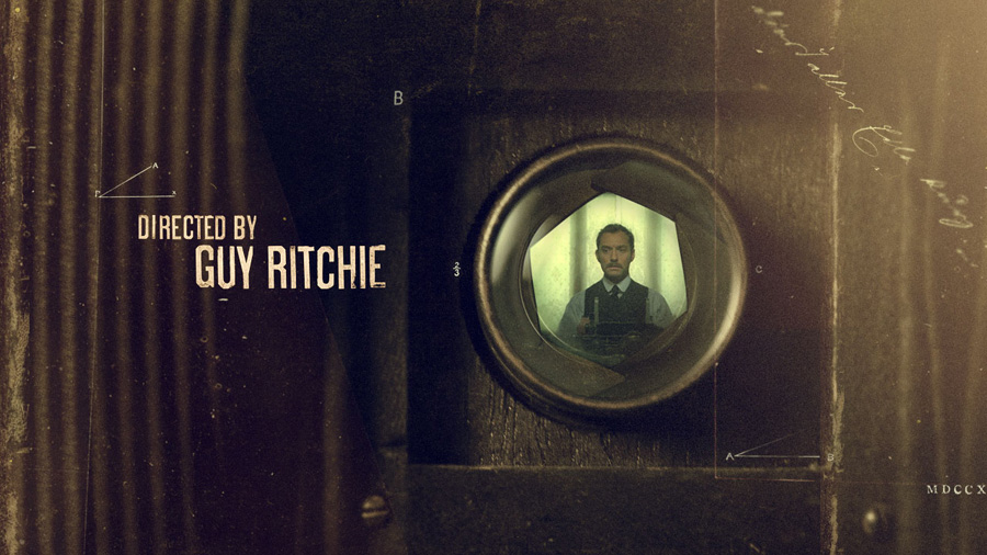
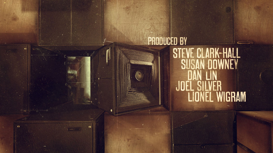
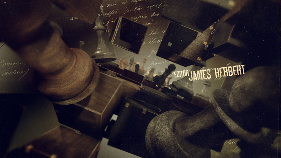
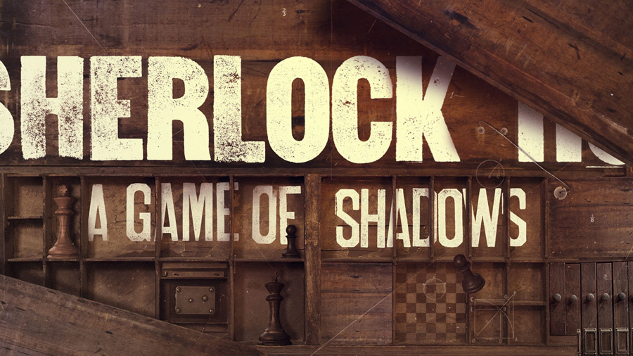
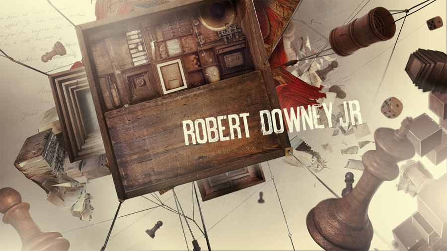
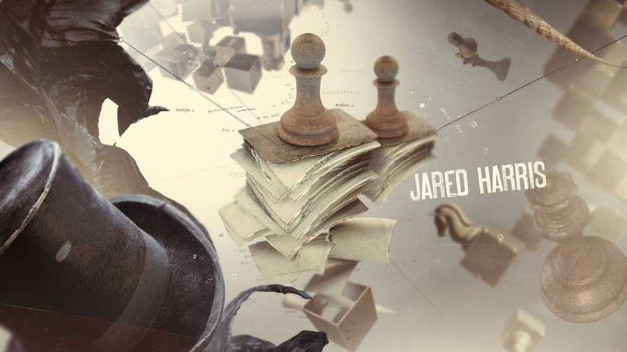
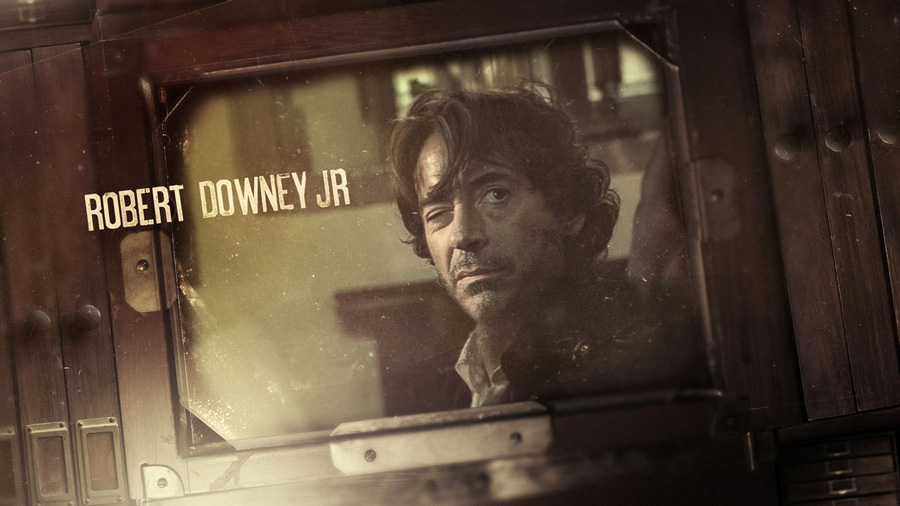
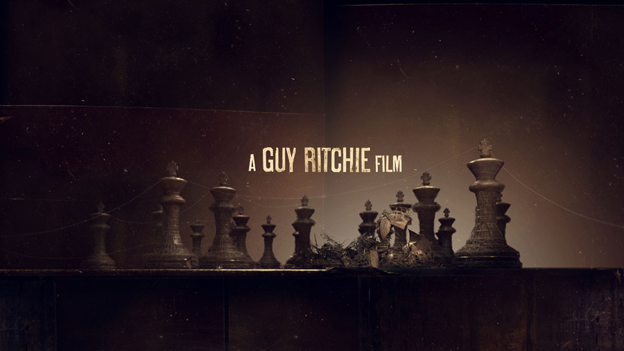
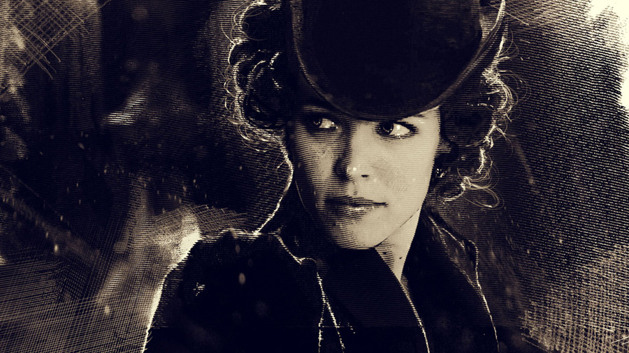
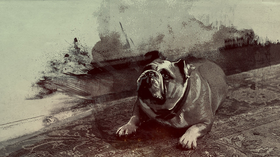
Sherlock Holmes (2) A game of shadows - credit sequence by Prologue

perso / february 20th / 9.16 PM / from St Cannat near Aix en Provence


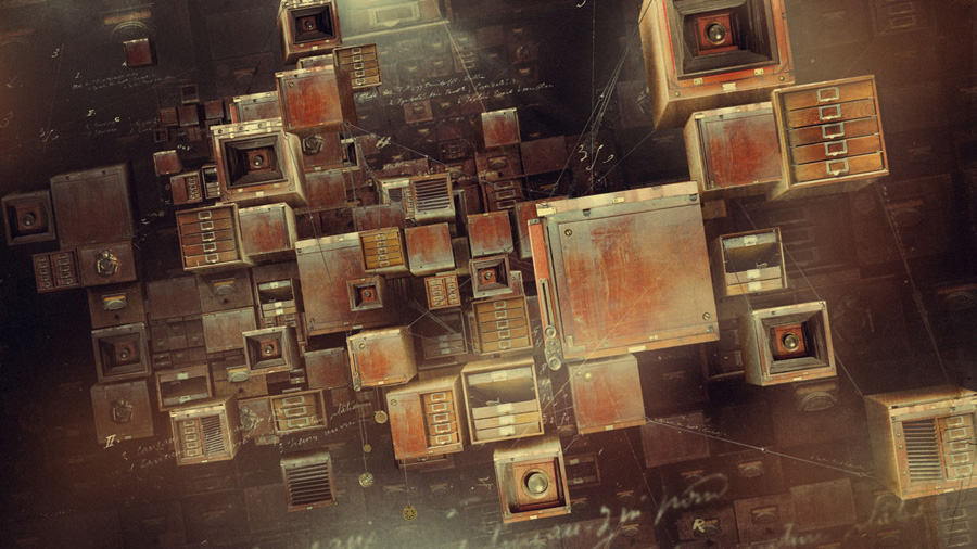
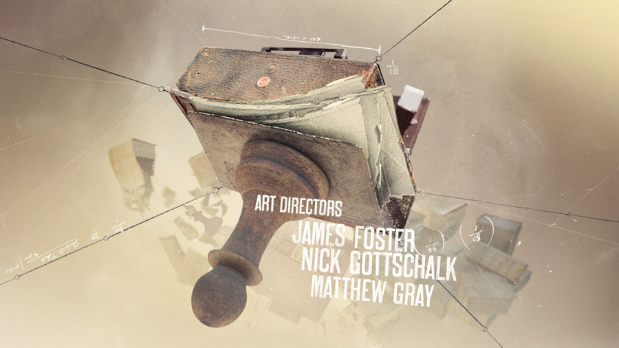
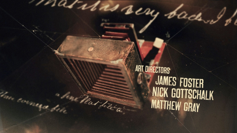
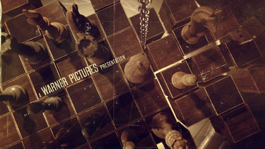
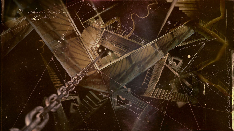
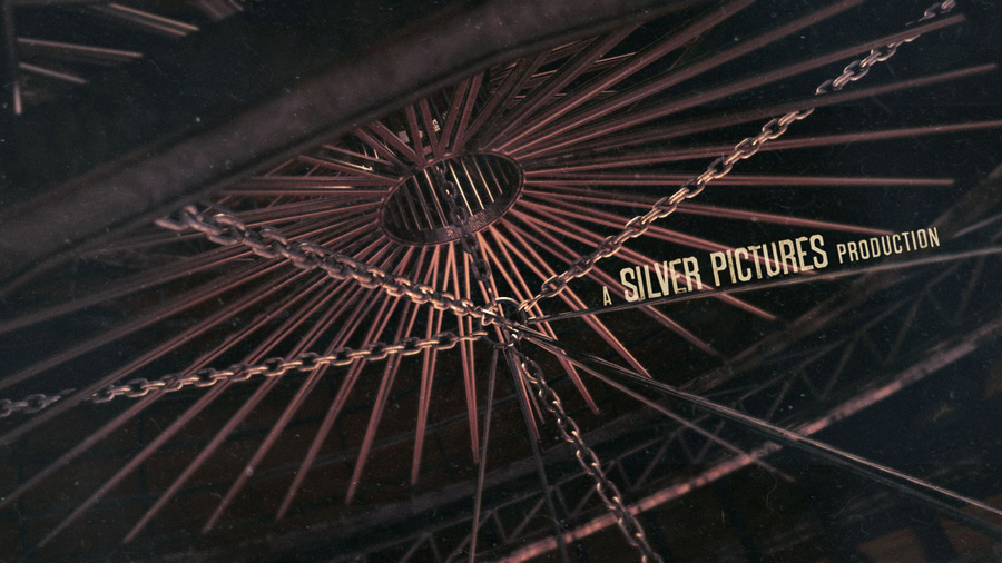
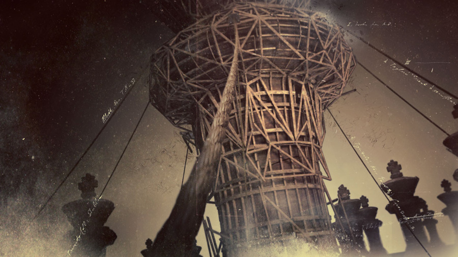
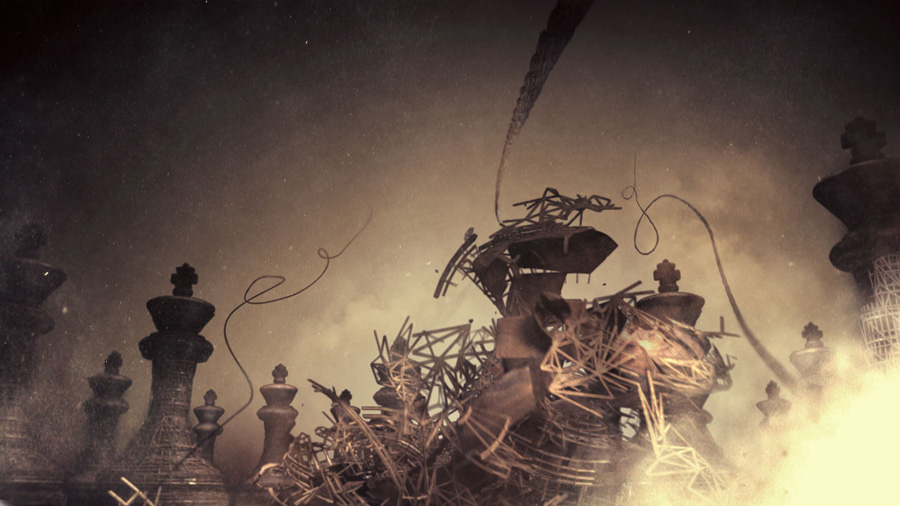
I was impatient to see the second Sherlock Holmes movie by Guy Ritchie, and even if the movie is great, I was impatient it ends to see the new sequence done by Prologue ;) And I was not desepointed... I contact Danny Yount as soon as I can, who kindly answer question about the first 2009 sequence and send me these amazing research phase images with his answers...


The sequence you did for the first Sherlock Holmes movie had a lot of "succes" for itself. On youtube, you can found tutorial to do animation in the Sherlock way... Even myself, as a designer, I get some clients briefs than can be summerized as "we want to Sherlock Holmes effects" ;) On your side, I also see a Vicks commercial for which the brief must have been the same... Knowing that, how did you start to work on the second movie ? Do you share what U2 feel after recording Achtung baby ;) ?

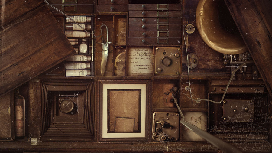
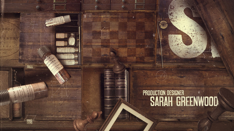
Well, actually I started by doing things that were in the opposite direction - I came up with an idea Ilya Abulhanov worked with me on that involved a 3d chessboard connected to cables and all of these moving boxes that opened up and released all kind of objects from Holme's study - notes, pill bottles, books etc. VFX Supervisor Jose Ortiz and his team made an excellent motion test to prove the concept.

All the producers and the director loved it, but in the last hour they decided to do the same kind of thing again. It was sad at first but once we got going we were able to find ways to overcome repeating ourselves completely. I thought it would be good to have everything painted on this time and to make better use of 3d space. We were also to add more detail to the illustrations and render everything more like real paper.


Have you some behind the scene images to share ?

Here they come


Does the movie team, or Guy Ritchie himself, gave you a biref this time or follow you seeing what you have done on the first movie ?

When they decided to do the same kind of things as last, they gave us a brief of making everything look like the magazine TheStrand - a very popular mag that was read by everyone around the turn of the century. It was probably the Vanity Fair or Interview Magazine of the day. I asked one of our producers Kate Berry to find the earliest copy of the original Holmes stories she could find. Luckily, she was able to find an old Memoirs Of Sherlock Homes from @1900 that was in great shape, so we ended up using a lot of that for the page designs. 


Does the team was the same as on the first movie ? Please present us who work on this sequence.

Yes, Alasdair Willson (the original animator) and Lisa Bolan, who was involved in the first concept development process. But Daniel Kim and Jeiko Jongyoon Soh (super talented designer / animators who did a lot of Ironman 2 vfx) were responsible for making all the work look amazing in motion. And Gary Mau who made the main title at the front of the film look great.

This new sequence is more black and white... But the illustration are even more detailed... Can you talk more about this ?

Lisa Bolan made these awesome Illustrations that looked like real etchings and Ke Cao joined in and made many of them as well, including the nice studio logos at the front of the film. The first round by Lisa was more painterly - which were great but in the end we ended up doing more of an etched look, which was a more evolved version of what Chris Sanchez and I pitched on the first film. Lisa and Ke pulled it off beautifully those and had to work around the clock for the 2 short weeks of production to make it al happen. It was a tough assignment for them as many shots were pulled out of the cut sometimes after they would finish them. It was like losing limbs at times but they handled it like pros.


Thanks again for your inspiration
 
prologue.com


see previous posts >>


  RSS
  all the archives


My myself I
  What I do in 1 link
  Portfolio
  HI stickers
  HI posters
  byDandB
  Photo portfolio
  Cargo
  my dribble
  Behance
  Ffffound
  Flickr
  Letterpress-calendar
  My flickr favorits
 
Support
  Casajordi
  Design from Paris
  Freddauzat
  Laure Dalet
  Funnel Eric-kass
  Honeypielivingetc
  Les brumes
  Mediafix
  Moreyellow
  Pensée Sauvage
  Virages
 
Favorits blogs
  {inspirare}
  Allan Peters
  Beastpieces
  Stuckincustoms
  Lovenordic
  Design work life
  Eight hour day
  Brown dress with white dots
  FPO
  Lovely Stationery
  Lovely package
  From up north
  Pia Jane Bijkerk
  SeptemberIndustry
  Vintage me oh my
 
A to Z
A Abduzeedo
  Art of the title
  April and may
  Automatism
  anthologymag.com
   
B Benign Objects
  But does it float
  Brand new
  Butterfly in house
  Busy being fabulous
   
C Creative and live
  Convoy
  Caroline Briel
  Contemporist
  Creature Comforts
  creative-mug
   
D Design and design
  theDieline
  Design Dust
  David Arias
  Decor 8
  Design files
  Delikatissen
  Drifter and gypsy
  Design vagabond
  Dailypoetics
  Design Attractor
  designspiration.net
   
E Enviromeant
  Eat drink chic
   
F Ffffound
  Forgotten hopes
  Form fifty five
  Fubiz
  Fffflckr
  Fontshop/blog
  Freshly Blended
  Fontsinuse
   
G Grain edit
  Graphic hug
  Geek art
  Green Wellies
   
H Home design
  house-universe
   
I I love typography
  I believe in adv
  imprimerie Marais
  ISO50
  iainclaridge
   
J/K Kool and kreativ
   
L Living design
  Looks like good des
  Letterhead Love
  Letterheady
  lamaisondannag
  latelierdelasardine
  Lovenordic
   
M Ministry of type
  Mika 78
  My mama's table
  Mnml
  Minimalissimo
  Men's mentore
  Morea Steinhauer
   
N/O oh so btful paper
  Oh hello friend
  Nick Jankel
   
P/R Pitch Design Union
  Remodelista
  Paper is lovely
  press-my-cards
   
S Swiss-miss
  Slanted
  SwissCheeseBullets
  Strukturblog
  Style-files
  SF girl by bay
  Sunday suppers
  shirotokuro
   
T Type theory
  typographic posters
  The artist & model
  Typojungle
  Tinyk
  Twig and thistle
  theburninghouse
  thehobbitblog
  travel-files
  This is collate
  Type is everything
  typojungle
  thisiscolossal
   
U/V Uppercase gallery
  Violet voice
  a View to
  visuelle.co.uk
  Vigor branding
   
W Welovetypography
  What makes us blog
  (Wit + Delight)
  Woodtyper
  Where we design
   
XYZ Yay every day
  Yatzer.com
  xote
   
1 3eavenue
  100layercake