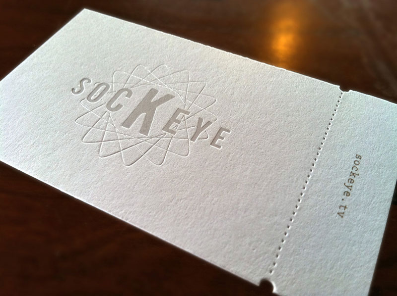
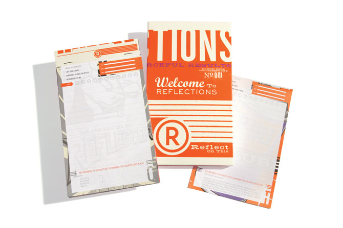
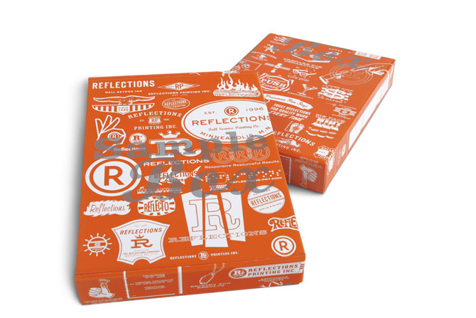
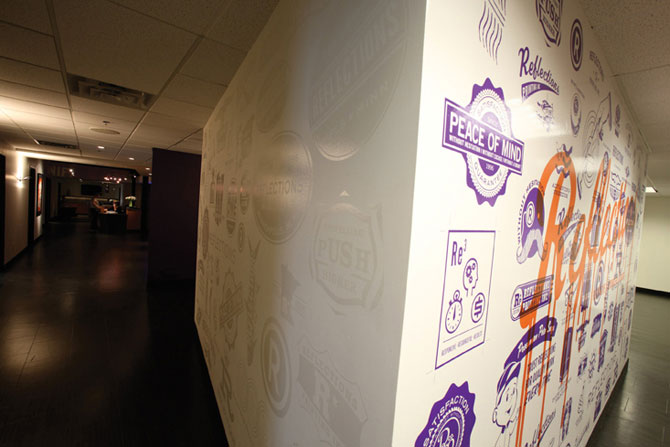
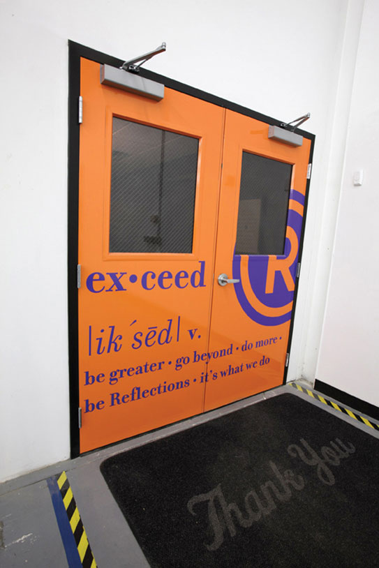
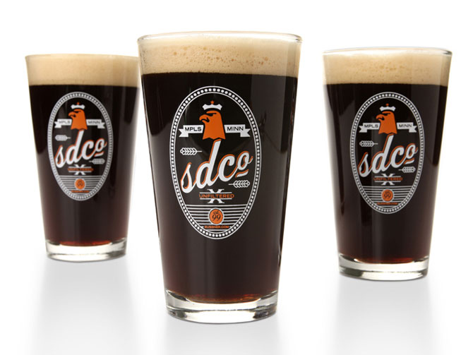
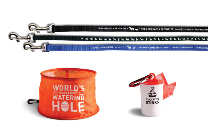
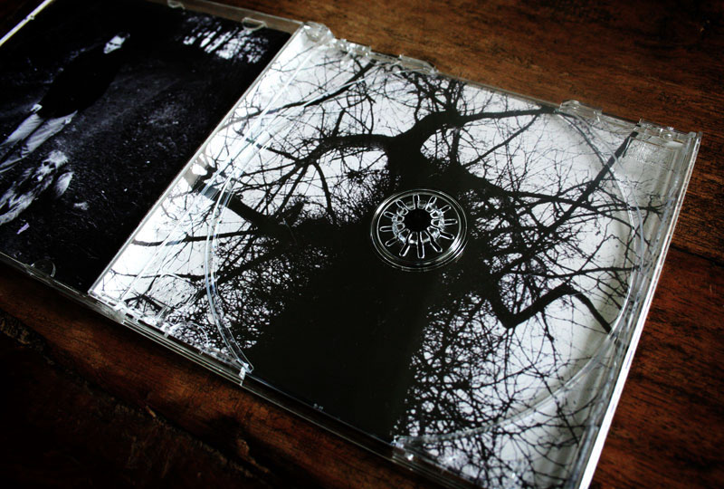
| Sockeye |
print / june 15th / 0:14 AM / FINK . Perfect darkness |
|
|
 |
 |
 |
 |
 |
 |
 |
 |
 |
 |
|
 |
 |
 |
| www.flickr.com/photos/52035020@N02 |
 |
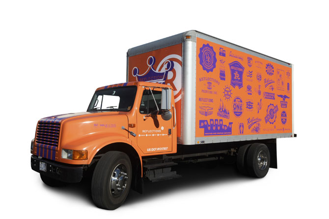
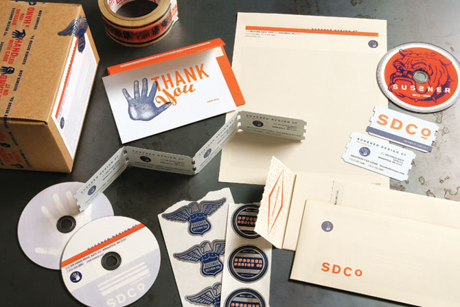
| Marque creative |
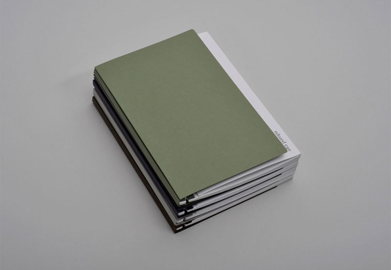
print / june 13th / 10:31 PM / REM . Colapse into now |
|
|
 |
 |
 |
 |
 |
 |
 |
 |
 |
 |
|
| marquecreative.com |
|
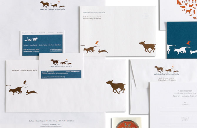
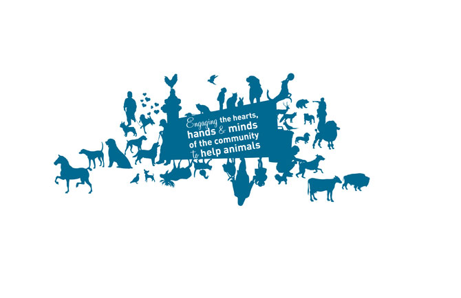
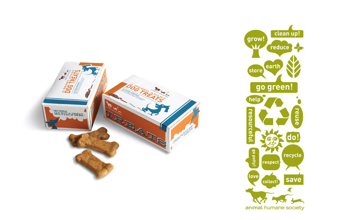
| Brandon Van Liere |
identity / june 10th / 10:52 PM |
|
Why do I feel guilty to haven't done more updates this week ? I always feel guilty for something... when I work I felt guilty to not having time with my daughter and wife; when I am with them I think I should work... When I work on a project, I felt guilty to not work on an other... and I felt guilty to not give you your daily dose if inspiration ;) Hope you will like this one :
|
 |
 |
 |
 |
 |
 |
 |
 |
|
 |
 |
 |
|
 |
 |
 |
 |
 |
|
 |
 |
 |
 |
 |
 |
 |
 |
|
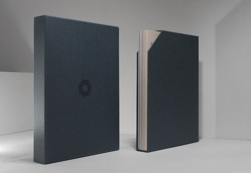
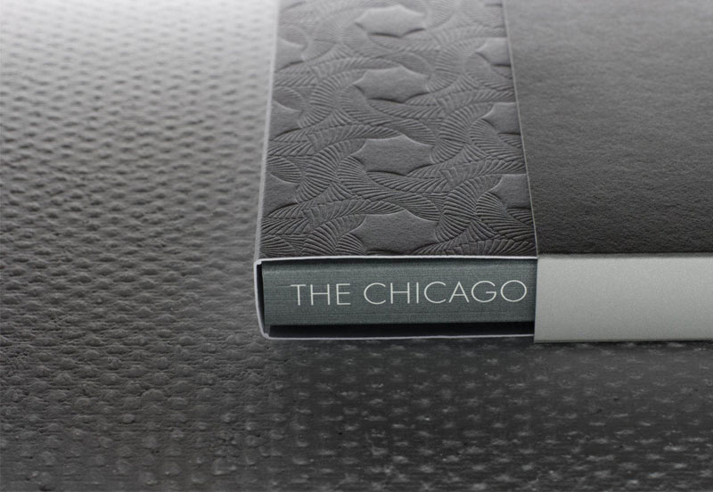
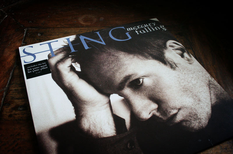
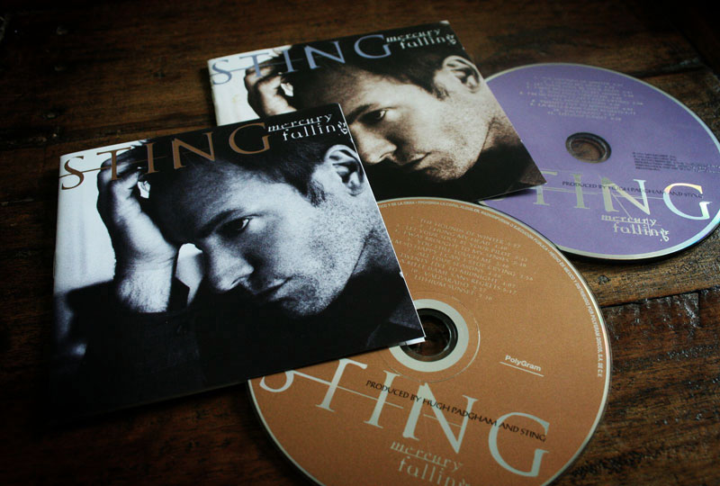
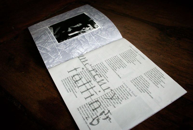
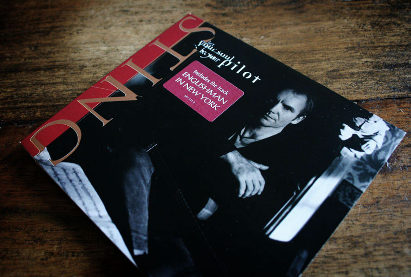
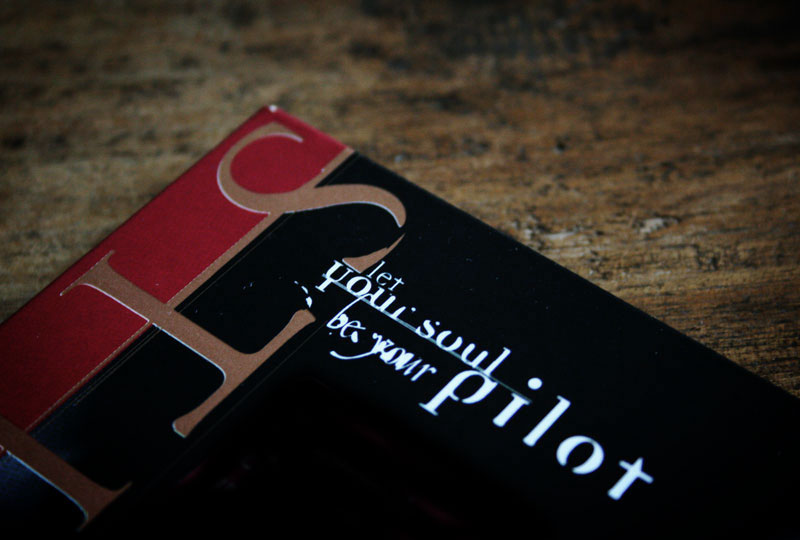
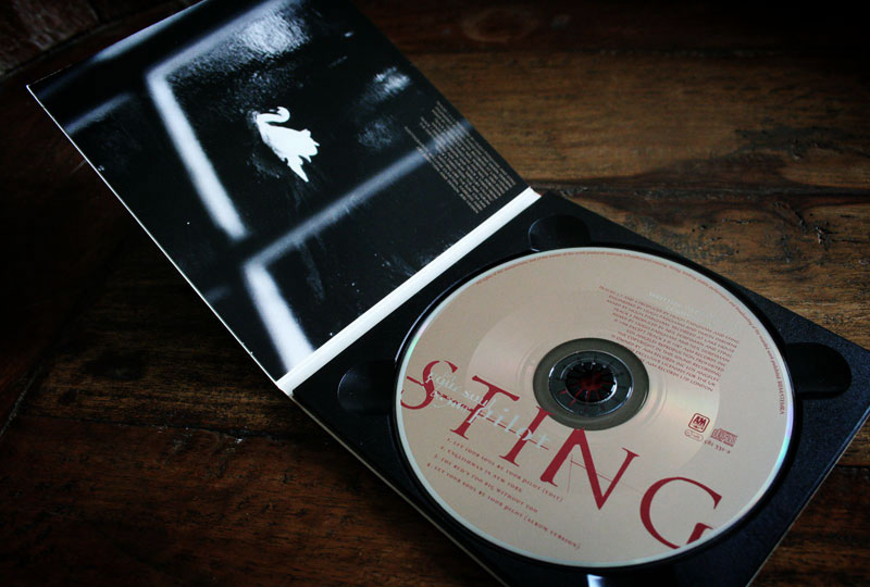
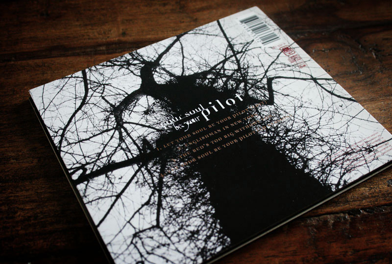
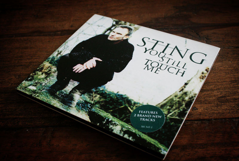
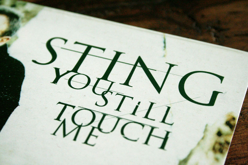
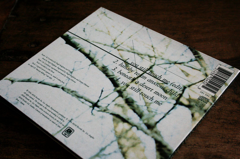
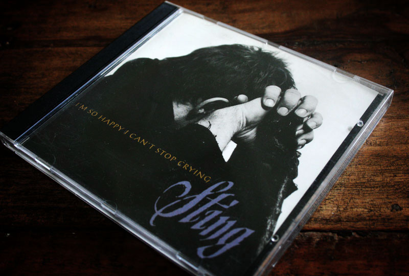
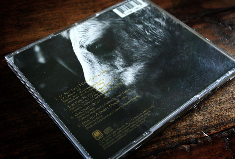
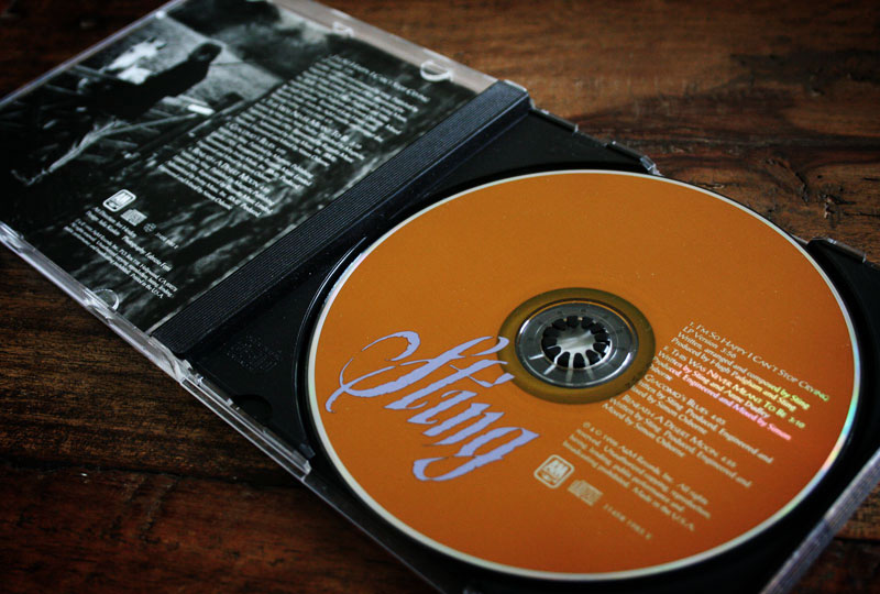
| Sting Mercury Falling - album design by Jeri Heiden |
| exellence / june 9th / 11:32 PM / Sting - Mercury falling |
I guess what bring me to graphic design are the records I listen and collect since I am 13. I am not the only one in this case, but I do collect them during year, specialy Sting ones. I always have been attracted in design variations, and for each album, I collect the different countries editions as well as all the singles or special promo issues... That was in another life, as I stop this for some time... The list of artists she worked with is amazing, from Elvis Costello to Madonna, k.d. lang, the Eagles, John Mayer, A-ha, P!NK or Tom Petty... From the early 1980s to the mid-1990s, she does the graphics for Warner Bros. Records. then became creative director of A&M. She currently operates as SMOG Design with husband John Heiden. |
 |
 |
 |
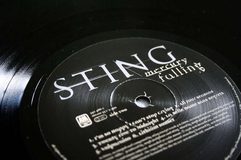 |
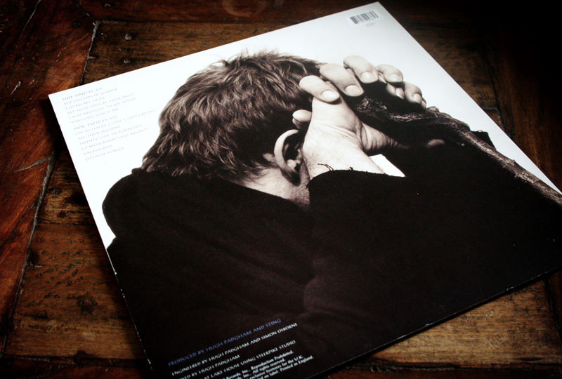
How did you get in invloved in this project ? I was the creative director at A&M Records from 1995-1999. I had the good fortune to work with Sting, Suzanne Vega, Sheryl Crow and many other of their well-known artists while I worked there. Did you do a lot of proposals for this album sleeve ? If yes, any chance you found them in your 15 years old archives ? I'm sure that I did many comps – at least 25-30 – as that would be fairly typical for me. I will see what I can dig up. The digital archives would be archaic at this point but I might have some sketches or journal entries. I had the chance to met Sting one day and talk about him about sleeve design. He told me his only consideration is that sleeve reflect the mood of the album, and the he did not look to ugly ! Did you get some demo to inspire you and to reflect this mood ? I was able to hear the music while working on the project. It's always a huge help and inspiration. In this case, some of the darker, more introspective themes informed the imagery. |
 |
 |
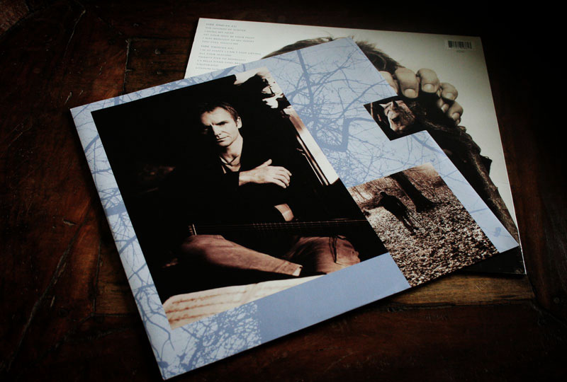
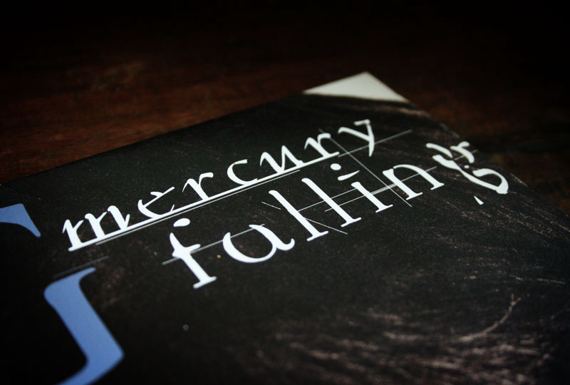
You have done a very nice work on fonts for this album and the singles behind it, they are almost logos by themselves, can you describe your precess behind this ? Very precise question that will let you know how much I know my subject ;) In the english spoken countries, the design of the album is with purple type and brown photos, while in other countries what is purple on the first sleeve is gold, while the pictures are more purple... do you have any idea why ???
|
 |
 |
 |
|
 |
 |
 |
 |
 |
 |
 |
 |
 |
 |
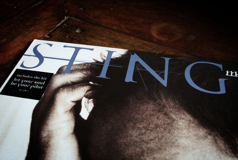
What is you best memory about this project, and of course what is the worst ? This was one of my favorite projects while at A&M. Sting and Trudie are both delightful. William Claxton was a favorite photographer and I was so pleased that he was able to shoot Sting. Fabrizio Ferri is an old friend of Sting's and also brought a beautiful sensibility to the photography. My only bad memory is that Sting beat me at chess in about 6 moves – I didn't have a chance! Did you ever work with Sting after that ? Unfortunately no. A&M was purchased by Universal Music Group in 1999 and closed its historic Hollywood offices. We lost touch after that. Thanks a lot Jeri for taking time to answer and for the inspiration www.smogdesign.com / aiga profile / http://www.allmusic.com/artist/jeri-hei ... 80/credits |
|
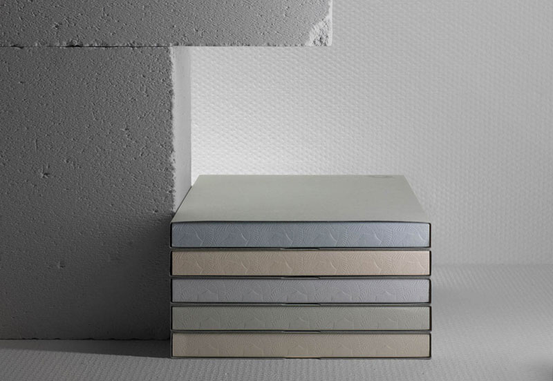
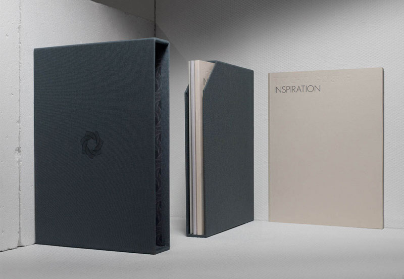
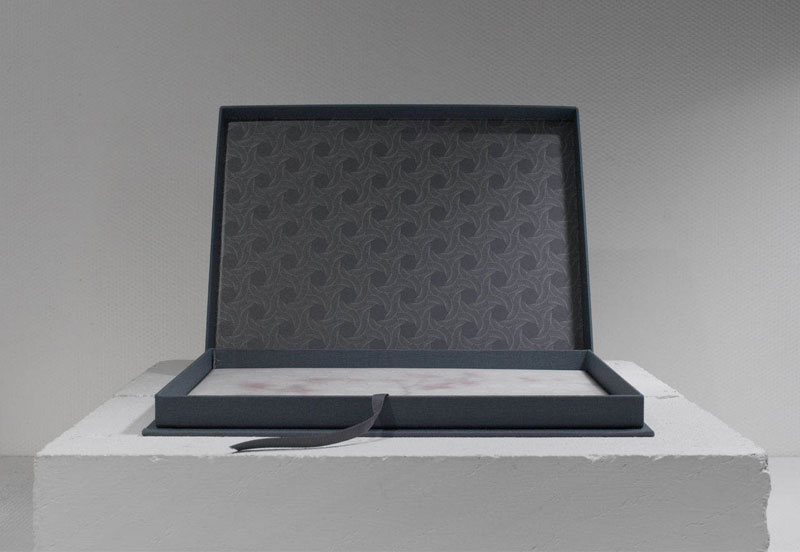
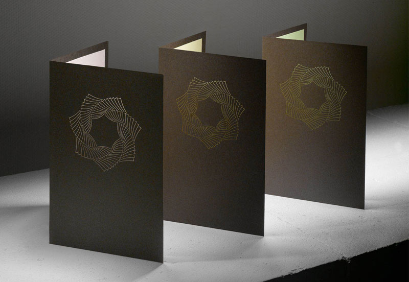
| by D and B updates... |
| personal / june 7th / 11:04 PM |
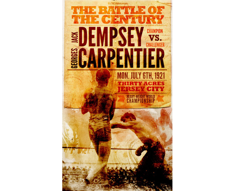
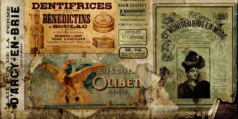
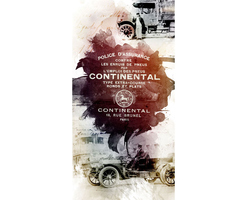
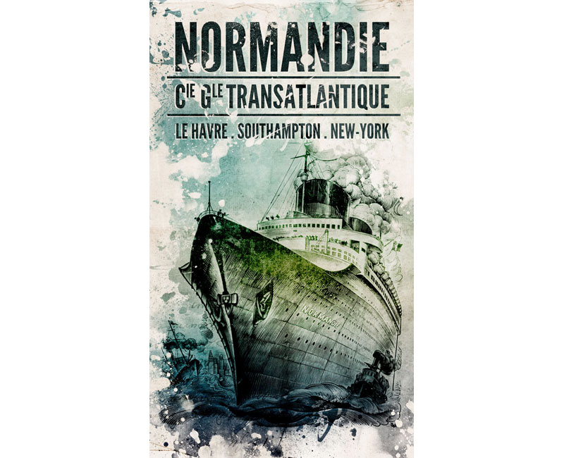
In Paris for some days to work on th byDandB.com project... Thanks a lot for the very nice feedbacks and question about how to get the products... You need to be patient for the summer I guess ;) Comment the new images on flickr if you want to... |
 |
|
|
 |
 |
|
|

 |
 |
 |
 |
 |
| |
||||