| Home design ideas | ||||||||||||
| posted in interior section on April 1st | ||||||||||||
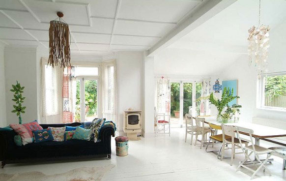
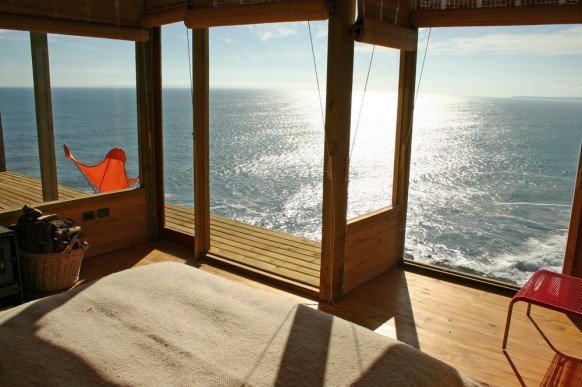
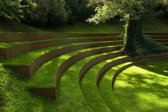
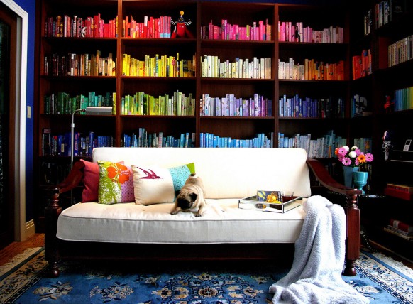
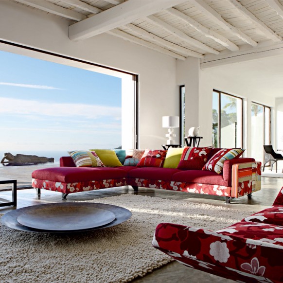
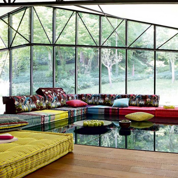
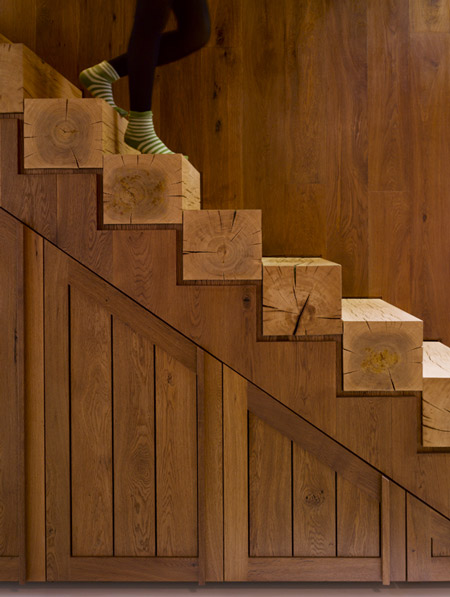
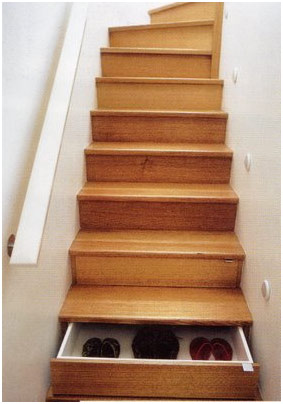
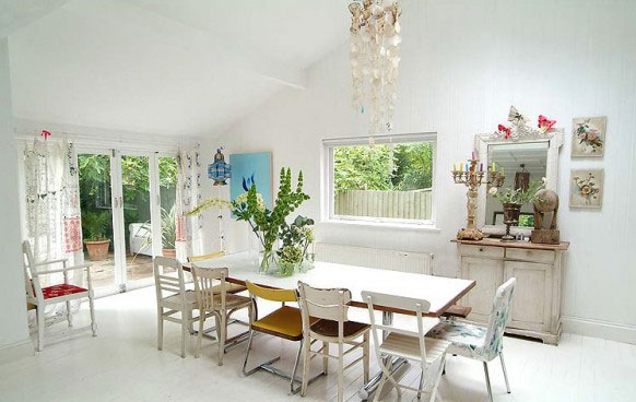
| So much great ideas... well, for some you need to be rich ;) | ||||||||||||
 |
||||||||||||
|
||||||||||||
 |
||||||||||||
|
||||||||||||
 |
||||||||||||
|
||||||||||||
|
||||||||||||
|
||||||||||||
 |
| The Police Synchronicity | ||
| posted in music section on march 30th | ||
| On all the design blogs, we are always looking for
the latest things that came out... so on we often have the same information...
But some things have been done years ago... Beside my passion to graphic
design, I also have one for Sting and The Police, I know everything by
them and so on have a special interest in the sleeves design... When you
follow a band (and artist) that start in 1977, it show you a graphic design
evolution over the last 33 years... You can see that some things designed
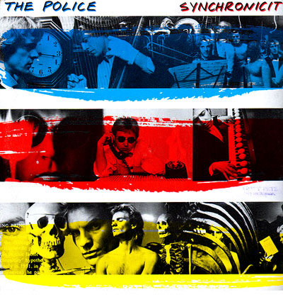
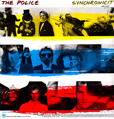
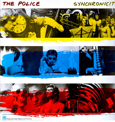
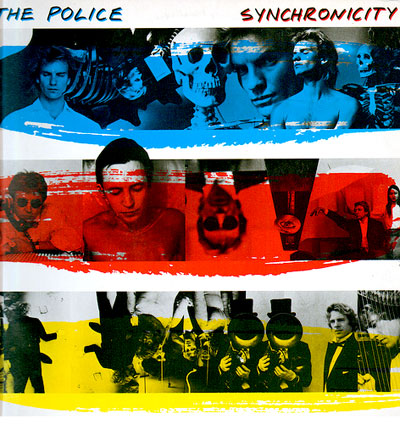
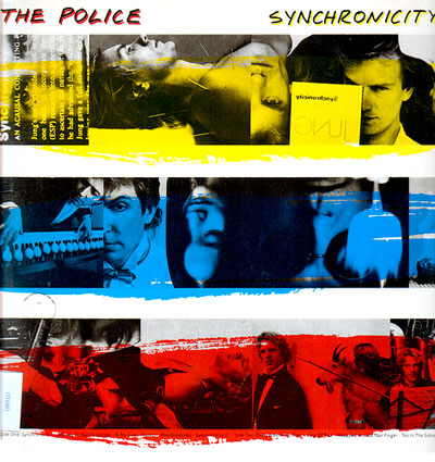
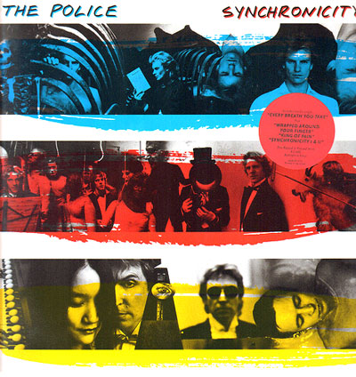
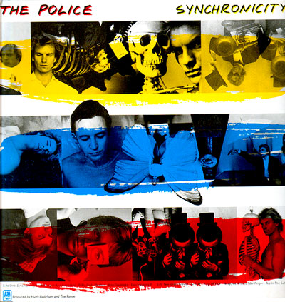
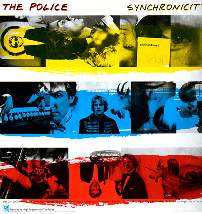
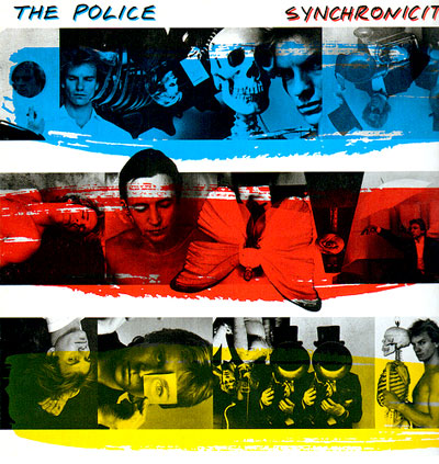
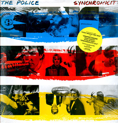
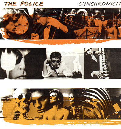
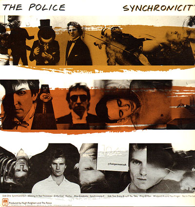
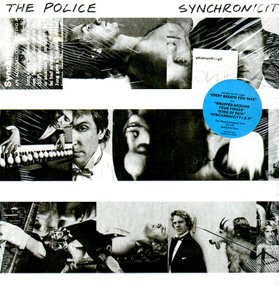
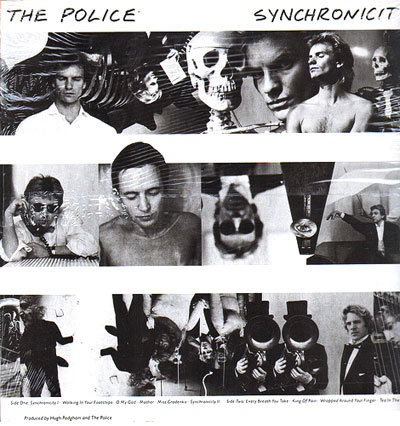
in the early 80's are much better than thing design in 2000 ;) It is the case of this amazing album sleeve. You probably all know it, because these 3 colors stripes are as famous as the band... But you may not know how crazy it can be... This sleeve is compose of 3 photos stripes, one for Sting, one for Andy Summers, and one for Stewart Copeland... and above each black and white images, you have a red, blue and yellow stripe... on both sides of the cover... That's simple... |
||
|
||
But, for the USA LP sleeve, a graphic designer have some fun... With all the pictures available, why not mix them?... and what about invert the stripes too... so on, some sleeve start with Andy in blue, some with Stewart in yellow, some with Sting in red...
|
||
|
||
|
||
|
And what about mixing the picture of Sting, Andy & Stewart instead of having one strip for each of them ??? |
||
|
||
|
||
With this little game, there are more than 30 different sleeves for this album... but that's not all, for collectors there are even more rare sleeve... Some LP were issued with gold/silver/bronze stripes and some without color at all...
|
||
|
||
|
||
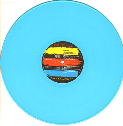
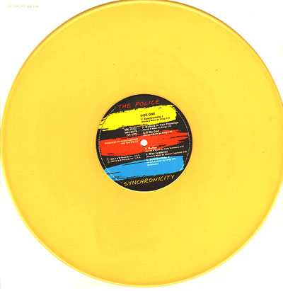
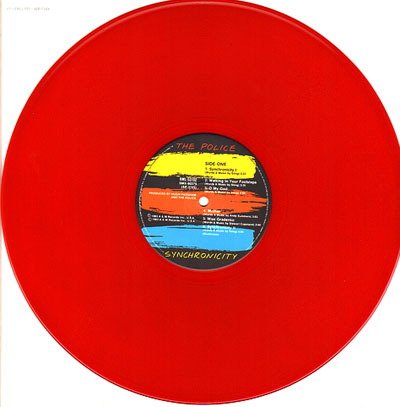
| In Australia, instead of having fun on the sleeve, they have fun on the disc iteself,with some issues in yellow, red or blue vinyl... | ||
|
||
|
||
| The pictures were taken by Duane Michals, who (has said Wikipedia) style often features photo-sequences and the incorporation of text to examine emotion and philosophy, resulting in a unique body of work. | ||
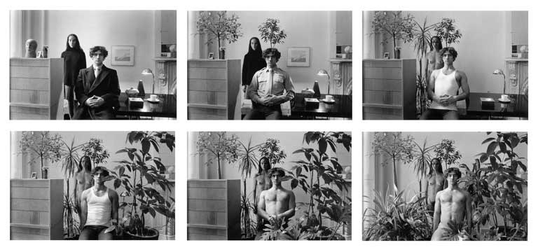 |
||
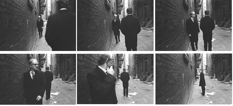 |
||
| More about the synchronicity album | All the sleeve referenced on this site | more images here | ||
 |
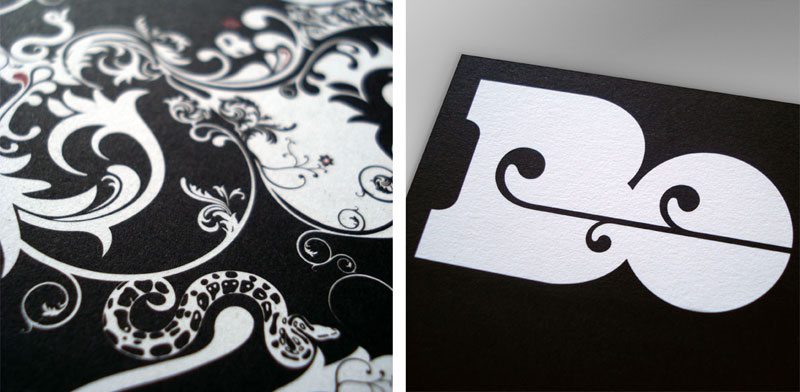
| Sawdust | |||||||
| posted in identity section on march 29th | |||||||

|
|||||||
|
|||||||
 |
|||||||
 |
|||||||
 |
|||||||
|
|||||||
| www.madebysawdust.co.uk | |||||||
 |
| Stephane Perche | |||||||
| posted in graphic & packaging sections on march 26th | |||||||
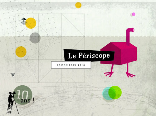
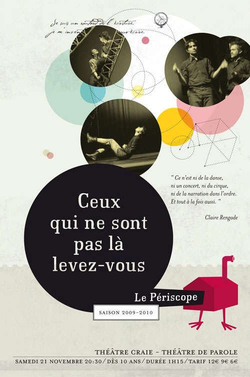
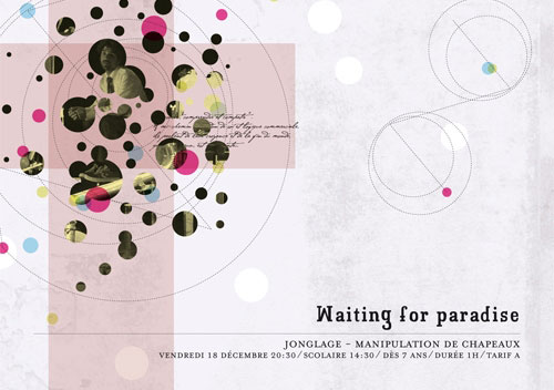
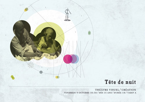
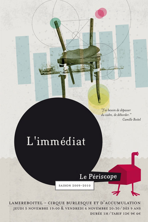
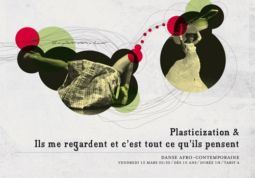
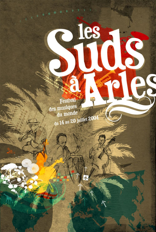
| I am pleased to present something I have not discovered on screen. Stephane Perche isworking in the same part of France as I am, and I saw the "Periscope" posters and the program in the biggest city near of my home.. |
|||||||
|
|||||||
|
|||||||
| www.les-anges.org/stephane-perche | |||||||
 |
 |
 |
 |
 |
 |
| |
||||
