| Last week, I present you the amazing Sherlock Holmes
credits... Danny Yount, creative director at Prologue film, and
to said it, a master, nicely answer my question about the making
of... and send me some behind the scene images... |
| |
| How many people work on a such a sequence
? We broke up into a 3 separate
teams - with a total of about 14 people working around the clock.
The end credit sequence required the most people by far, as there
was so much detail in the illustration and transition work. The
illustration took a long time to make. I'm not sure if Jorge slept
very much. The main title and Hallucination (example) VFX team
was myself and Brett. The opening logos Jose and Todd.
I work very closely with everyone and I am always
part of the process. I owe that to the client and I especially
owe that to the younger designers who are building their own body
of work and careers. I also learn a lot from them - they always
bring in new ways of doing things. And they learn from me as I
help them to avoid the same mistakes I made when I was their age. |
| |
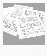
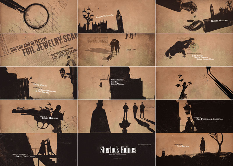
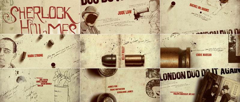
| Who is the illustrator behind these amazing
images ? Jorge Almeda. He's a great illustrator
and animator - a very talented guy and hard worker. They were
based off some looks that Chris Sanchez and Lisa Bolan were doing
in earlier concepts. |
| |
| Can you describe the development process
of the sequence ? I got a call from
director Guy Ritchie while he was in the middle stages of principal
photography. He liked what we made for RockNRolla and asked us
to consider something good for Sherlock Holmes. We were sent a
script and got very excited about it after realizing the more
edgy and fun interpretation of the classic character of Holmes.
So Ilya Abulhanov and myself made a couple of ideas. |
 |
|
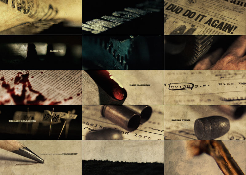
I was invited to fly out to present them at one of
the sets in London and see some of the film, so I had a very strong
sense after that of where they wanted to go visually. The brief
I was given was to do a live action shoot that involved a lot
of newspaper headlines from the late 1800's, which would give
a little history to the early beginnings of Holmes and Watson
and lead into the first scene of the film following the last headline
on top of a stack of newspapers laid at the doorstep. We also
wanted to show part of the printing process of that time period
using the linotype machine and wood block type headline compositions.
After going back and forth a bit we concluded that it be a macro
shoot that was very graphic, so we rented some time at a printing
museum and set up several still shoots to get all the material
we needed for storyboards. |
 |
 |
 |
| |
I also shot some test footage with the Canon 5D
to do a style test. They liked the presentation and told us they
would get back to us. |
| |
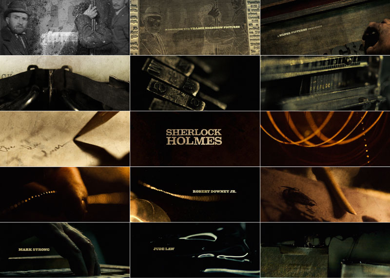
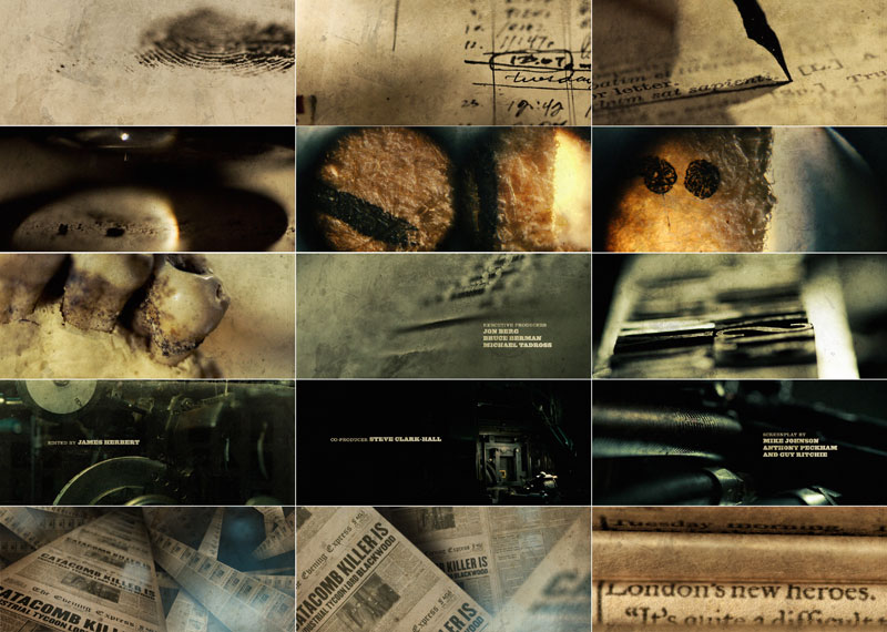
| Several months went by and the film had taken shape
more so they decided to loose the headlines sequence. So they went
from wanting a full main title to having a short main title and
an end credit sequence. They also wanted the end credits to be an
anthem to the film - using highlights from the movie. Designers
Henry Hobson, Simon Clowes and Lisa Bolan teamed up and made the
storyboards. |
 |
| |
| I decided to go into a different direction with mine
(see below). In retrospect I think they were a little dark though
(ha). |
 |
| |
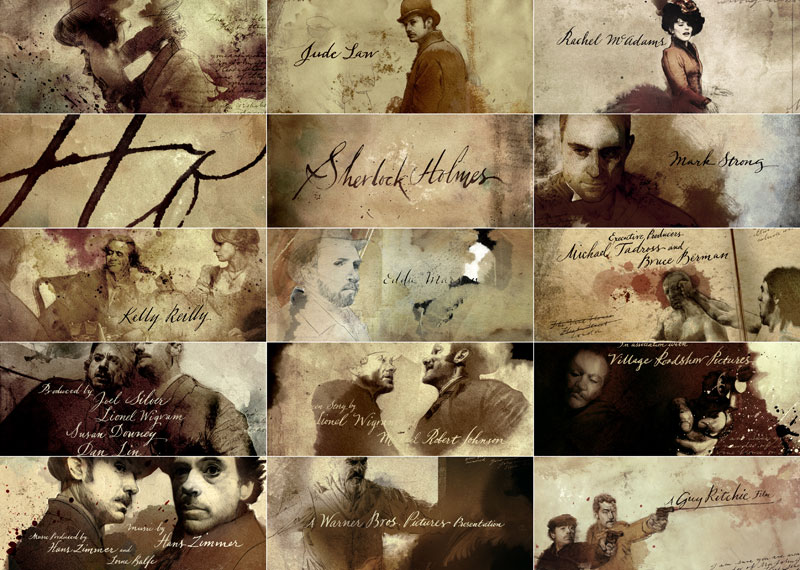
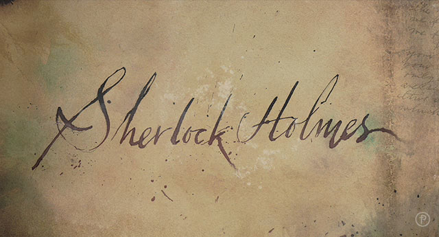
We also can see a very special and unique
typographie work, we can even talk about calligraphy... who did
it ?
The calligrapher Bonnie Ebbs. She does a lot of work for studios
in Hollywood. She's very professional and works very fast.
|
 |
What was the most difficult aspect of the piece?
We had about 4 weeks from start to finish, and we were also given
a special effect sequence. It was a lot of work, even for a company
our size. But we have a great group of talented and dedicated
people who did what it took to get it done.
Would you give us a few of your favorite
elements of this sequence and s why they are special ?
I like the work that Jose Ortiz and Todd Sheridan Perry did on
the logos. The really came out great I thought. And I think the
detail that Henry Hobbs and Simon Clowes did designing the end
credits are terrific.
This is sincerly truly amazing...
Thank you |
| |