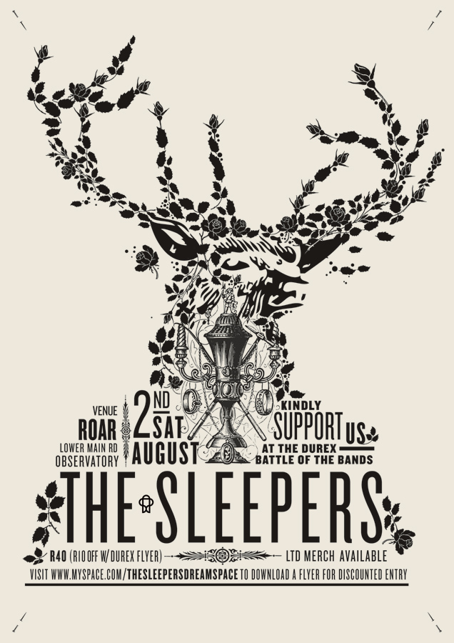
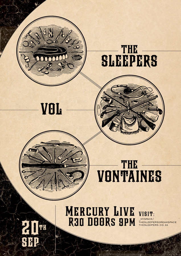
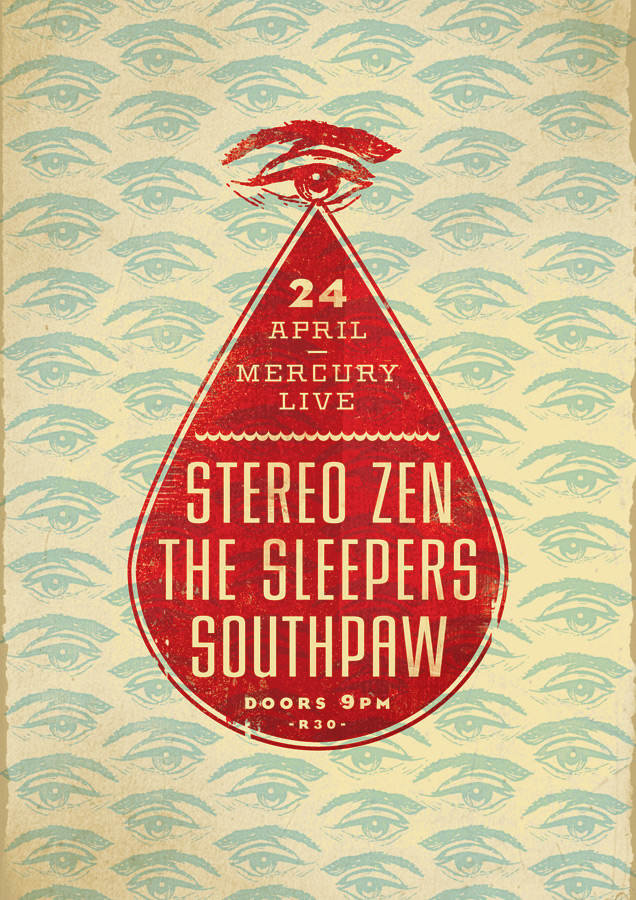
| Moffitt Moffitt |
| Posted in music section on april 9th |
|
|
|
 |
 |
 |
 |
 |
 |
| The Police Synchronicity | ||
| posted in music section on march 30th | ||
| On all the design blogs, we are always looking for
the latest things that came out... so on we often have the same information...
But some things have been done years ago... Beside my passion to graphic
design, I also have one for Sting and The Police, I know everything by
them and so on have a special interest in the sleeves design... When you
follow a band (and artist) that start in 1977, it show you a graphic design
evolution over the last 33 years... You can see that some things designed
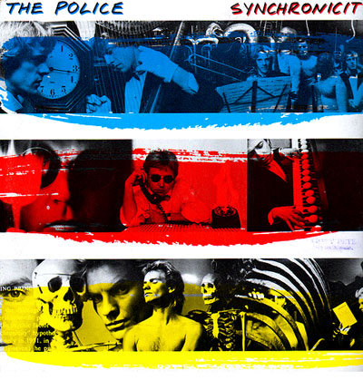
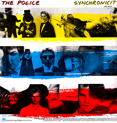
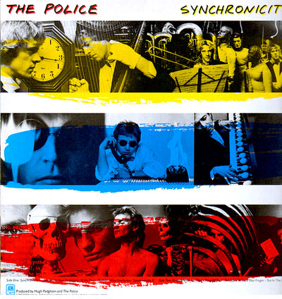
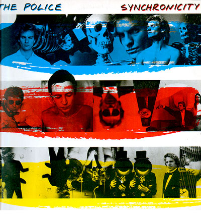
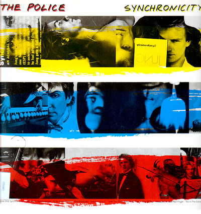
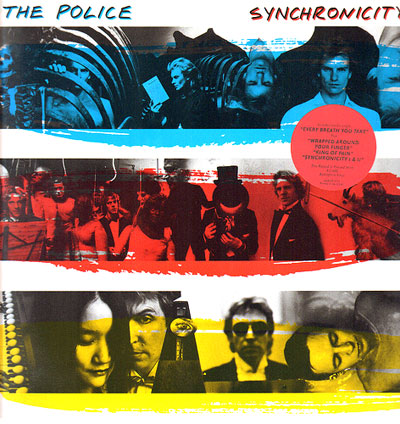
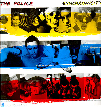
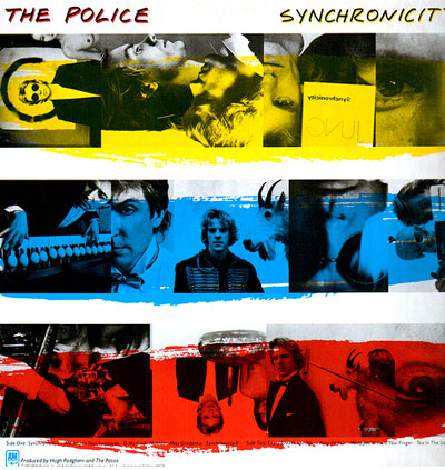
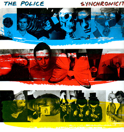
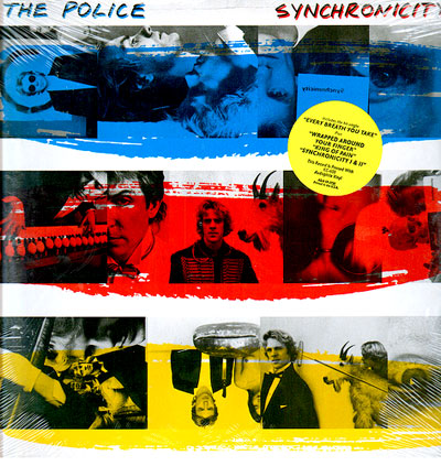
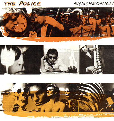
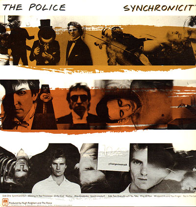
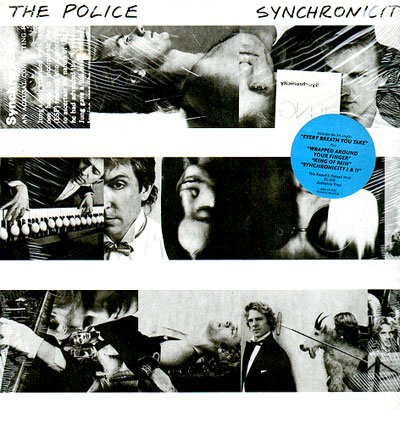
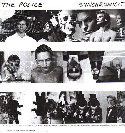
in the early 80's are much better than thing design in 2000 ;) It is the case of this amazing album sleeve. You probably all know it, because these 3 colors stripes are as famous as the band... But you may not know how crazy it can be... This sleeve is compose of 3 photos stripes, one for Sting, one for Andy Summers, and one for Stewart Copeland... and above each black and white images, you have a red, blue and yellow stripe... on both sides of the cover... That's simple... |
||
|
||
But, for the USA LP sleeve, a graphic designer have some fun... With all the pictures available, why not mix them?... and what about invert the stripes too... so on, some sleeve start with Andy in blue, some with Stewart in yellow, some with Sting in red...
|
||
|
||
|
||
|
And what about mixing the picture of Sting, Andy & Stewart instead of having one strip for each of them ??? |
||
|
||
|
||
With this little game, there are more than 30 different sleeves fwor this album... but that's not all, for collectors there are even more rare sleeve... Some LP were issued with gold/silver/bronze stripes and some without color at all...
|
||
|
||
|
||
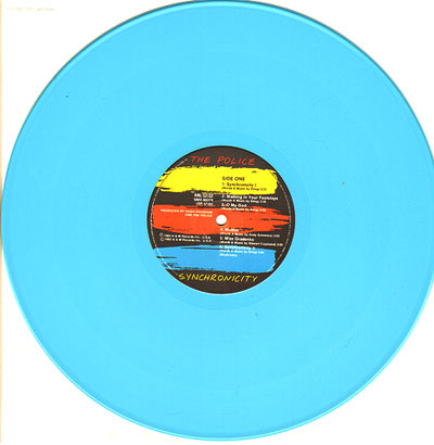
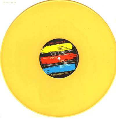
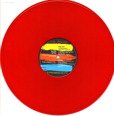
| In Australia, instead of having fun on the sleeve, they have fun on the disc iteself,with some issues in yellow, red or blue vinyl... | ||
|
||
|
||
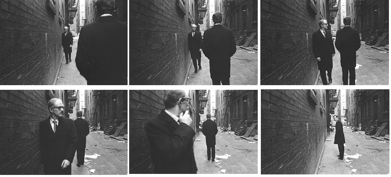
| The pictures were taken by Duane Michals, who (has said Wikipedia) style often features photo-sequences and the incorporation of text to examine emotion and philosophy, resulting in a unique body of work. | ||
 |
||
 |
||
| More about the synchronicity album | All the sleeve referenced on this site | more images here | ||
|
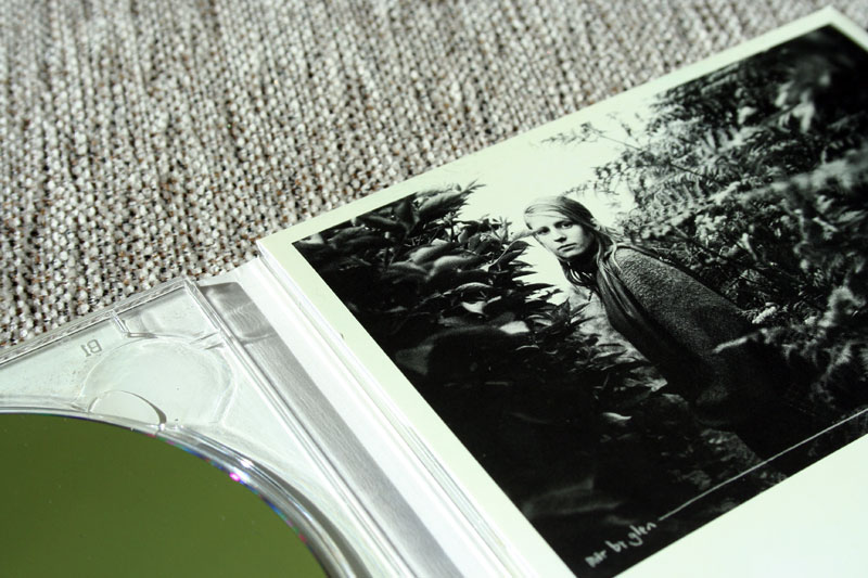
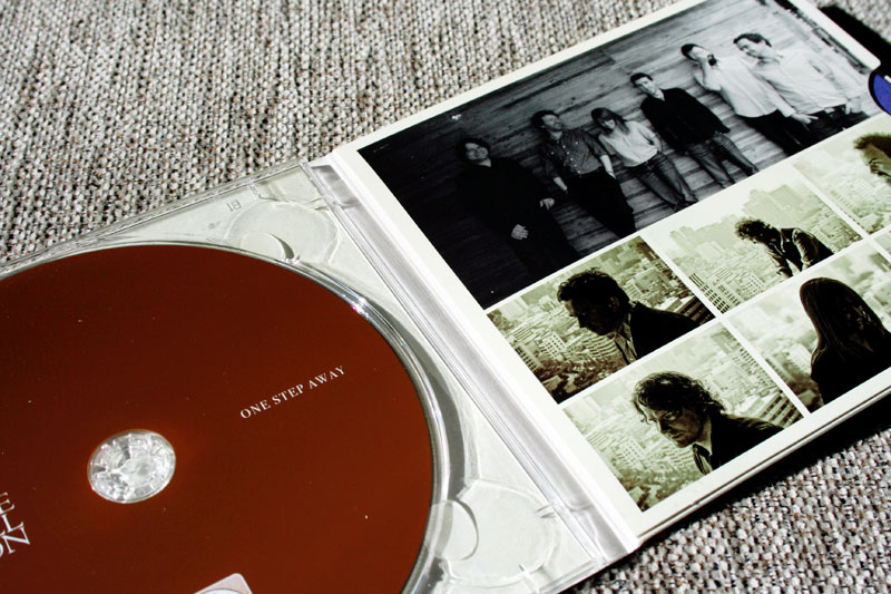
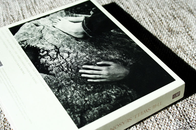
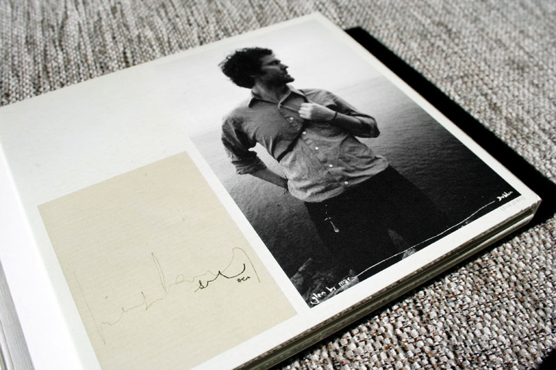
| The swell Season and music in general |
| More words today... I am listening to music all the
time... I am not a musician, I never learned to play an instrument. I
prefer it like this; so that I can feel music as pure emotion... Unlike
when I look at a design piece, I try to know how it was made, what font
was used... I guess it is the same for musicians...
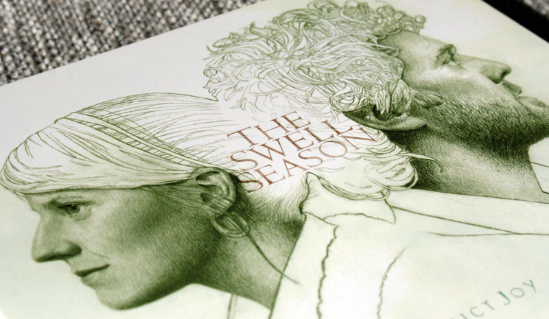
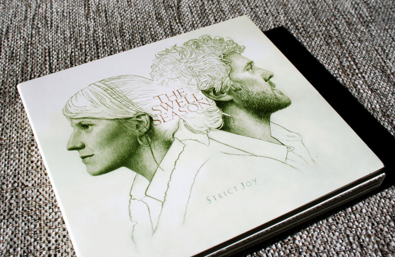
But, I guess I am a graphic designer because I always like album covers and music design in general... I do with music what I do with images on this site, always making selections, compilations, etc... Even easier with itunes now, buying only the songs that I like... But nothing can replace the real CD, I love special edition, digipack, etc... All that to say with tools we have today I want to share with you more music... We will start with The Swell Season, that you may know for the movie Once... I discovered them with the movie, and it is the perfect example of how images can show you music in a different way... You can not be touched the same way if you have seen the movie or not... Last year they issued a second album, to be honest less
deep that the first one (but maybe because there was no movie associated
that time ;) I really like the front sleeve, as well as the global design...
And a good point, for the price of one album, you have a nice package,
an album, an amazing live performance on CD and a great DVD documentary...
The best way to let people buy real items instead of downloading them... |
 |
|
|
 |
 |
 |
| This is the latest single |
|
| Adam the Velcro Suit | ||||||||||||||
 |
||||||||||||||
|
||||||||||||||
|
||||||||||||||
 |
||||||||||||||
 |
||||||||||||||
 |
||||||||||||||
|
||||||||||||||
www.flickr.com/photos/velcrosuit | first post in graphic section |
||||||||||||||
|


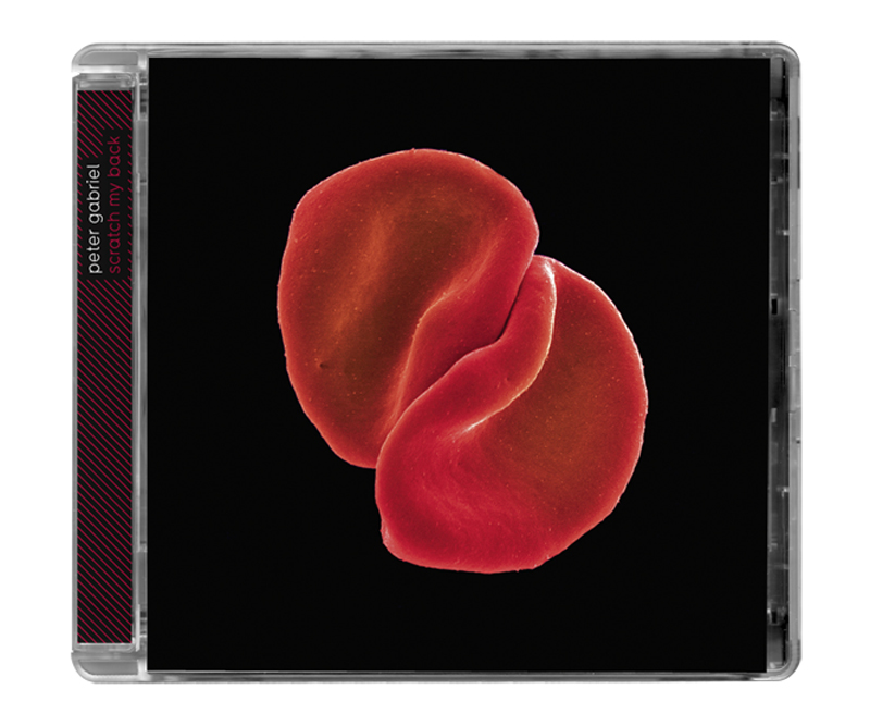
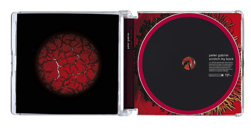
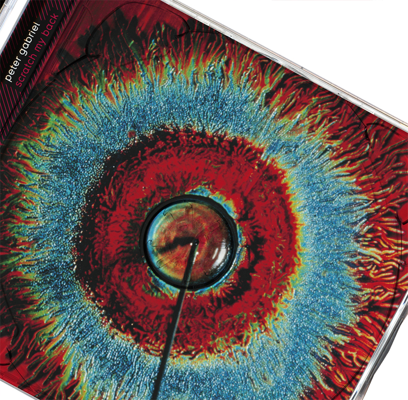
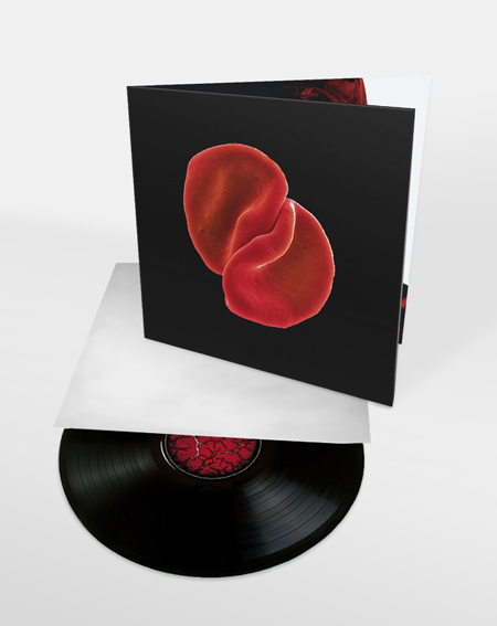
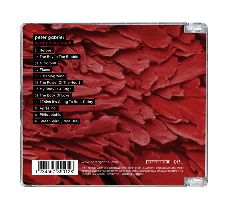
| Peter Gabriel - Scratch my back - by Marc Bessant |
| Peter Gabriel's first album in seven years is an orchestral
covers collection called Scratch My Back. It features reinterpretations
of Elbow, the Kinks, Talking Heads, Lou Reed, David Bowie, and Neil Young.
It's being called a "song swap," which implies some artists
will also cover Gabriel... Marc Bessant, who work at realworld design studio, and already did the latest Peter Gabriel records and DVD, give me more info on this new project : "I was struck by how simple, honest and sensuous the music was sounding with just the two elements - Peter and the strings. 'Two' became important - two parts, two acts, two songs, two albums - a shared experience, one dependent on the other. From then it
was a fairly visceral approach, not much time to over-think and so retains
some of that original energy. I wanted the design (and particularly
the colours) to be seductive and sensual (touching on sexual?), perhaps
even a little tense, a typical relationship between one and another. This album is for me one of the best I have heard, I love
it, and the cover is simply aprefervisual interpretation of it... |
 |
|
|
 |
 |
www.marcbessant.com | check Marc interview done some month ago here |
|
See CD archive page 08 | page 07 | page 06 - page 05 - page 04 - page 03 - page 02 - page 01
 |
 |
 |
 |
 |
| |
||||